 kelvinA
-
[A] Shelving most projects due to Tetrinsic [gd0041] delays
08/31/2023 at 14:01 • 0 comments[15:00, 31 Aug 2023]
I was hoping that this wouldn't be the case, but it seems that the time until I obtain a #Tetrinsic [gd0041] powered device is going to be longer than I hoped. More information can be found in this project log.
I'm looking into pivoting to a promising custom linear motor solution that I'll write about later, but custom solutions mean unforseen problems. It also means that I have to redesign a lot of things, including the PCBs.
I also expect that this isn't going to be an isolated case, in that my other projects are going to have setbacks and delays of their own, meaning that the cost in development time will too high.
The most notable project to get shelved is #Tetent [gd0090] as I will be focusing on #Tetrescent [gd0150].
-
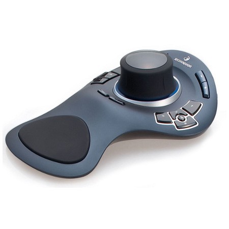
[T] SpaceExplorer (SpaceMouse) as actual mouse?
04/01/2023 at 13:14 • 0 comments[2 April 2023]
So I was researching into input devices, and I had an idea: what if there was a way to use the SpaceExplorer I have in a shelf as a 2D mouse? Hear me out here!
The main reason it was in a shelf was because I didn't want to have to keep swapping my hand between the keyboard and the mouse, and 3 devices takes up quite a bit of space (but that's mainly because a full sized keyboard is already quite large).
I've considered getting a trackball mouse to further reduce the amount of deskspace needed, but mainly so that I didn't actually need a desk surface to use the mouse accurately. Unfortunately, none that I could find had enough programmable buttons, and I only need 4 (+2 for left / right click).
The SpaceExplorer I have very much looks like an earlier iteration of the SpaceMouse Pro. I'm not really sure why 3DConnexion dropped support when the inputs are electrically identical.
SpaceExplorer SpaceMouse Pro, where I think the biggest improvement has been the enlargement of the topmost 4 buttons. The idea is simple:
- Move the cylinder X/Y like a TrackPoint to move the cursor
- Tilt the cylinder in one of 8 directions to send an event (a bit like the SpaceTraveller but not using 8 physical buttons). East/West will be the left or right clicks and up / down would be for scrolling, leaving 4 user programmable "buttons".
- The 'Fit' key on the SpaceExplorer toggles between mouse and spacemouse mode. The reason the "2D" button isn't used for this is because it's much harder to press with the thumb, and unreachable if the SpaceExplorer is on the right side of the keyboard.
[4 April: Morning]
Ok, so I've been digging though the forums for clues and I've got part of a solution, and have learned some things about the undocumented XML along the way. I've got cursor X/Y and scrolling working nicely, but I haven't yet been able to get mouseclick events or macros on the cylinder.
So first, navigate to
%appdata%\3Dconnexion\3DxWare\Cfg
There should be a Global.xml file. I edited it to make it look like:
<?xml version="1.0" encoding="UTF-8" standalone="no"?>
<Global Default="false" xmlns="" CfgFormatVersion="1.3" ThisFileVersion="2.0">
    <CfgProperties>
        <ID>ID_Global_Cfg</ID>
        <Name>STR_GLOBALCFG</Name>
        <InheritsFromID>ID_Base_Cfg</InheritsFromID>
    </CfgProperties>
    <Settings>
        <InstallerAutoCheckForUpdates>true</InstallerAutoCheckForUpdates>
        <LastAutoCheckForUpdates>3-4-2023</LastAutoCheckForUpdates>
    </Settings>
    <ButtonActions>
        <ButtonAction Type="Driver_Other">
            <ID>Driver_Desktop_ToggleGrab</ID>
            <Name>STR_DRIVER_DESKTOP_TOGGLEGRAB</Name>
            <Image>
                <Source>[driver_images:Driver_Desktop_ToggleGrab.png]</Source>
            </Image>
        </ButtonAction>
    </ButtonActions>
    <Devices>
        <Device>
            <ID>ID_Standard_3D_Mouse</ID>
            <ButtonBank>
                <Button>
                    <Input>
                        <ActionID>V3DK_FIT</ActionID>
                    </Input>
                    <Output>
                        <ActionID>Driver_Desktop_ToggleGrab</ActionID>
                    </Output>
                </Button>
            </ButtonBank>
        </Device>
    </Devices>
</Global>
Driver_Desktop_ToggleGrab is a specific action that changes the Desktop.xml file (that you have to create), specifically toggling:
<Grab>Hard</Grab>
<Grab>None</Grab>
In "Hard" mode, the driver will lock onto using this .xml file everywhere and never let it go. However, if it's on "None", the driver acts as usual, selecting the .xml that relates to the application currently in focus.
The names for mapped buttons (eg V3DK_FIT) can be found in
Program Files\3Dconnexion\3DxWare\3DxWinCore64\Cfg\Base.xml
You can use the driver software to change the button map in some random program, look in the same folder as Global.xml / Desktop.xml and you'd get something like "HIDButton_13", which you can then look up in Base.xml, such as:
...
<ButtonID>HIDButton_13</ButtonID>
<V3DKID>V3DK_1</V3DKID>
...
Anyway, next was to create Desktop.xml in the same folder as Global.xml
<?xml version="1.0" encoding="UTF-8"?><...Read more » -
[A] Icon Logo Update
01/26/2023 at 23:51 • 0 commentsI noticed this fact maybe 2 weeks ago now: my designs have a lot of square diamonds but not a lot of squares. From the grills in #T^2 TyMist [gd0138] to the large squared diamond #Tetent TestCut [gd0139] makes when in use, it seems that I like square diamonds.
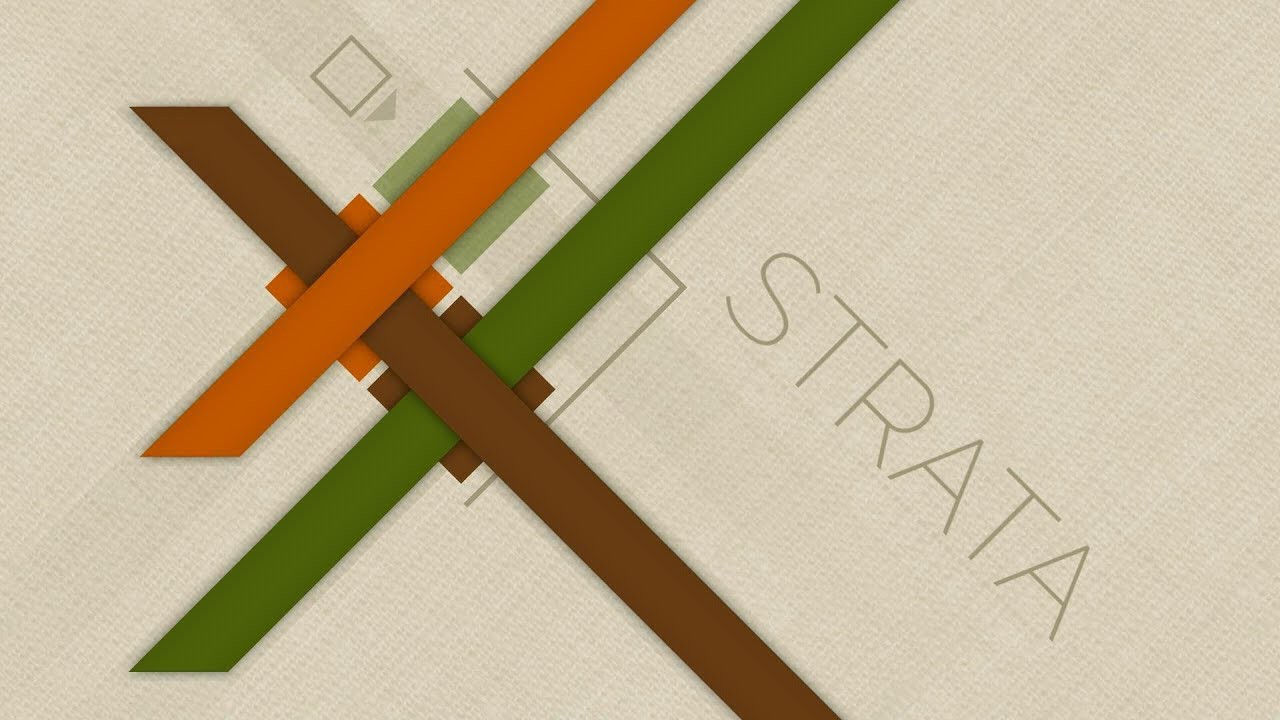
Now, the icon logo used squares because I like(d) squares more than circles. Back over a year ago when I designed it, Teti was the only design with diamonds. Now, thinking about the hardware and software designs I have planned, it does seem like I'd be using diamonds more than squares. I probably might have realised this sooner since that was one of the reasons I liked the game Strata:
![]() My main worry was that it would look sharp... in a bad way. I really should've just gone into Fusion360 and made the change instead of thinking it over another 2 weeks.
My main worry was that it would look sharp... in a bad way. I really should've just gone into Fusion360 and made the change instead of thinking it over another 2 weeks.![]() It looks brighter, like the diamonds are sparkles. Then I switched back to the current logo
It looks brighter, like the diamonds are sparkles. Then I switched back to the current logo![]() and my first thought was genuinely "Who is this plain and bland imita-- oh". Maybe it's just because the logo is over a year old and it's starting to feel a bit stale, but it just makes me think more towards "office" and... not as energy-emitting.
and my first thought was genuinely "Who is this plain and bland imita-- oh". Maybe it's just because the logo is over a year old and it's starting to feel a bit stale, but it just makes me think more towards "office" and... not as energy-emitting.![]() I'll probably realign the diamonds before rolling it out (see aligned new logo below), but otherwise it looks fine. It also looks similar enough to the current one that it should still be recognisable and possibly interchangable. HP has 2 drastically different logos; I think I can get away with the same logo but one has rotated squares. I'm already imainging it opening up new potential motion graphic animation opportunities.
I'll probably realign the diamonds before rolling it out (see aligned new logo below), but otherwise it looks fine. It also looks similar enough to the current one that it should still be recognisable and possibly interchangable. HP has 2 drastically different logos; I think I can get away with the same logo but one has rotated squares. I'm already imainging it opening up new potential motion graphic animation opportunities.![]() [14th Feb 2023] Rolling out the new personal branding now.
[14th Feb 2023] Rolling out the new personal branding now.![]() The curve of the brackets has been slightly tweaked, which means that the icon and full kelvinA look slightly more fluid and less orthagonal.
The curve of the brackets has been slightly tweaked, which means that the icon and full kelvinA look slightly more fluid and less orthagonal.![]() I also decided to put a filleted chamfer in the E because I use those extensively in my designs and so shoud be part of my brand image somewhere.
I also decided to put a filleted chamfer in the E because I use those extensively in my designs and so shoud be part of my brand image somewhere.
 My main worry was that it would look sharp... in a bad way. I really should've just gone into Fusion360 and made the change instead of thinking it over another 2 weeks.
 It looks brighter, like the diamonds are sparkles. Then I switched back to the current logo
 and my first thought was genuinely "Who is this plain and bland imita-- oh". Maybe it's just because the logo is over a year old and it's starting to feel a bit stale, but it just makes me think more towards "office" and... not as energy-emitting.
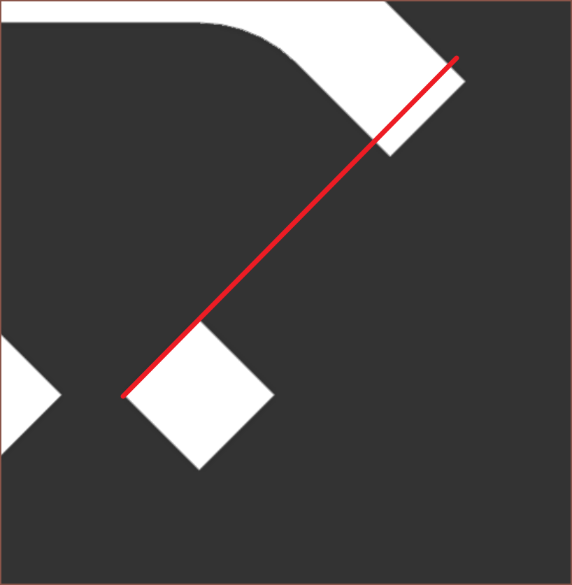 I'll probably realign the diamonds before rolling it out (see aligned new logo below), but otherwise it looks fine. It also looks similar enough to the current one that it should still be recognisable and possibly interchangable. HP has 2 drastically different logos; I think I can get away with the same logo but one has rotated squares. I'm already imainging it opening up new potential motion graphic animation opportunities.
 [14th Feb 2023] Rolling out the new personal branding now.
 The curve of the brackets has been slightly tweaked, which means that the icon and full kelvinA look slightly more fluid and less orthagonal.
 I also decided to put a filleted chamfer in the E because I use those extensively in my designs and so shoud be part of my brand image somewhere.
 Max.K
Max.K Vijay
Vijay Nick Rehm
 Pamungkas Sumasta
 Peter Mac
 Xieshi Zhang
 oneohm
 Andrew Kotite
 xpDIY
xpDIY Ludwin
 gear_geek
 Greg Zumwalt
 glgorman
 Ryota Kobayashi
 deʃhipu
 Satoshi Tanaka
 massimodeagro
Thanks for the like :)