 kelvinA
I noticed this fact maybe 2 weeks ago now: my designs have a lot of square diamonds but not a lot of squares. From the grills in #T^2 TyMist [gd0138] to the large squared diamond #Tetent TestCut [gd0139] makes when in use, it seems that I like square diamonds.
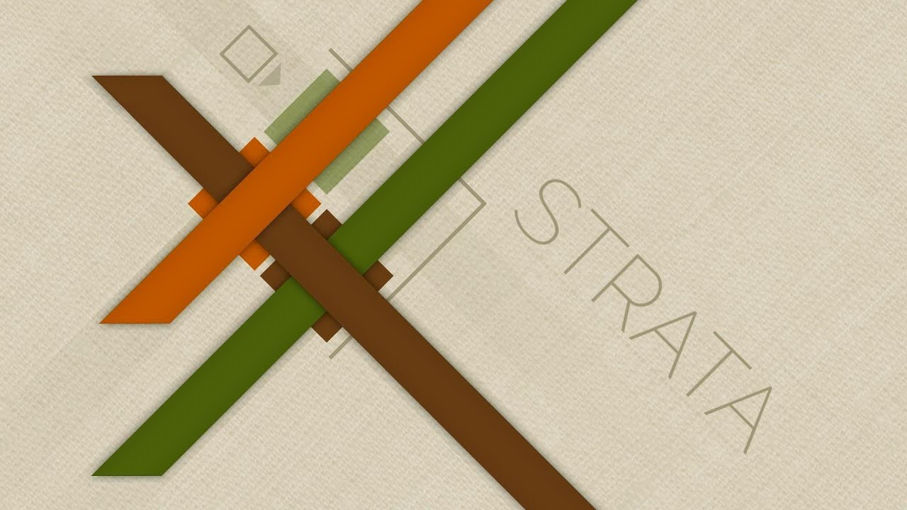
Now, the icon logo used squares because I like(d) squares more than circles. Back over a year ago when I designed it, Teti was the only design with diamonds. Now, thinking about the hardware and software designs I have planned, it does seem like I'd be using diamonds more than squares. I probably might have realised this sooner since that was one of the reasons I liked the game Strata:
 My main worry was that it would look sharp... in a bad way. I really should've just gone into Fusion360 and made the change instead of thinking it over another 2 weeks.
 It looks brighter, like the diamonds are sparkles. Then I switched back to the current logo
 and my first thought was genuinely "Who is this plain and bland imita-- oh". Maybe it's just because the logo is over a year old and it's starting to feel a bit stale, but it just makes me think more towards "office" and... not as energy-emitting.
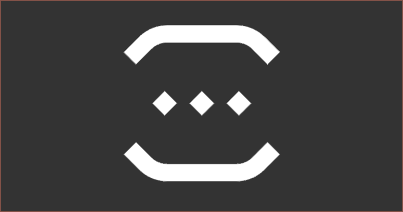
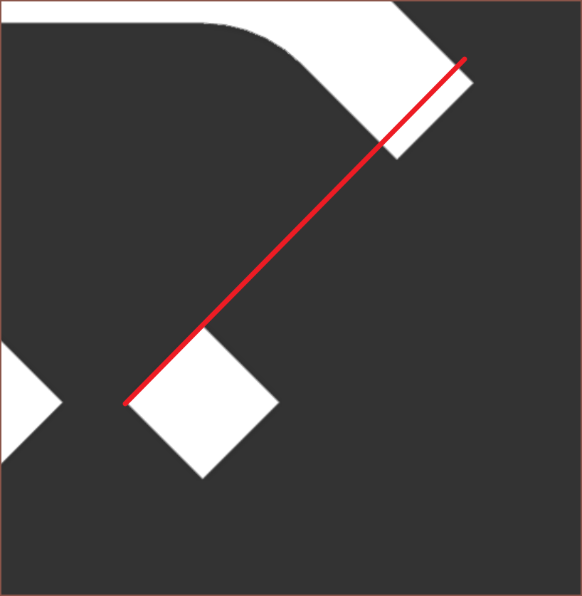 I'll probably realign the diamonds before rolling it out (see aligned new logo below), but otherwise it looks fine. It also looks similar enough to the current one that it should still be recognisable and possibly interchangable. HP has 2 drastically different logos; I think I can get away with the same logo but one has rotated squares. I'm already imainging it opening up new potential motion graphic animation opportunities.
 [14th Feb 2023] Rolling out the new personal branding now.
 The curve of the brackets has been slightly tweaked, which means that the icon and full kelvinA look slightly more fluid and less orthagonal.
 I also decided to put a filleted chamfer in the E because I use those extensively in my designs and so shoud be part of my brand image somewhere.
Discussions
Become a Hackaday.io Member
Create an account to leave a comment. Already have an account? Log In.