The project uses the NU32 breakout board with a PIC32 microcontroller along with a LSM303D accelerometer/magnetometer on a Pololu breakout board. A 100 Hz interrupt service routine is run where a reading from the accelerometer/magnetometer is acquired over SPI and sent back to a laptop over UART. From there, the data is processed in matlab. Much of the work on this project was setting up the data acquisition in Matlab and processing the data.
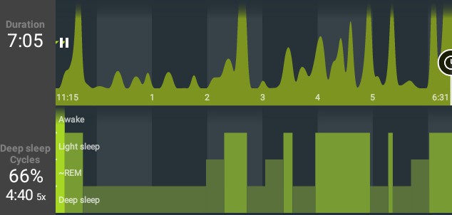
To acquire data, I placed the accelerometer/magnetometer adjacent to my body as I slept. As a result, while at rest, the readings should be relatively constant. When I move, there should be a change in the accelerometer readings. My goal was to create a similar graph to what my sleep tracker app creates (see below), with spikes shown when there is movement in my sleep. The next few sections describe my process for analyzing the raw accelerometer data.
To start off, because the accel/magento readings in the X, Y, and Z directions had very different scales (i.e. accel X was around -75 whereas accel Y was around -1900), I first shifted the readings to be centered around 0 by subtracting the average of all the data for each reading. For example, in the Z direction, I subtracted -15000 from each so the average is now at 0.
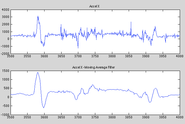
Next, I applied a 17 sample moving average filter to the readings. Although I did not use the MAF in the final filter, it was helpful for visualizing the data. Because data is analyzed after all the samples are taken (i.e. not in real time), I was able to use an acasual filter using both past and future data points. Below is a sample of a portion of the data with the filter applied. You can see a spike in the data which matches a shift in position.
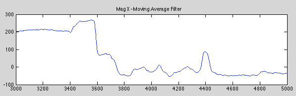
After analyzing the data, I noticed the rest position accelerometer reading would change when I came to a new rest position. See the chart below as an example where I’m plotting the magnetometer X reading (the magnetometer data makes viewing this issue easier). You can see my rest magnetometer reading is about 200, then after a 10 second shift in position, my rest reading lands on 0 (remember this is the average for the entire data pull).
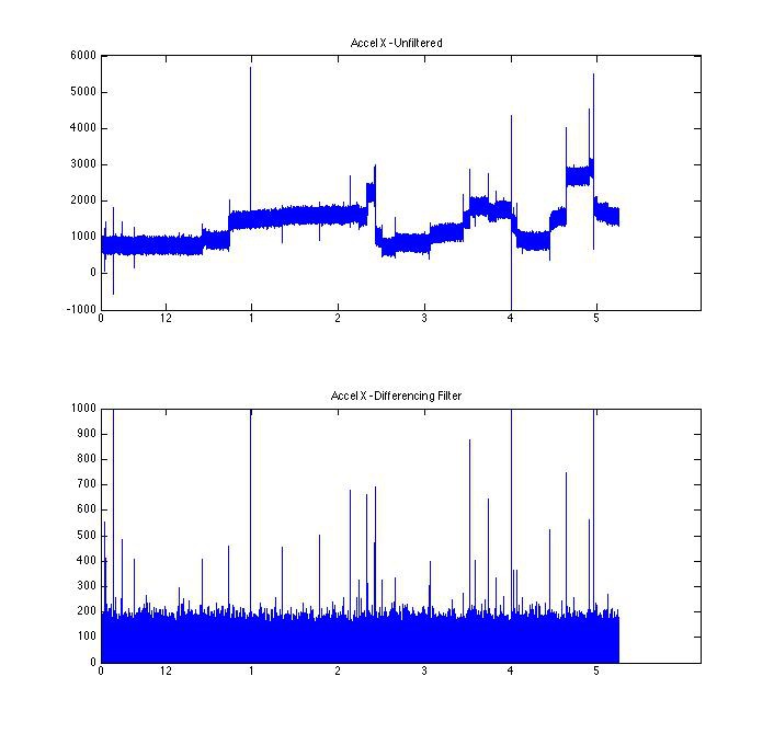
In order to recreate the sleep tracker app graph, I needed to design a filter that would provide a large reading when I’m moving and 0 when I’m not. As a result of the above, I realized I wanted a filter that would compare to the previous readings to see if there was a big difference. If there was a difference, that means movement had just occurred. In addition, taking the difference meant the absolute reading didn’t affect the output, only the relative difference between the previous readings. The final filter averages the previous 8 readings and compares to the current reading. Below is a comparison with the unfiltered acceleration X data.
I applied the filter to the X, Y, and Z acceleration, scaled each so they were all the same approximate range for moving and not moving, and then took the max of the all 3. Below is that graph with a comparison to the graph from the sleep tracker app. The red line is there to show the alignment of the graph I created and the sleep tracker app.
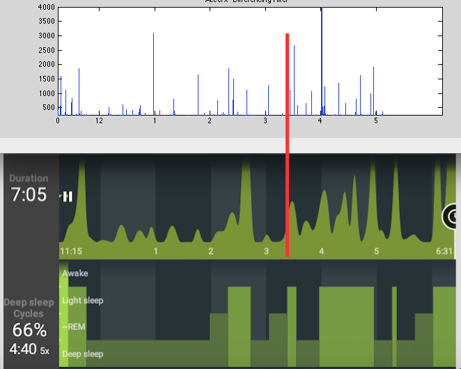
In general, there is pretty good correlation between the graph I created and the sleep tracker app in terms of timing of movement, but less similar in terms of scale. It’s tough to know which one is accurate since I have no way to validate either one.
As next steps, I’d like to collect more data and use it to analyze the filter’s accuracy. In addition, it would be great to add some features to the graph to make it look more similar to the sleep tracker app graph. This would most likely need to be done using python.
As a side note, much of the code for the micro-controller programming and communication with Matlab came from the Embedded Computing and Mechatronics With The Pic 32 Microcontroller textbook (which accompanies the NU32 breakout board). I programmed most of the Matlab code.
 Lex Kravitz
 Emach00
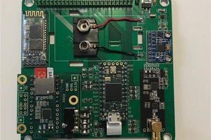
 lukasz.iwaszkiewicz