 Kate Reed
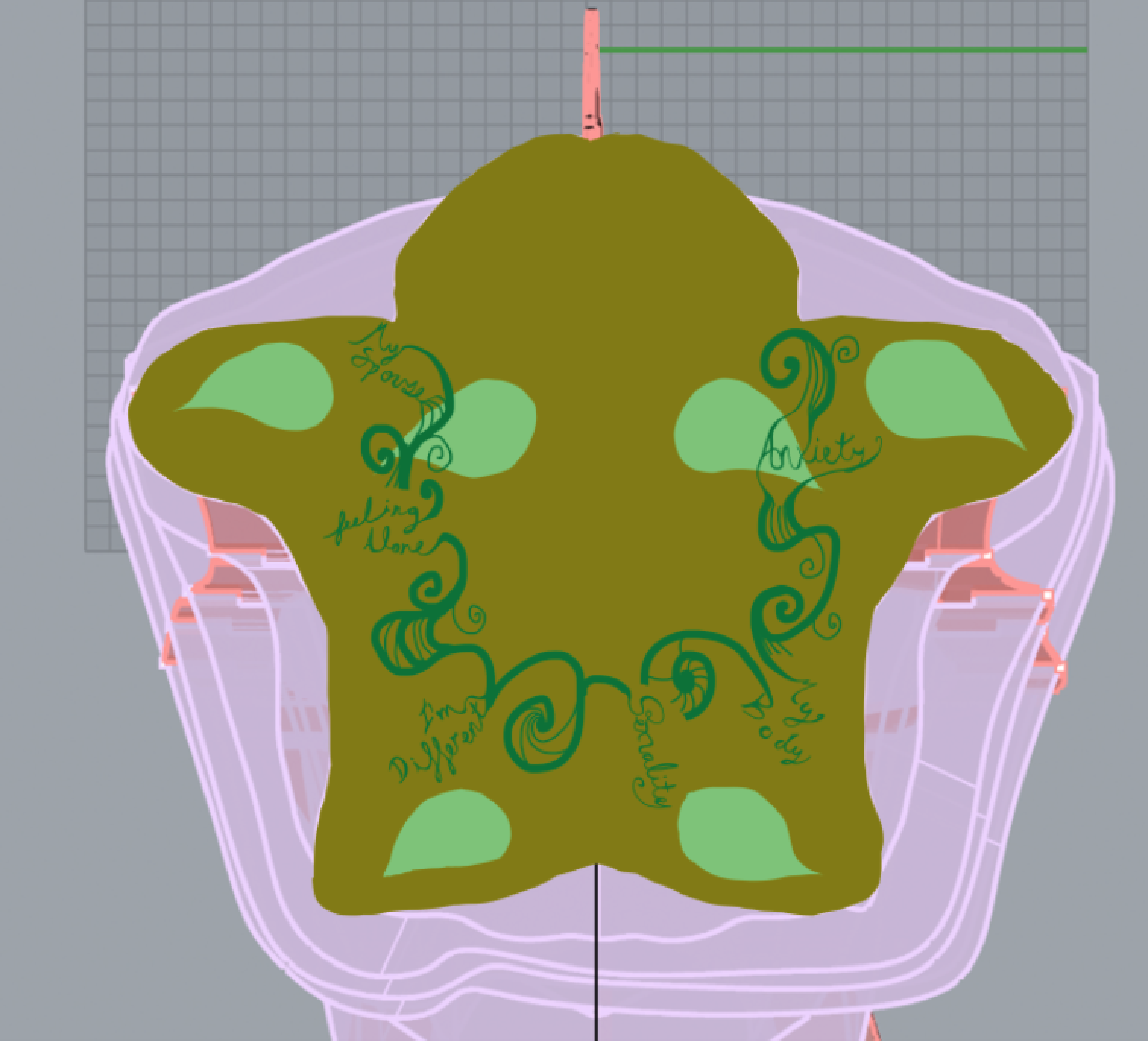
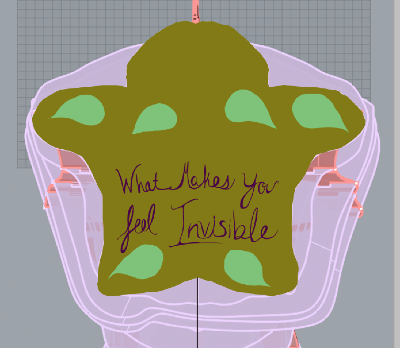
Once the piece was visually and structurally sound, it was time to design the chest plate. The chest plate is where people are actually going to put in their notes, and it is the part of the sculpture that pulls people in. I was first thinking of having text asking, “What makes you feel invisible?” The text would be surrounded by vines and leaves, and written in the leaves and vines would be example answers that people have given. Once I made that version, it didn’t look as good as I thought it would. I realized that the text might get lost under the head of the sculpture.
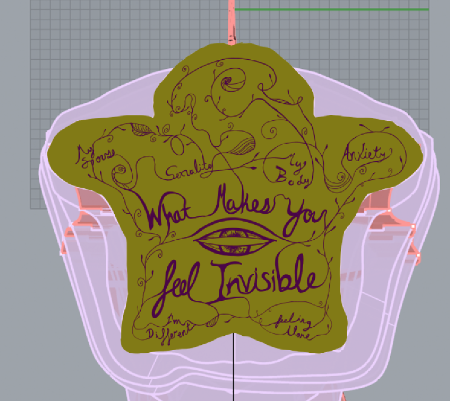
For my next iteration I decided to move the text down to the outer most point, to make sure that it will be readable. I decided that I wanted to go with flowing cursive writing so it will mesh with the vines nicely. There is also something about the cursive writing that plays towards your soul. It is a very intimate font.
I decided to ditch the leaves. There really isn’t enough space on the chest plate to have the words and the leaves and it’s hard to know where to look with your eyes. It’s too busy. I toned down the line weight on the vines and I beefed up the line weight of the text to try to make it more clear where to look. I finagled the white space around the edges, and tried to get the vines to be as consistent as possible. I tested the design by etching into a plywood sheet to see if it was readable. There are a few changes I want to make, but it looks quite lovely, if I do say so myself.
Discussions
Become a Hackaday.io Member
Create an account to leave a comment. Already have an account? Log In.