 Mario Frei
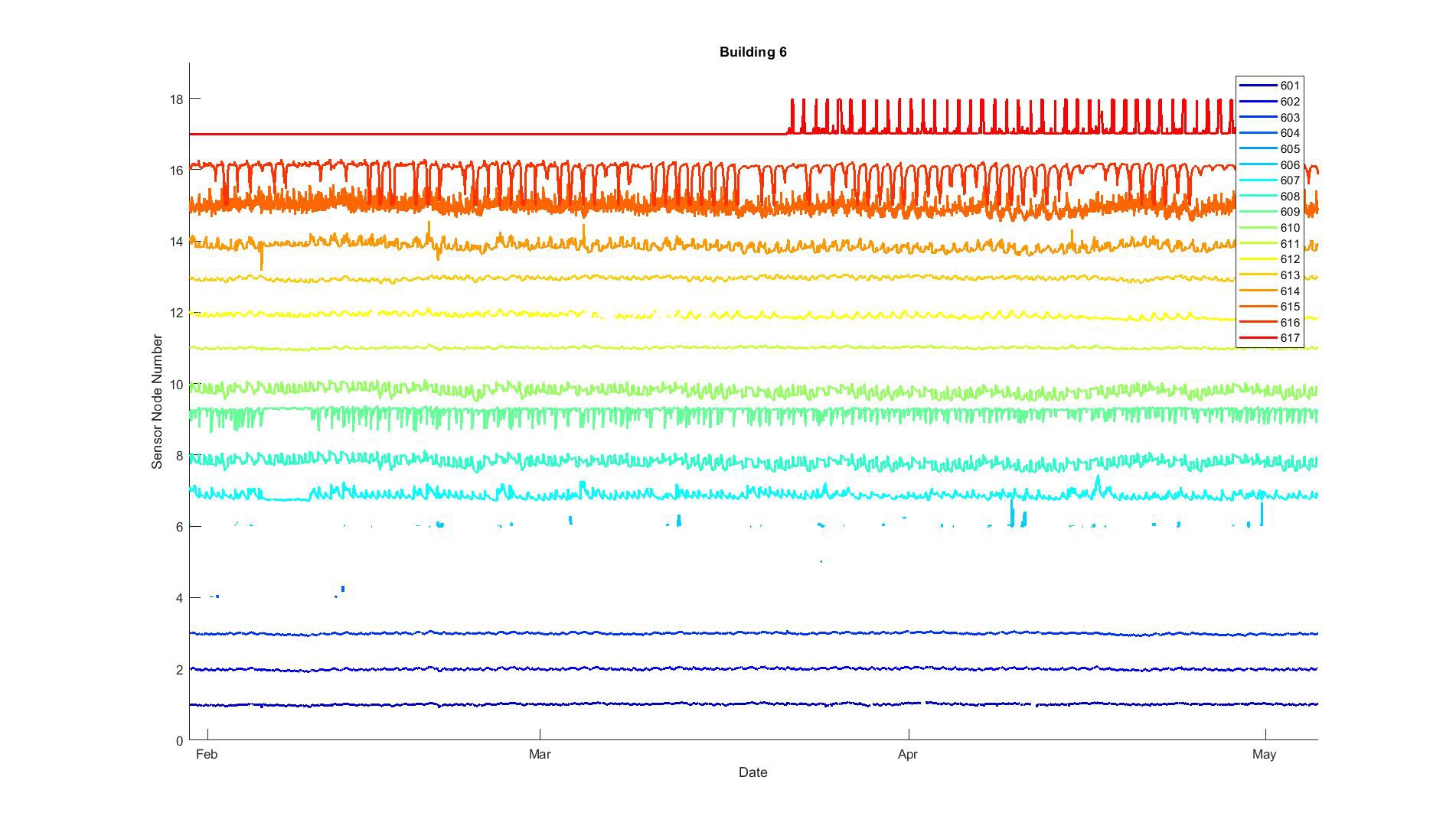
The quality of the gathered measurement data varied quite a bit between the different buildings. The overview plots I am using show all measured data from 18 sensor nodes in one figure. For that purpose, the mean of the measured data was subtracted, and then the result time-series was scaled by the maximum of its absolute values. The y-axis shows the sensor node number. Similarly, the legend shows the sensor node number plus the gateway identifier, e.g., the sensor node 601 is sensor node 1 associated with the gateway 600. In the plot, two data points are only connected if the time gap is less than 15 minutes; otherwise there will be a gap. However, only gaps of several hours are visible in the figure due to the resolution. This representation allows us to assess some characteristics of all time-series of one building in one figure; time-series gaps, variations in the data, and irregularities can be seen. However, this does not work for event-based data, i.e., windows opening events. In the data sets presented here, the sensor nodes show the following data: Sensor nodes 1-3: Indoor temperature & Relative humidity, Sensor nodes 4-6: Window opening times, Sensor node 7: CO2 concentration Sensor nodes 8-10: Supply and return temperature of heating systems Sensor nodes 11-13: Indoor and outdoor temperature of building elements Sensor nodes 14-16: Heat flux through building elements Sensor node 17: Electricity consumption Sensor node 18: Oil consumption If more then one sensor is connected to one sensor node, only one entity is shown in the overview plot.
The figure below shows an example of a set of measured data with good quality. There are only a few gaps visible, e.g. sensor node 1 in April, and sensor node 12 in March. Sensor nodes 4-6 don’t show very little data, because they represent windows opening times, which are event-based. So lines are only visible, if the windows was opened twice within a short time. Sensor node 17 only shows activity starting in March. This is because the pulse detector for electricity metering didn’t work initially and needed to be fixed. Sensor node 18 doesn’t show up, because it wasn’t installed at all. Sensor nodes 1-3 and 11-13 appear to have small extremes compared to the mean. While sensor nodes 14-17 show much more pronounced spikes. Sensor node 16 was a heat flux sensor mounted on a south-facing window. The peaks are from solar radiation causing large heat fluxes from the outside to the inside. Sensor node 17 measures the electricity consumption of the entire building. The spikes are caused by the resistive electrical heating system, which heats up large water tanks during the night. More on that can be found here: https://www.sciencedirect.com/science/article/pii/S0378778818316256
Discussions
Become a Hackaday.io Member
Create an account to leave a comment. Already have an account? Log In.