 Benchoff
I am designing the Dumb Badge with the idea that is a product, not a single one-off project. Being a product demands some work must go into the design, both the design language of the enclosure, but also the typefaces and logotype of the screenprinting and packaging. Basically, I need to decide on a font or two. It's also time to start designing the enclosure, which means I need to imagine what a product made in the alternative history of 1991 would look like.
FIRST OFF, TYPOGRAPHY. For some reason companies change their industrial design language faster than their typography, so this is easier to nail down
The overarching theme of the design of this project is an alternative history. What if there were high-resolution (well, 800x480) cell phone screens and microcontrollers with a megabyte of RAM in 1985? There was still a market for dumb terminals then, and as I've noted before, some company would have made this product if the technology existed at the time. Let's assume the company that made this alternative history project was DEC. I'm already ripping off their naming convention by calling this the 'VT-69', anyway.
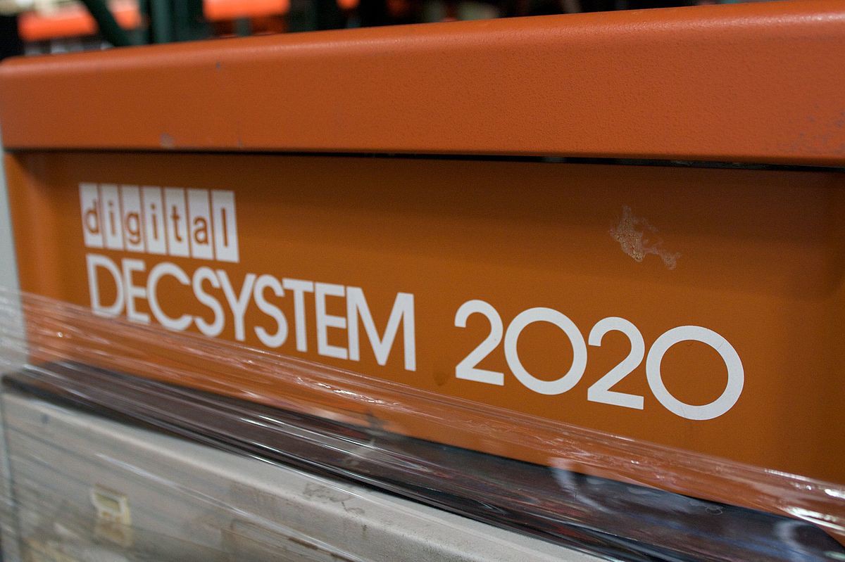
Here's some of the designs of logos from 50 years of DEC products:
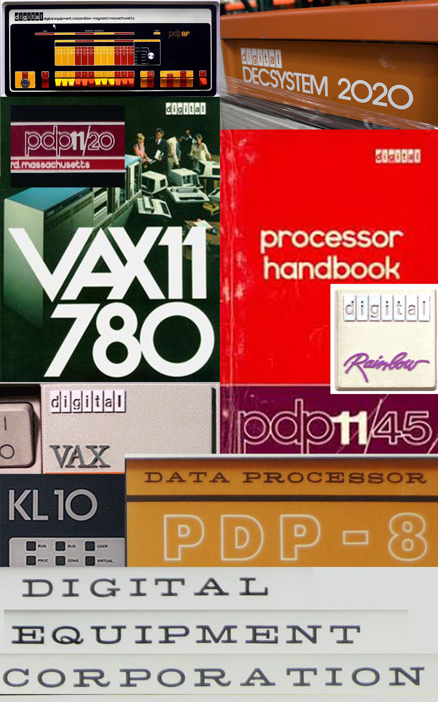
There's a lot going on here, from the strange antique serif type of the Straight-8 to the vaporwave ッゥ横 aesthetic of the DEC Rainbow. The PDP11s had outlined lowercase text, the Vaxxen had oppressively 90s serifed fonts, and between that you had Cold War era Kinda-Futura-But-Not-Futura. There's a lot to pick from here. There is one constant -- the 'digital' in boxes -- that was used from the 60s until acquisition by Compaq. That should be included somewhere, and Ned Batchelder, the guy responsible for digitizing the original photo art, has that all documented. I'm going to use that somewhere, but I need something else for the main logotype and packaging
I've settled on the 'not Futura' logotype (seen below). It's bold enough that it works, it doesn't have the oppressive 90s connotation of the serifed Vax type, and this type is more easily scaled down to PCB silkscreen than the 'outlined lower case' logotype.
The question is, what's this font? Well, you can ping the dude that was responsible for it on Twitter. The typeface is Avant Garde, and a quick check of WhatTheFont confirms it:
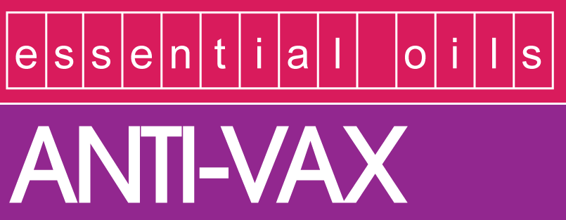
yes, it's a joke, but the ANTI-VAX is dead-on. I'm using ITC Avant Garde Gothic for the main logotype. There will be a little bit of Helvetica in boxes thrown in for good measure.
The colorway... Blue. Maybe orange. God damn DEC design was so good, and it's a travesty none of it is written down
Ah yes but what about industrial design?
I'm talking about the design of the enclosure here. All industrial design is a function of the machining capabilities available at the time. The most famous industrial design ever, Apple's Snow White design language, featured in the Apple IIc and Mac SE, is a function of two advances made in injection molding at the time: zero draft enclosures and diamond cutting plastic. What is zero draft? Most injection molded parts are tapered one or two degrees, to allow for extraction from the mold. In the late 70s, zero drafting was invented, and Apple spent a god damned fortune buying and building the capability to bring this technique to consumer electronics. Likewise, the use of diamond cutters came into service in the late 70s, and that's why 80s and 90s Apple products had a tiny recess for an embossed rainbow apple logo.
Art is a study of the capabilities of production. Oil paints on panels were invented by Jan van Eyck, a dutch artist, around 1400. Just after that, boom, dutch masters creating oil paintings. The 1940s, and 50s saw an entire field of chemistry dedicated to the creation of pigments, and boom, right after that you've got 'modern art' and rothkos that are just panels of color. Zero draft tooling was invented, then boom frog design apple blah blah blah. Art isn't about art, it's about the implementation of materials and techniques.
With 3D printing and CNC and EDM and all the production techniques available to me, I can call upon any past design language to emulate or replicate. It's really just a question of what I want to go after. So let's look at some stuff
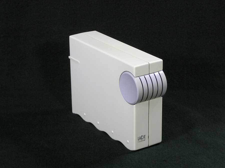
LaCie Ziba design
LaCie is a French manufacturer of external hard drives. Ziba is a design house in Portland. Around 1992, they came out with these:
LaCie Tsunami:
LaCie Cirrus:
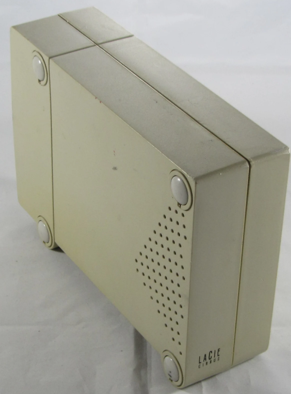
With those two hard drives in mind, you have repeating geometric patterns. The vent holes in the Cirrus form a triangle; much like the drop shadow geometric patterns of Memphis aesthetic, you have the same thing rendered in plastic. Take a look at the bottom of the Tsunami hard drive. You have Memphis squiggles, punctuated with dots. You have completely unnecessary geometric shapes. It's glorious.
Apple's Cappuccino
First off, why copy Apple? Because everyone copied them. Remember the translucent polycarbonate everything around 1999? It was happening before that. Here's Apple's Cappuccino, their early 90s design language, rendered in the Mac Classic II, Color Classic, and the LC/Performa 500 series:
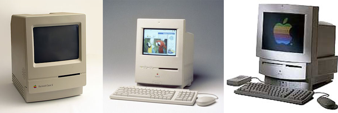
The design is monolithic, with a large radius curved front. There's a vertical line somewhere on the front, and later versions featured small round holes everywhere. The key word here is round. Everything has a fillet. The fillets have fillets. Take a look at the Power Mac 6400:
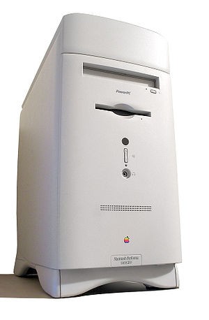
Good god that's round. I'm trying to emulate something much earlier, though, which brings us to Apple's earlier design language, Snow White:
Apple's Snow White
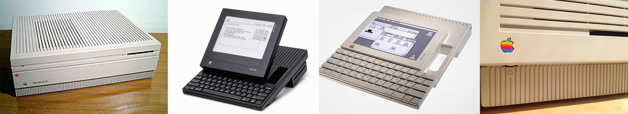
There are published design guidelines for Snow White:
- Minimal surface texturing
- Zero draft enclosures
- Recessed port icons
- silk screened name badging
- shallow horizontal and vertical lines, 2 mm wide, 2 mm deep, spaced 10 mm apart on center, which run along any and all of the surfaces of the product, some of which act as vents and set back 30 mm from the front and 4 mm from the back
- 3 mm radius, rear and 2 mm radius, front corners
- simple unadorned ports and slots
Think this was an Apple exclusive? Think again:
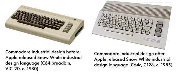
Compared to the breadbin C64, the C64c and C128 featured the same small radiused corners, horizontal slats that served the dual function of vents, and embossed ports. The 64c is simpler, smoother, and more unadorned. A Snow White-ish design language is a viable choice for anyone looking to replicate the look of mid-80s electronics
Need some examples? Apple HD20:
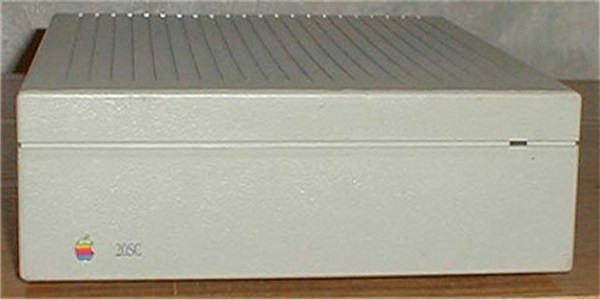
HOWEVER, SNOW WHITE IS LIMITED TO THINGS PEOPLE DON'T HOLD. Everything above isn't meant for the human hand. You don't hold a hard drive, you don't hold a workstation, but is there something that's snow-white ish that allows for some sort of tactile interaction? Well, yes, this phone, by hartmut esslinger:
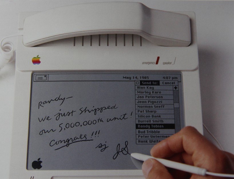
Again, you have rounded corners, somewhat set back, inset 'vent holes' that aren't, but you have a very ergonomic phone. Since this project is meant to be held, I'm somewhat trapped by what I can do here. This needs to be something you can hold, but snow white just doesn't do it.
The Just Square design aesthetic
But I'm building a portable device, and there's some design language specifically relevant to portable devices as well:
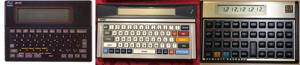
This 'just squares' design language is seen in a whole bunch of products from the 70s and 80s. A square is the easiest shape to put electronics in, and these calculators and pocket terminals are no exception. It's all squares, with some design element highlighting the keyboard area, or at least differentiating the keyboard area from the display.
The Greatest Industrial Design Ever
With all that under consideration, there are a few things I'm going for. I want a square, 'this is obviously injection molding technology' aesthetic of Snow White, but that industrial design is somewhat anachronistic for the age I'm trying to capture. I really want a vaporwave Memphis design like the LaCie drives. If only there was a company that produced computers in the mid-90s that captured. It would be even better if it were actually a Frog design.
Turns out that exists. It's Packard Bell. Packard Bell had the best industrial design of the mid-90s:
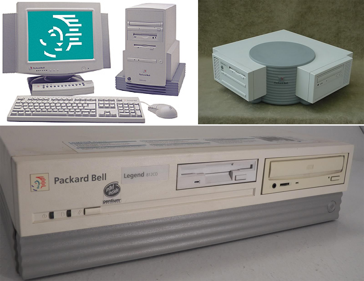
Few things to cover here. You've got a plinth style tower, like the LaCie drives. You have wavy Memphis-style squiggles. You have odd geometries, and you have the corner desktop which is all basic geometries that was meant to serve a purpose (fit a computer in a corner desk). How the corner computer didn't win a design award is beyond me. It's insane. It's the most 90s computer ever. Don't like gray? No problem, because Packard Bell has you covered:
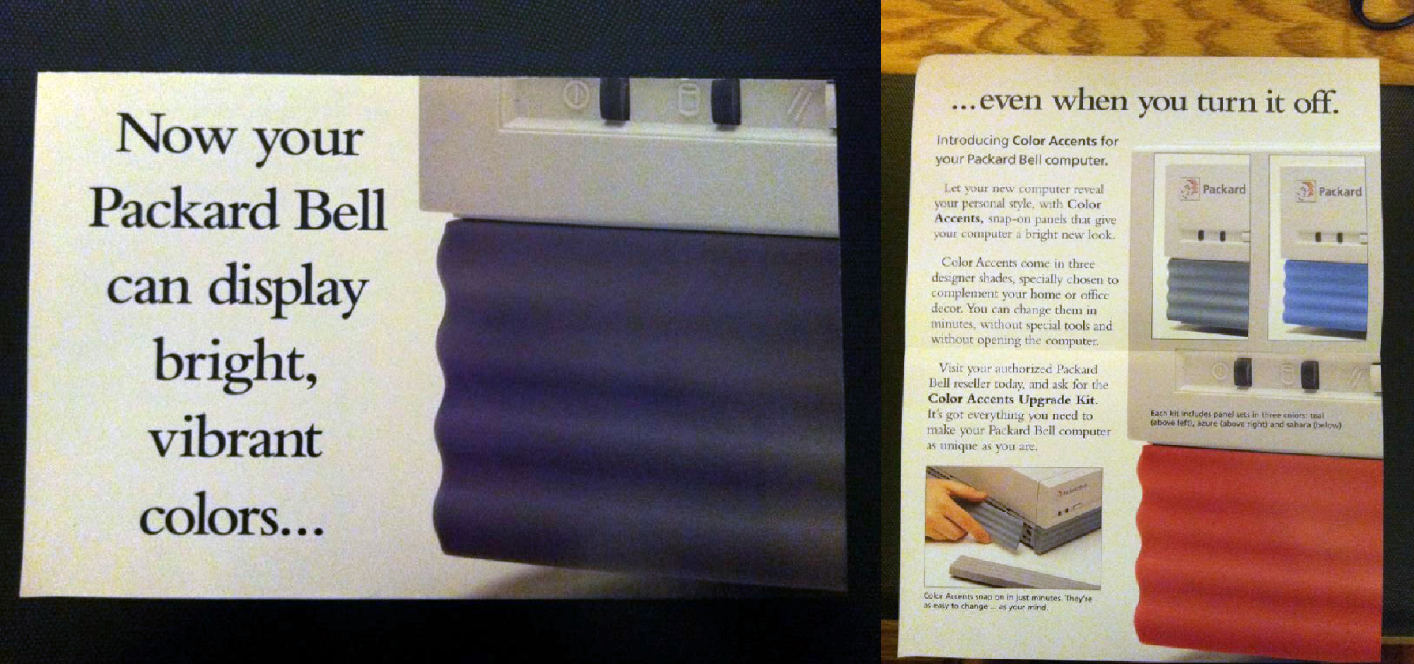
Yes, you could interchange the wavy panels for something brighter and more colorful. Holy shit. These designs were actually done by Frog Design, the people behind the original Snow White Apple design. It's a masterpiece, and exactly what I'm going for.
With that said, here's what I got:
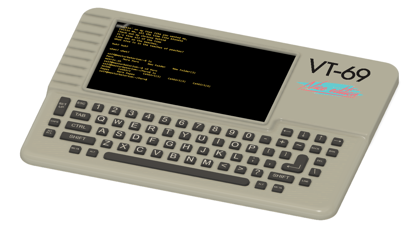
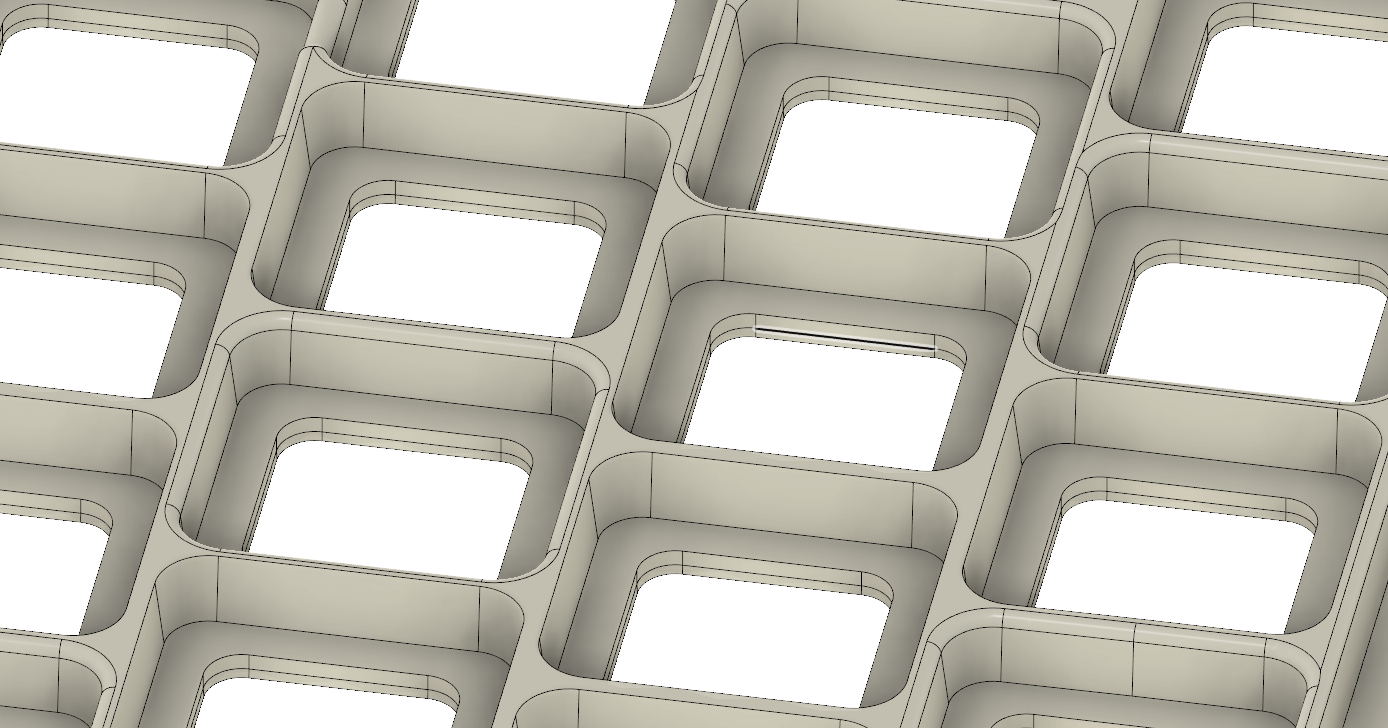
This is not a thick piece of plastic. The thickest part, from top to bottom, is just 7mm. I believe the larger fillet on the keyboard vs the smaller fillet on the 'screen half' will be a bit more ergonomic, and the 'snow white' slats to the left of the screen really help out with the aesthetics. The 'keyboard waffle grid' on the back still needs a bit of work, but it's getting there. Everything is held in place with M3 screws, with an affordance for M3 heat set inserts to support a daughter board for a Raspberry Pi.
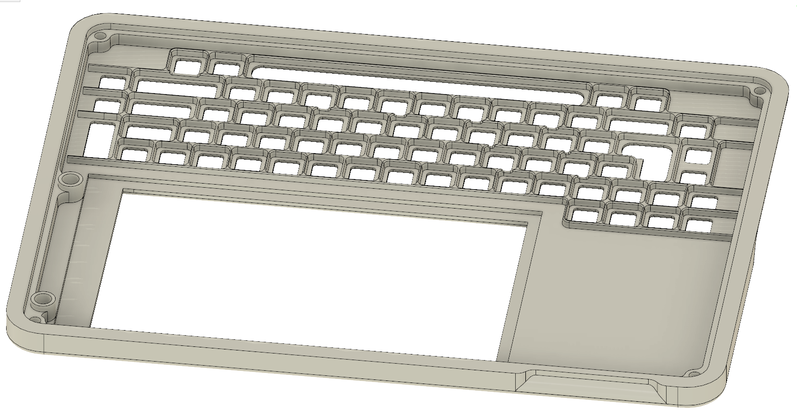
Important things to consider here are the larger fillets on the keyboard side of the badge, versus the smaller fillets on the 'display' side of the badge. This will be slightly more ergonomic, but is also somewhat functional: there's no circuitry on the keyboard half of the badge, it's just a silicone keyboard. The other side will have various pins and parts and stuff sticking up through the PCB. The next step is to order a blank PCB of the finalized dimensions (done) and order a resin/high quality version of the case (that's next). Now it's really time to start working on the electronics.
I'm not happy with this design. It really doesn't capture the 'memphis' of the Frog design Packard bell. I did this as a test:
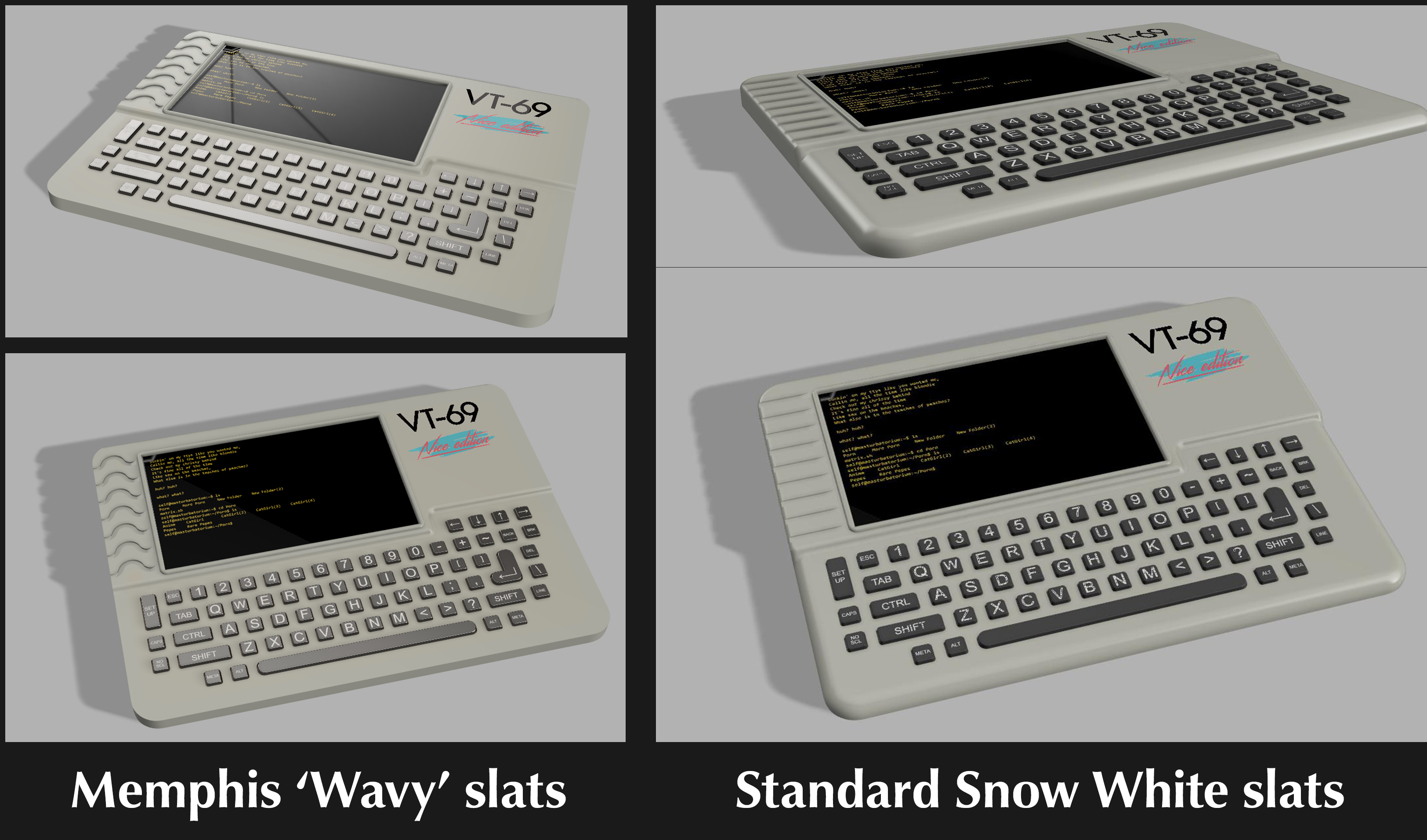
Here, we're running into a fundamental problem of the form factor, and this applies to mid-90s laptops as it does cell phones, and other portable devices. There's simply not enough space to implement the correct design. There is a limit to how much geometry you can put in such a small area, and there's simply not enough space to put Memphis in this design.
It's okay, and this is going to be what I'm running with, but I'm not especially happy about it.
Discussions
Become a Hackaday.io Member
Create an account to leave a comment. Already have an account? Log In.
Even though the dumb badge is a product, it has certain unique features and design challenges that go along with it. I'm going to be designing the dumb badge with the idea that it is a product, not a one-off project and also you can find out here for quality work. Being a product demands some work must go into the design, both on the enclosure and in the screenprinting.
Are you sure? yes | no
The "The Just Square design aesthetic" reminds me of the Canon X-07. A computer I was very fan of in the 80s. I own one for many years.
Are you sure? yes | no