 Radu Motisan
The uRADMonitor project has a complex architecture, involving both hardware and software. The software level also has two separate components, one is the client firmware – the software running on the dosimeter’s microcontroller, and the other is the software running on the server.
The last posts have shown a lot of progress on the hardware side but due to limited time, the software was left behind. Now, important upgrades have been made on the server, and this post will show a few of them.
There were a few problems that had to be addressed. For stations running in close proximity, the symbols were overlapping, and the only way of selecting / clicking all of them, was to zoom in enough to see them separately and so be able to click them. Here are the two stations in Florida, running close to each other: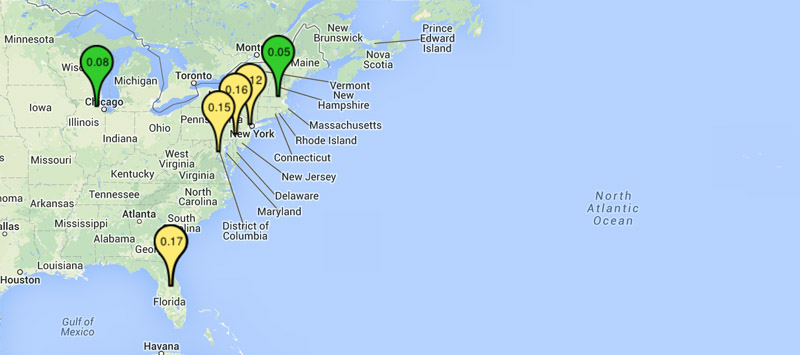
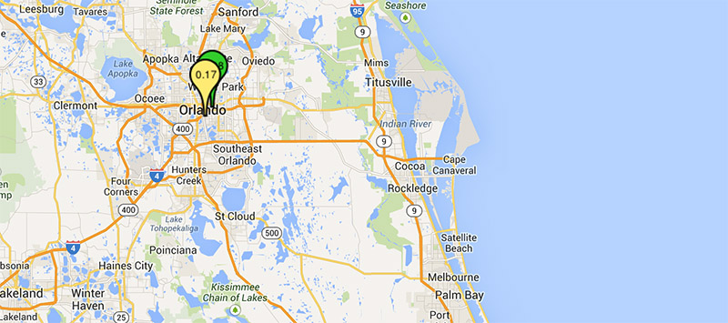
Not that easy to select, and certainly not convenient. So the first fix was to find a way to allow the user to select the desired station even when the map is zoomed out. We’ve opted for ‘OverlappingMarkerSpiderfier’, and the results were good. Also the pins have been made smaller, and they get larger when selected in a circle: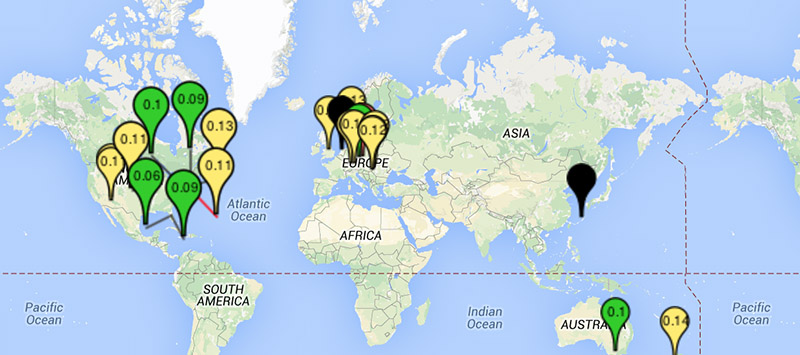
The above photo shows how clicking a group of stations at maximum zoom opens a circular list were we can easily click the unit we are interested in . Hovering the cursor over a map marker (unit pin symbol) will show a label with the unit’s ID and the city where it is located.
But the difficult part was to improve what happens when the user clicks a map marker – the popup showing detailed unit measurements. The previous version was a little rough, getting out of the screen and requiring additional mouse work to see it properly. The new version packs all relevant data, and brings new features: the right side shows the last 24h chart, while the left shows the city, the country and the flag (new!), clicking the city will open its Wikipedia page (new!).
The radiation chart image is pre-generated every 10 minutes with an automated job on the server, so we no longer get a blank image while waiting for the chart to be generated (it happened before).
The next lines show the average 24h radiation measurements, both as particle counts (CPM) but also the approximation for radiation equivalent dose (in uSv/h and mrem/h). The marker colours on the map are using this averaged value, so no more random colour changes on the map (the previous implementation was using the last instant value, which was fluctuating a lot). The instant measurements are next, featuring radiation data, temperature (now supporting the A2 models), barometric pressure (only for the A2), and estimated altitude based on the barometric pressure of dry air (only for A2).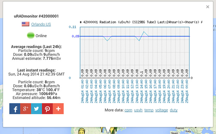
You can share the data using the social buttons at the bottom. Below the chart image there are also a few additional links that you can use to access more data for radiation, temperature, tube parameters (voltage and inverter duty cycle).
Discussions
Become a Hackaday.io Member
Create an account to leave a comment. Already have an account? Log In.