 WJCarpenter
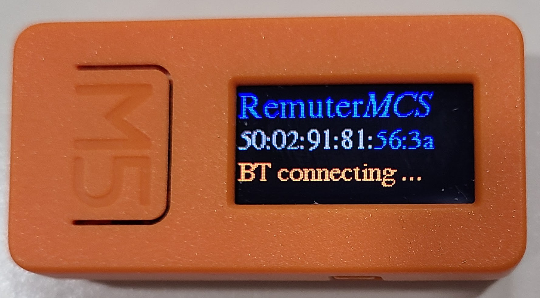
I've designed a splash screen, which is the first thing you see when you power the device up. It's also the screen which tells you whether or not it's connected to Bluetooth, which is nice to know.
(Instead of this sloppy picture, I had intended to read the pixel values from the display and show it here in screenshot fashion. I never got that to work, despite an encouraging comment in the library code. Reading pixels always came back as 0 values no matter what I tried.)
I originally started working with the "built in" fonts from the M5StickC Arduino library because I didn't feel like messing around with figuring out how the fonts worked in the Adafruit GFX library, and I also wasn't sure it was worth the flash space. It turns out that the M5StickC "M5Display" already includes all that stuff behind the scenes, including all the standard Adafruit converted "FreeFonts". The space is already being consumed unless you go to some trouble to chop those fonts out. So, I switched over to using them and experimented until I got sizes and styles that I liked.
What's the splash screen displaying?
The middle line is the hardware Bluetooth address of the device, which is commonly called the MAC. When the device advertises itself for pairing, the part in blue is included in the device name. That's in case there are multiple devices floating around and you need to be able to tell them apart.
The "connecting ..." part of "BT connecting ..." repeatedly types itself as an animation while connecting is taking place. Once connected, the entire line changes to a blue "BT connected". The display rests there for 1-2 seconds and then switches to the normal view showing the icons for the microphone, camera, and speakers.
You might not notice that this display has a bias for people who hold the device in the right hand with the "M5" button away from them. There is a configuration option to rotate the text 180 degrees for those who prefer it that way. There is no performance difference either way.
After I took the picture, I changed the middle line to use a sans serif font, which made it more readable. That's probably it for the visual design of the splash screen, except for overlaying the battery and signal strength indicators that will also be on the main screen. I might also move things around to make them more centered, but to be honest I didn't notice it being off-center so much until I saw this still photo. I'll make a video of the splash screen in action later. I'm pretty pleased with how it turned out.
Discussions
Become a Hackaday.io Member
Create an account to leave a comment. Already have an account? Log In.