 Joseph Eoff
I posted some pictures last time around showing some of the data from my yard.
There were some bugs, though, and I also wasn't happy with the representation of the area of the yard.
I looked into what was causing the bugs, and decided that I was doing something wrong with the SciPy interpolate.interp2d function. I had originally intended to use the SciPy interpolate.griddata function, so I switched to that and got the results I expected - mostly.
This is a plot from a couple of days ago:
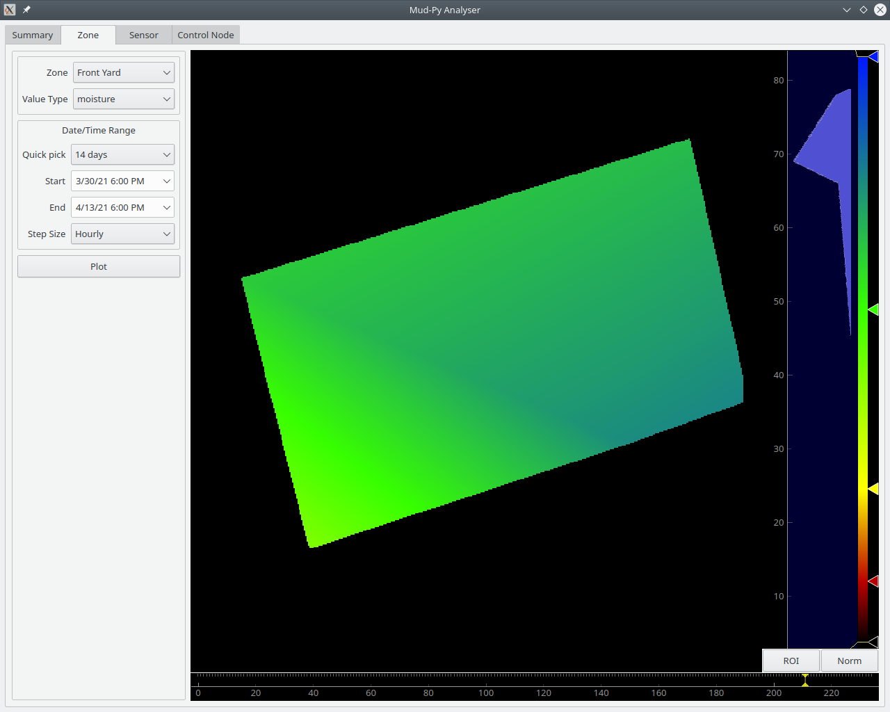
The shape of the yard is now correct. The bogus data is gone - it was never in the database, it was all in an incorrect interpolation. The griddata interpolation gets it right.
That picture shows a moment when it was raining here. The blue(ish) areas have around 70 percent soil moisture. The green is around 50 percent.
The animation part works, but I don't have it rigged to render to video yet. I did a screen recording of an analysis run instead.
Here's a video of the soil moisture in my garden for last 14 days:
That's fourteen days, at 24 plots per day, compressed down to just a few seconds. Sixteen sensors contributed data through two control nodes. That's over 5300 data points interpolated into a video.
That bunch of rambling, flickering colors has been in my mind for over a year now. It's nice to finally see it in real life, reflecting real data.
From the video, you can see that things started out a little dry a couple of weeks ago. We had some warm weather and sunny days for a while, and things dried out a bit. It turned cooler after a few days, so the soil moisture stayed a little more stable. Towards the end we got some rain, resulting in times where the soil was temporarily wetter than is really good for the plants - that's the blue areas.
All of the parts are in place, now. It's all "just" improvements from here on out.
There's still lots of improvements to be made, though:
- Convert the interpolation to translate from WGS84 coordinates to meters by way of UTM before interpolating. Degrees are only linear over the very short distances. Anything larger than my yard would be very distorted.
- Implement a "compare" mode to show two sensor types simultaneously. It'd be nice to correlate soil moisture with temperature or light to see what's driving the variations. Playback the main display, and have the secondary sensor track it - synchronized animation of the two data sets.
- Implement a Date/Time display for the animation.
- Fix the "non-existent date" bug - there's one hour on the day of the daylight savings time switch over that doesn't exist. The animation generator hits that one hour and causes a date/time exception.
- Implement the overview page. I need to see which sensors are showing low moisture and where they are. I also need to see stats on the batteries so that I can replace them as needed.
- Implement "maximum, average, and minimum" functions for the animation to make it easier to see where there's not enough water.
- Save and recall the color settings for the various sensor types so that I don't have to adjust the histogram manually.
- Probably lots more that I can't think of right now.
With a bare minimum of analysis functions working, I think it is time to submit this to the "Data Loggin'" contest.
Discussions
Become a Hackaday.io Member
Create an account to leave a comment. Already have an account? Log In.