 Michael Gardi
One of the things that makes the Sol-20 so memorable is the logo bar of yellow/orange lettering that runs the full width of the body. Stunning. Needless to say I wanted to do a good job of reproducing the logo.
Again I have to thank redjr16 who sent me a great picture of the logo from his machine.
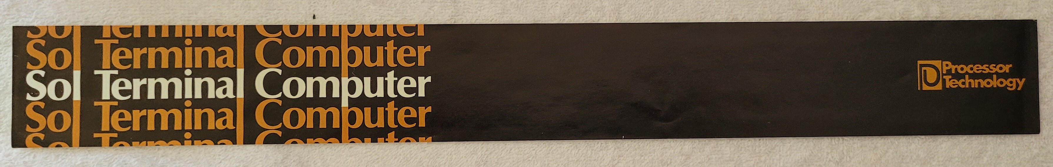
With his picture, and knowing the dimensions of the logo (width 446 mm), I brought the image into Fusion 360 as a Canvas and calibrated it within fusion to it's actual size. Using Fusion drawing tools (mostly splines) I "traced" the letters and icon and ended up with a sketch of the logo.
My plan at this point was to save the sketch as a DXF file, bring it into Inkscape, add the colors, and print the logo onto cardstock which is what was done on the original Sol-20. I even had a piece of acrylic cut to size to go in front of it to protect it, again like the original.
I have had some success in previous projects "drawing" text by extruding the letters and printing them in a different color by pausing the print at the appropriate layer and switching the filament. So I decided to give this a try. To my delight this worked better than expected.
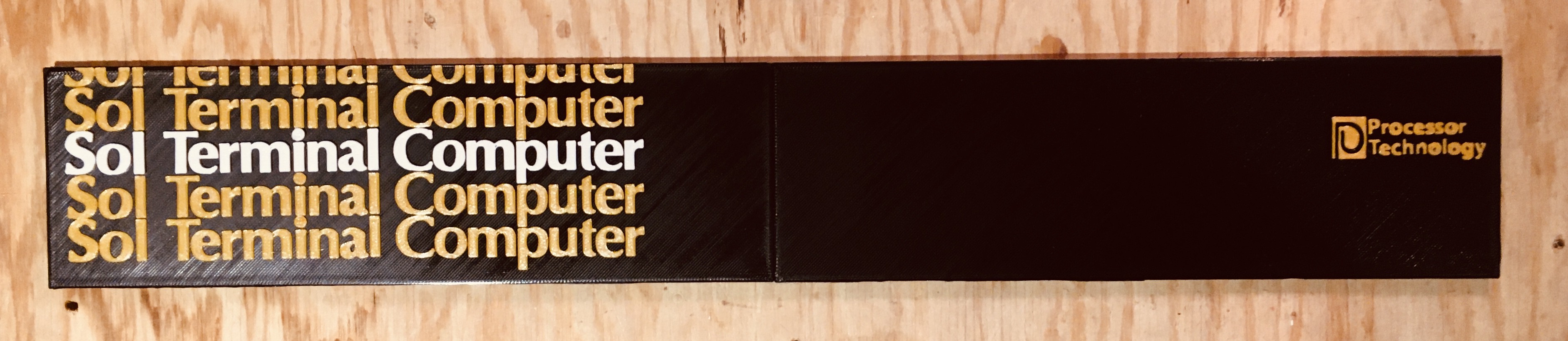
The small amount of relief afforded by the extrude characters makes them really pop. So as not to waste, I am using the acrylic piece as a backing for the printed logo which is only about 1 mm thick.
Here is a sneak peek at the logo bar in place. I have only just started printing the top panel.
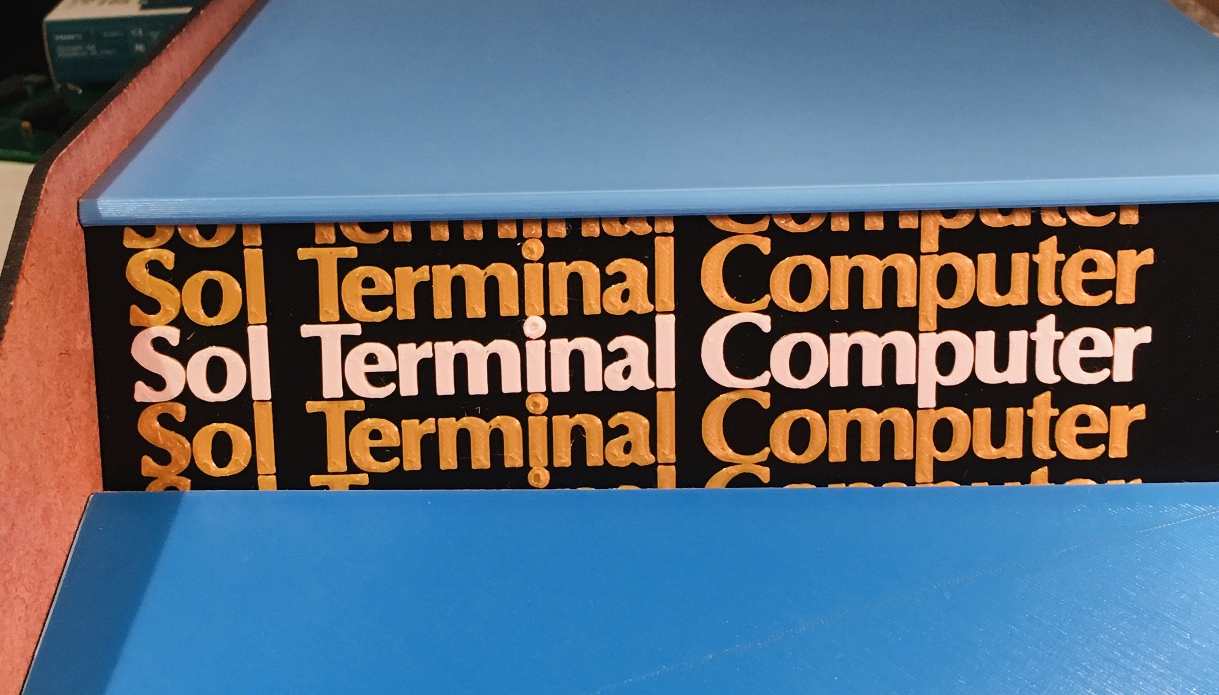
You might be asking "Hey Mike what's with the two different blues?". I tried the lighter blue on the top panel and I like it better, so I will eventually be reprinting the keyboard panel to match.
Discussions
Become a Hackaday.io Member
Create an account to leave a comment. Already have an account? Log In.
A good logo is when it is clear and easy to understand. The logo should also be able to stand out from the rest of the competitors and make sure that people will remember your brand name. Visit this https://lovebelfast.co.uk/assignment-help/ site to hire professional writers. Also, I think that a good logo can be used for many different purposes such as business cards, flyers and even online marketing.
Are you sure? yes | no
The first thing that comes to mind is the similarity between logos and lettering, particularly as it relates to fonts. The second thing is the idea of a brand being able to be used across multiple platforms. Click this https://masterbundles.com/templates/presentations/powerpoint/simple/ link to download simple and sweet templates. I want to see a logo that is simple, clean and easy to read. I would like it to be something that people will remember, but not too complicated so it's hard to get the message across.
Are you sure? yes | no