 mick
mickI've designed the device with two modes, the default mode is passive where the device can sit listening for events, process and then repeat. The other mode is active or clinician mode which is intended for medical professionals to submit samples to help build out the model and test patients.
The M5 Core2 AWS EduKit has three circles at the bottom of the unit, these are intended to buttons. My initial tests to go through the different modes used these buttons so that I could keep developing. But, the buttons are also capactive touch buttons and use a simple co-ordindate based system to know when to activate. May as well have some fun and design a UI.

Library or roll your own?
I had a quick look to see if there was a library for Arduino already that could be used, I was after UI elements like buttons etc to help reduce time. I found a few that looked quite interesting but overkill for what I wanted. I went back through the examples for the EduKit and it ships with library that you can use that looks straight forward enough.
Buttons
It's actually pretty easy to draw objects with the EduKit and because we know that we can use the co-ordinate system for activation we know that linking the objects to actions will be simple enough.
M5.Lcd.setTextColor(WHITE);
M5.Lcd.drawRoundRect(50, 100, 100, 50, 10, tyhacBluePrimary);
M5.Lcd.fillRoundRect(50, 100, 100, 50, 10, tyhacBluePrimary);
M5.Lcd.setTextSize(2);
M5.Lcd.drawString("submit", 63, 107, 2);

I initially started with a plain rectangle but later found you can draw a round rectangle and provide a radius int as a pararmeter, gives the UI a more modern look I feel.
Status indicators
I've added a bunch of serial output logging to help troubleshoot how the device operates and understand the different steps it's going through. This is great while its plugged in but how do you know whats happening when the device has been deployed?
I like the idea of simple dot indicators which I had seen on one of the demo projects and though it was quite simple and effective. We know that drawing objects is straight forward and this is just a circle with different colors and some static text.
I've decided to use the whole top bar as the status area, I think this makes sense when you think about how people use devices like mobile phones.
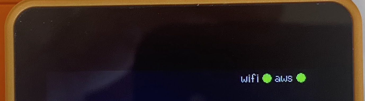
The dots provide a status for the network connectivity, wifi for wireless network and AWS for the AWS IoT MQTT connection as it maintains a pub/sub messaging system. Both of the dots change color with the status e.g. green for OK, orange for connecting and red for critical error.
I've made the status bar common across all screens, which gives the user a consistent feel.
I ended up adding additional messages to the status area, this matched the serial output more or less. I did this after lots of use of the device, I personally wanted to know more about the current status and steps the device was going through and I didn't want it to block the display.

Again, I've tried to stick to what seems easier for the user, simple messages and blue dot indicating informational messages. The message bar will display messages like connecting, uploading, requesting url etc.
The Dashboard
After a lot of use I started to wonder about how many events had been through the device, I didn't want the user to have to go through a web page for basic stats so a simple dashboard displaying some simple metrics would be ideal.
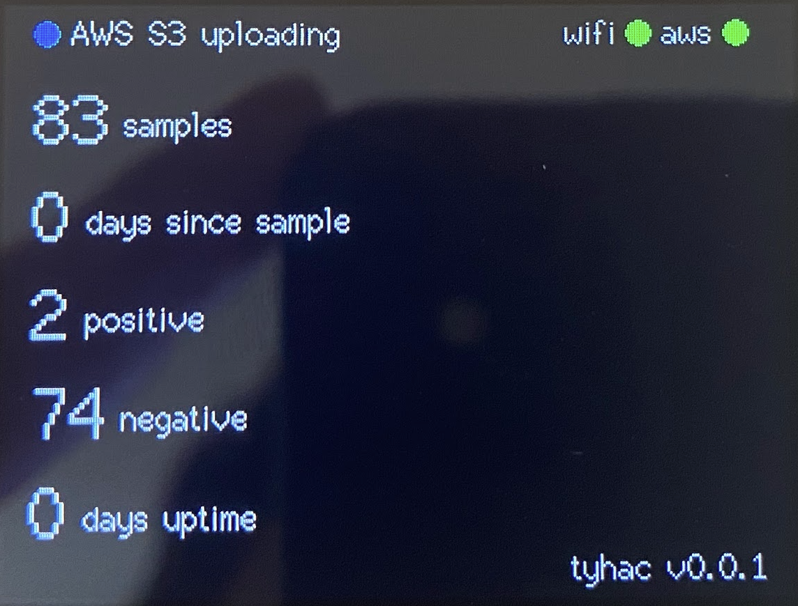
The dashboard is a great overview of the samples, I'm really happy with how it turned out, it doesn't matter which mode you're in when you return to the dash the device will request the current stats via AWS IoT.
I had a bit of trouble with the text spacing, as you can imagine the integer and the string need to move relative to the size of the integer. I've created a simple function that is called when rendered to dynamically adjust the spacing based on the length.
 // 1, 10, 100, 1000
    // 1, 2, 3, 4

    if (text.length() == 1)
    {
        return 32;
    }
    if (text.length() == 2)
    {
        return 47;
    }...
The vertical spacing also took a while to position everything so that it looked correct.
Changing modes
As above, the default three circle buttons are being used to change modes. I liked this because it didn't rely on screen elements. I ended up expanding on the positioning system a little by creating "listeners" for all three buttons. I'm only using two, the left and the right but added the middle for future expansion.
void buttonListeners(TouchPoint_t pos)
{
    if (pos.y > 240)
    {
        if (pos.x < 109)
        {
            tyhacMode = 0;
            buttonLeftAction();
        }
        if (pos.x < 192 && pos.x > 109)
        {
            // Spare button not used
            buttonMiddleAction();
        }
I found the positioning system to be reliable and had no issues with the buttons or elements missing. You just need to
Discussions
Become a Hackaday.io Member
Create an account to leave a comment. Already have an account? Log In.