 Matej Gurnak
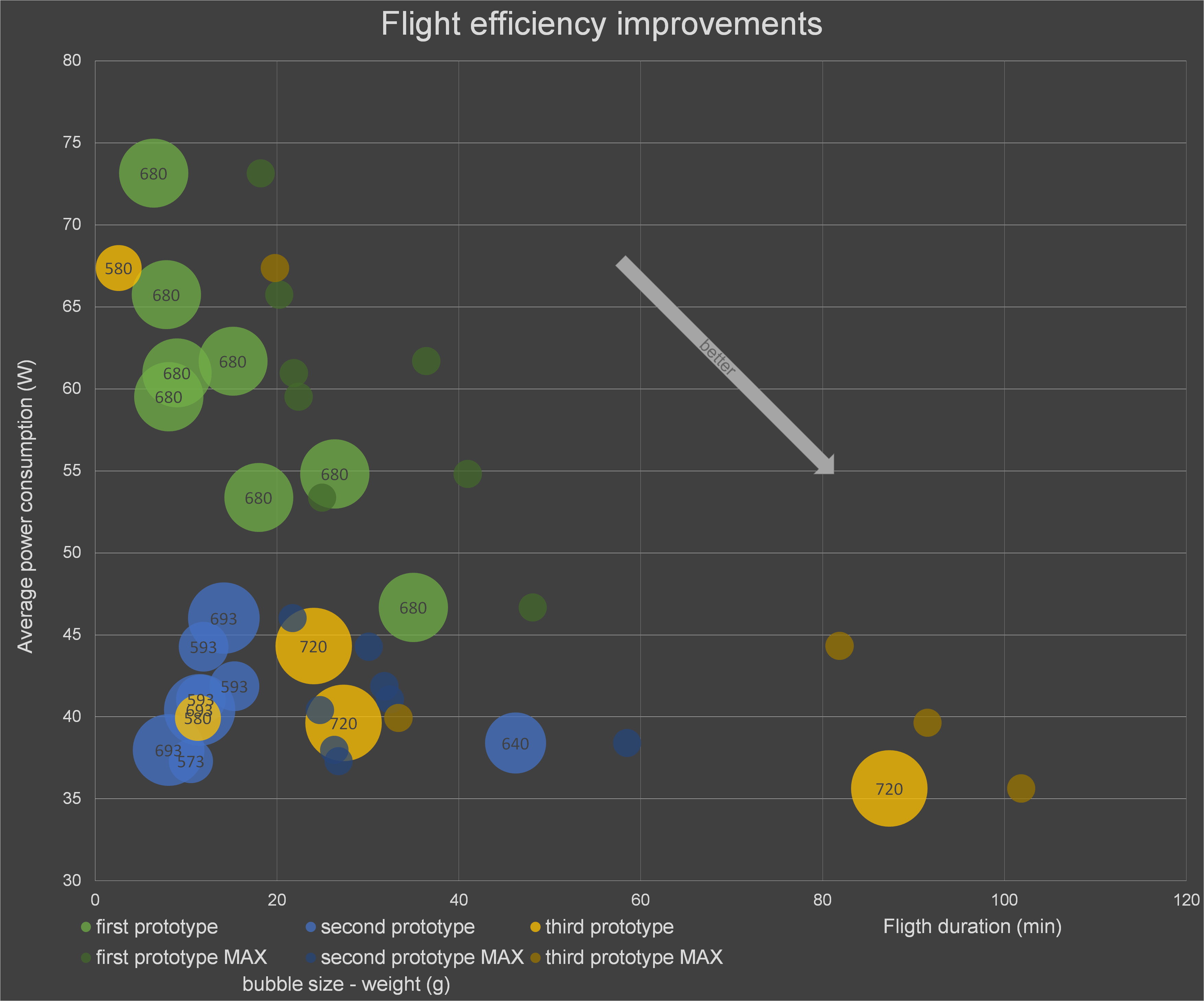
This chart shows how flight efficiency has improved throughout prototype development. There are data from flights made with three prototypes. Big bubbles represent the duration and average power draw of each flight. On many flights, I have only used a fraction of the energy stored in the battery, thus there are also small bubbles representing the flight duration, if the whole energy was used.
One can notice a huge reduction of average power consumption between the first and second prototype. This happened mainly due to a new more efficient motor and propeller. There is also a significant increase in flight durations between the second and third prototype thanks to a new battery I made.
Short flights have a higher average power consumption. The most power intensive part of the flight is takeoff and the other part significantly affecting this data is the time plane spend powered on on the ground before and after the flight. This causes a distortion between data from short and long flights. Therefore in the graph you can see flights with same plane and weight, but with different flight times and calculated maximum flight times.
In conclusion, the most compelling things are the increase in flight times from 40 minutes to over 80 minutes and the significant reduction of power consumption.
Discussions
Become a Hackaday.io Member
Create an account to leave a comment. Already have an account? Log In.