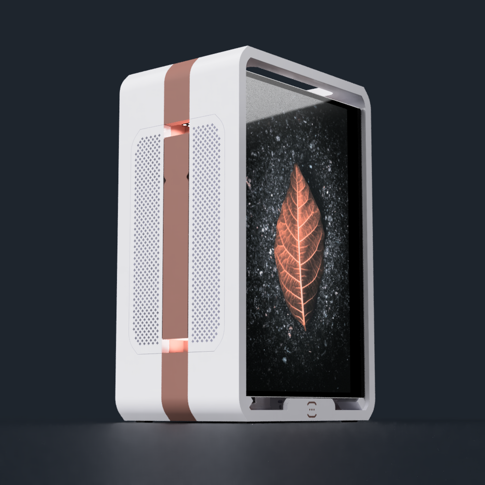
Last night, I was renaming Fusion 360 features to bring the standard of the CAD file more inline to the best practices I thought up a while ago. I also added a temporary stack of screen holders in the area that has been vacant for quite some time (see below).
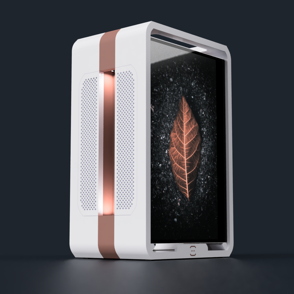
Eventually, I got to the part of the model that puts branding on the left panel, and I wanted to change it in a way that would be consistent with other projects.
Font
The first thing I did was choose what font I wanted.
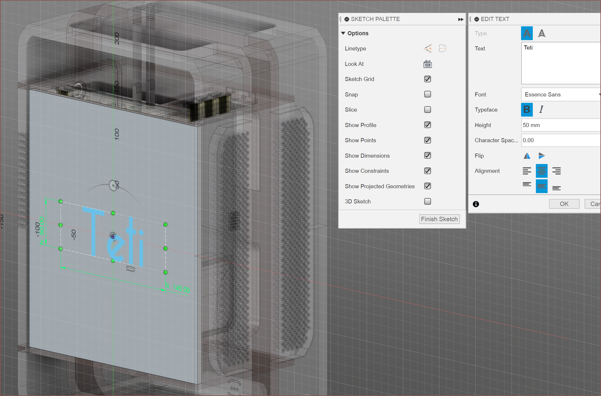
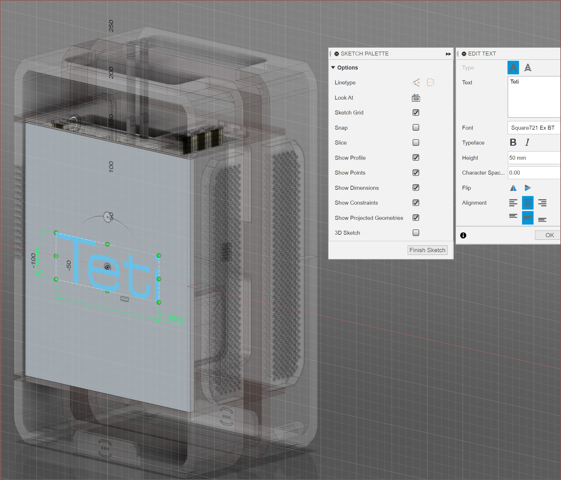
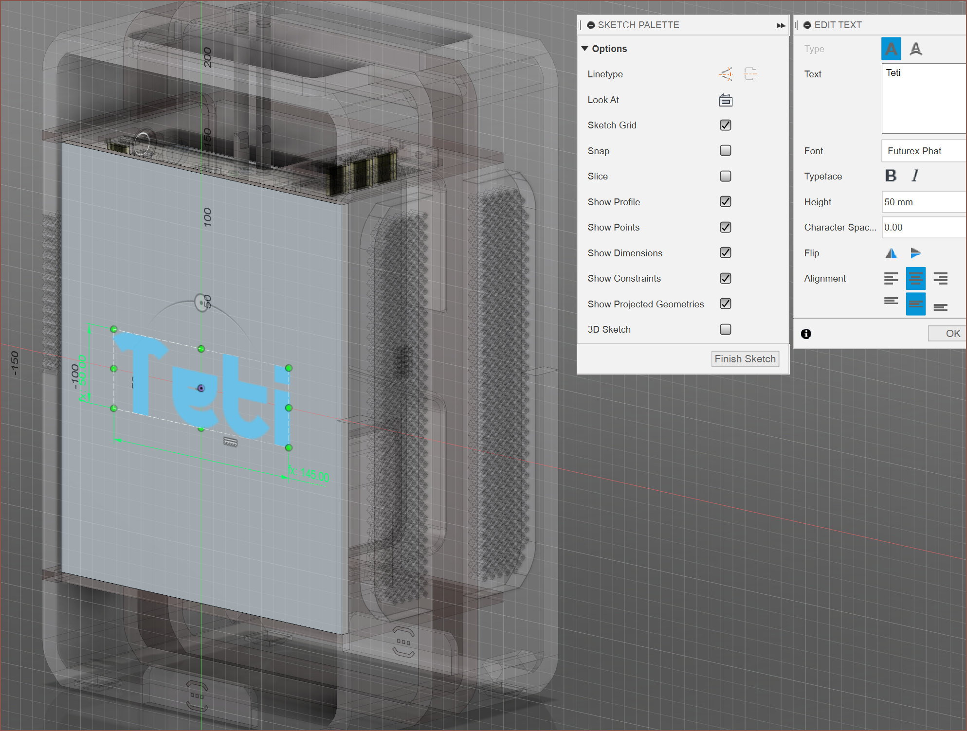
The first one is the classic Teti font that I used in the previous 2 designs (more on that in a later log), the second one is the font I intend to use with SecSavr [gd0036] and the last was the font I used on T^2 Tiles [gd0095]. I continued to use the first one; the grill was inspired from the "i" in Essence Sans.
Placement
The text was originally in the centre because that was where the kelvinA logo was. It always looked uncentered, so I tried out an idea I was going to use for gd0036.
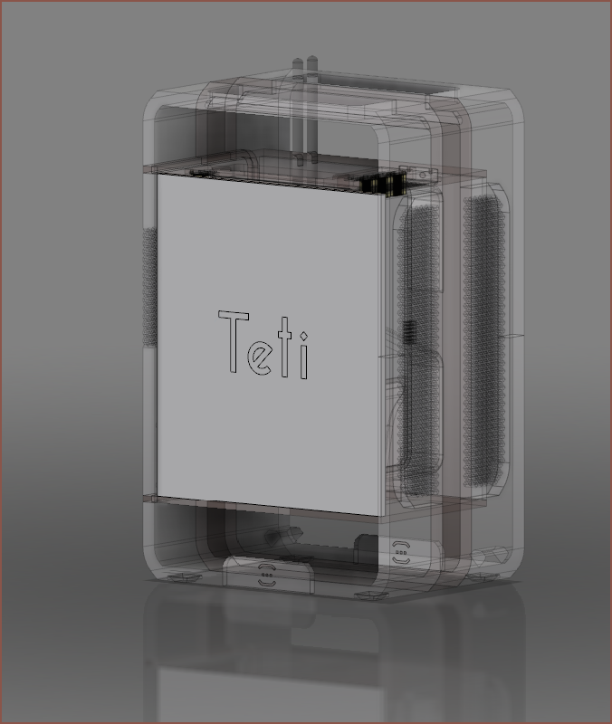
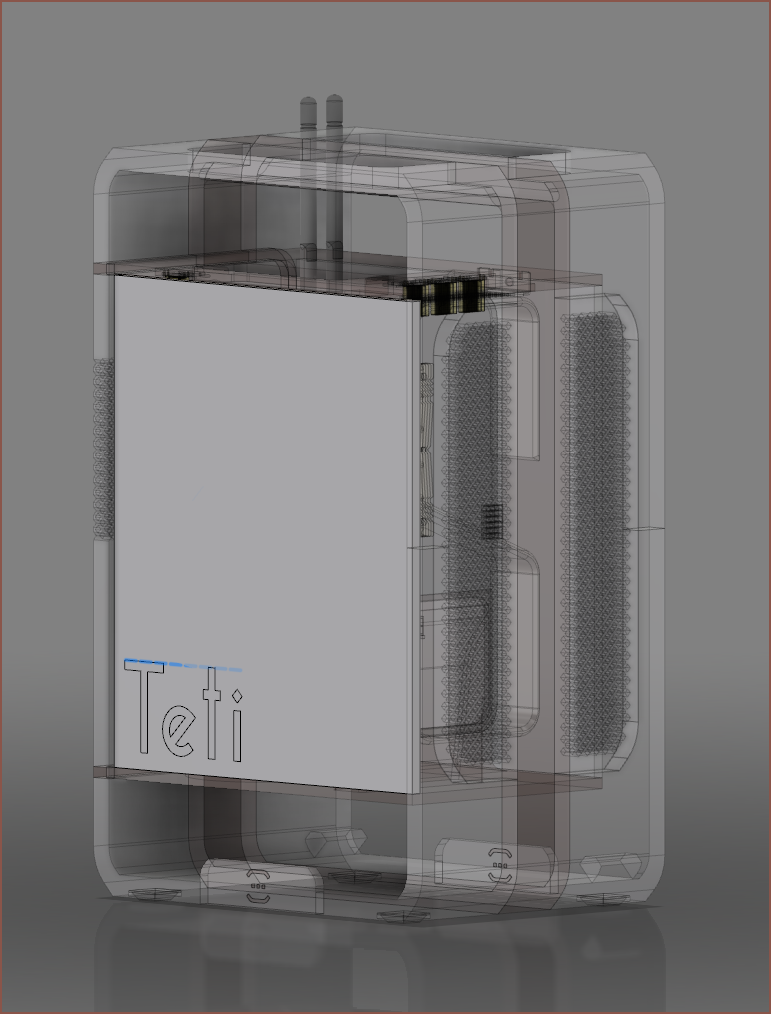
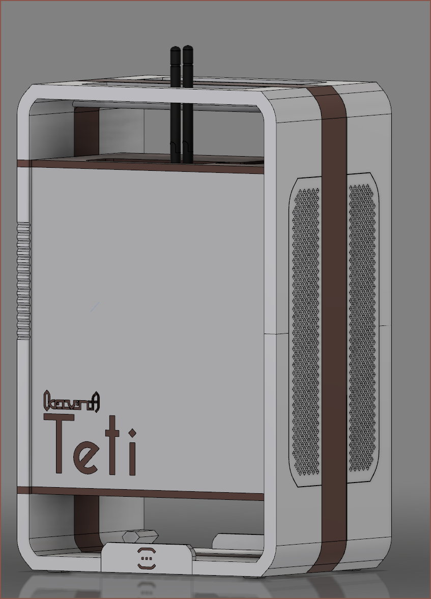 I then tried adding a line to the side, but I think it's better without:
Another idea was to make the kelvinA logo the line on the side of the text.
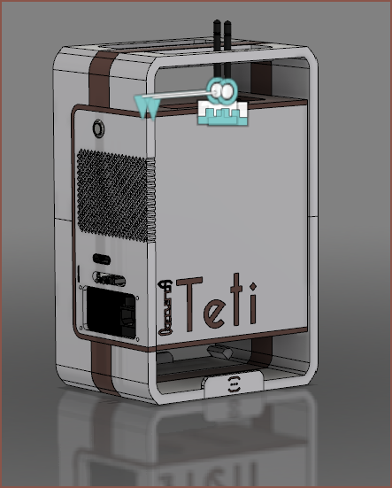 | 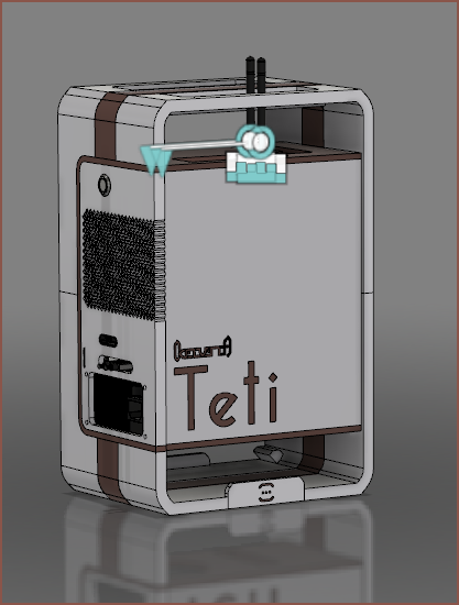 |
Other than it being mistaken for "ITeti" from affar, I couldn't really choose one over the other. This is when I decided to try other projects to get a consistent look.
SecSavr
 So I modelled this pretty quickly and it was straightforward enough to try both ideas:
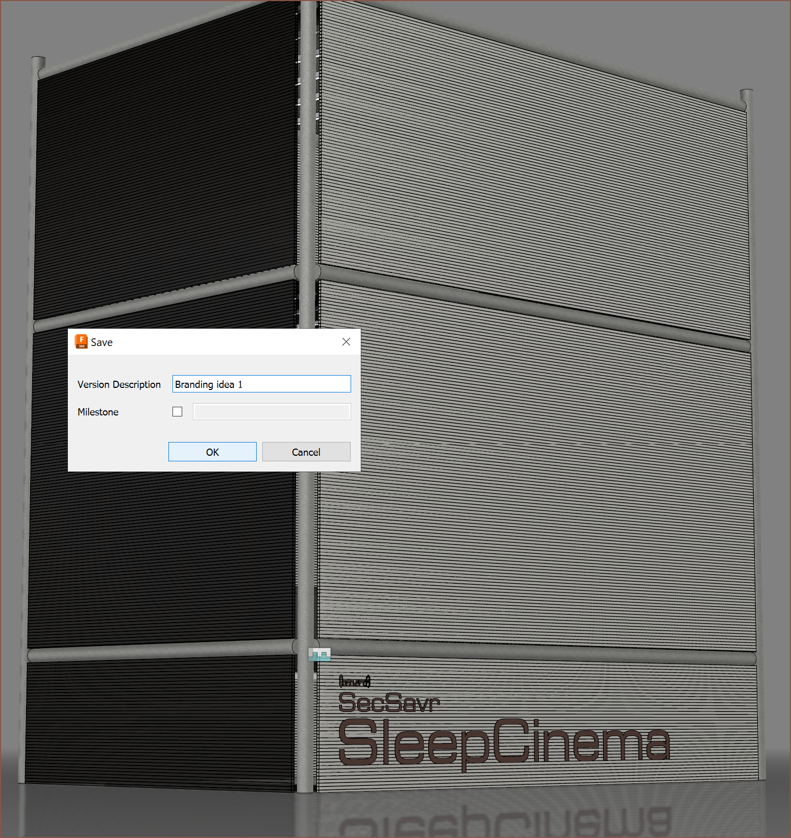
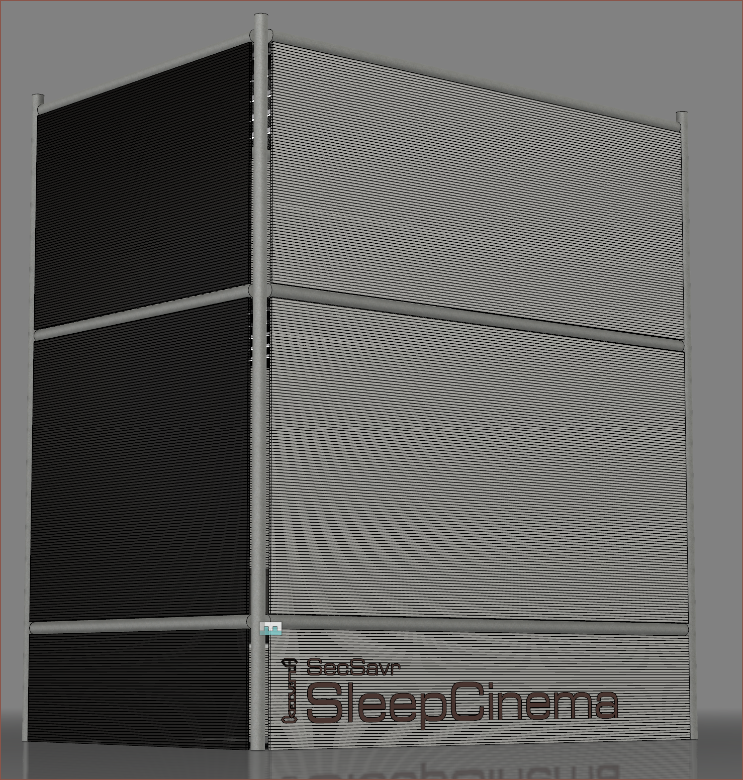 I feel like the second one works especially well for multi-line blocks of text as it looks more streamlined and the kelvinA logo can be bigger. It also reminds me of the "Super Precious Heat Beam!" arangement of words from OVERPOWERED!.

Tetinventory
[Click heading to go to Tetinventory's log.]
Summary
I think I'm just going to go with what looks the best in the location that the branding would be visible at, though with the 3 designs I've made, it seems that I'm more inclined to go with a kelvinA logo that is 90 degrees off front the project text. As long as it's not easy to accidentally misread the text like "ITeti", I don't think there are any particularly right or wrong answers. Perhaps an ideal idea is to keep "kelvinA" level so that people don't have to tilt their heads one way to read it.
 kelvinA
Discussions
Become a Hackaday.io Member
Create an account to leave a comment. Already have an account? Log In.