 kelvinA
These are verily hastily created wireframes in PowerPoint, as I thought that even the bare minimum in image technology would be easier to understand than text from the previous log entry. It still has given me many insights, and I have an unexpectedly significant amount of stuff to say on the matter. Truly no progress is too small to make into a project log entry.
Desktop / Tablet
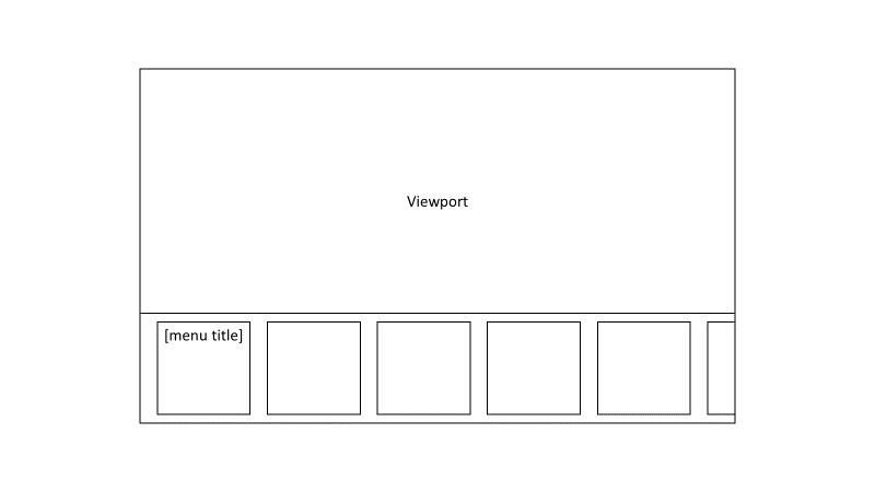
So the "menu title" part also has things like "All parts selected" or "3 parts selected" and buttons to change what parts are selected. There probably should be a button next to that to go back one level. The menu_title square doesn't have a visible edge. For defaults, I'm thinking of buttons into settings like "infill" will have a visible edge and settings inside that menu would not, such as infill percentage.
The background of the bottom pane would also have a dynamic background, somewhat inspired by the Nexus devices and the animated gcode from the old Craftware software. I'd like it if I didn't have to reslice the model just to look at all the different infils available, so for that menu, the background would be based on what selected parts infill setting was. There would also be a button to the right that hid the menu so that the user could see the expected generated infill better. This dynamic background should be user adjustable. For example, a user may want to see the infill background at the very topmost menu screen.
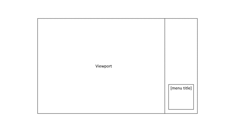
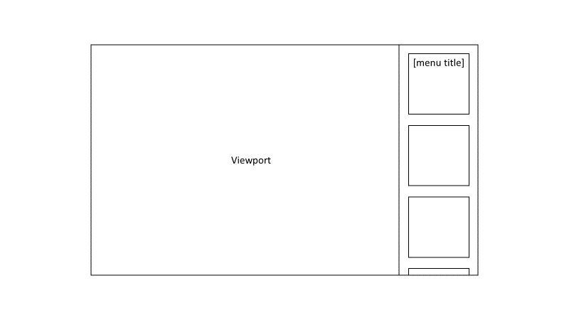 Obviously, some users may want the menu on the side of the screen and not the bottom. That is the reason I'm not updating to Windows 11 atm. Many users are moving towards ultra-widescreen. The first wireframe is geared towards users that like centered interfaces and the window (notice how I didn't say screen) has an aspect ratio of 16:9 and lower (lower = more square).
I'm also thinking of the thumb placement for tablet users. I'd like to keep as much of the functionality and clickable UI elements in the lower corners. Thus, being able to overscroll so that the top item is all the way at the bottom is a planned feature.
 Mobile
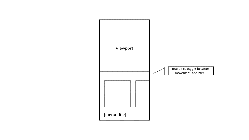 I don't want any UI elements too close to the bottom of the phone, as I've learned from using the Realme Q3 Pro with its ultra low fingerprint sensor is an undesirable idea. To make better use of space, the first card is removed and the menu's title is at the bottom. Overscroll will be in this menu too.
The movement/menu toggle is for a menu that is used to control zoom / pan / rotate, as well as a mouse cursor that can be moved to a location a user wants to zoom into, as well as moving the rotate origin. This feature is activated similar to Microsoft's keyboard feature that allows a user to move the cursor around.
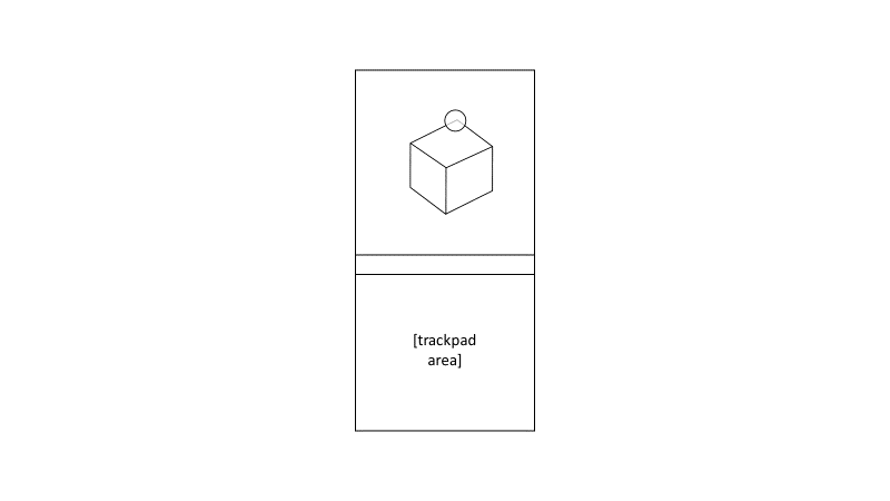 The circle is the user's orb cursor and locks to the closest thing in view. Then, when the user takes their thumb off the trackpad area, the view rotates for a better look of the corner.
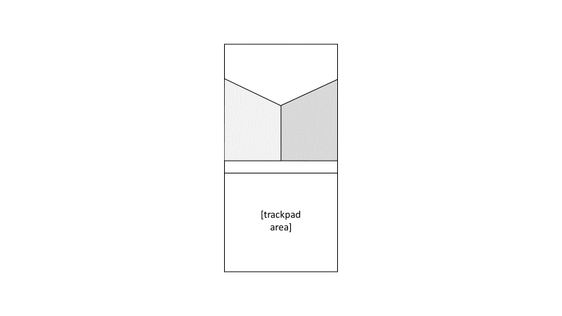 Conclusion
This quick exercise in making wireframes has made me realise that there's a lot more mockups I'd need to create.
Discussions
Become a Hackaday.io Member
Create an account to leave a comment. Already have an account? Log In.