Close
0%
0%

Custom Desktop Installer [gd0104]

This is a custom installer for my other software projects.

Similar projects worth following
I like it when I'm installing new software and there is a custom installer instead of InstallShield or something old looking that's similar.

Navigation

The title tag system is explained here, and the table is updated when a change occurs. Notable logs have bold L# text.

L1
[T] First use intro
L2
[T] Why the fixation on UI/UX?
L3
[T] Liquid glitter background
L4
[T] Installation UI appearance


Preface

[2022 - April 12]

Continuing from what I said in the description, I'm making this project as I expect that the installer would be seen enough times to warrant a custom look. For example, the installer is both seen when either MatterControl or Cura is updated. I also believe that it sets a more positive first user experience.

The coolest installer in recent memory is Intel's graphic driver:
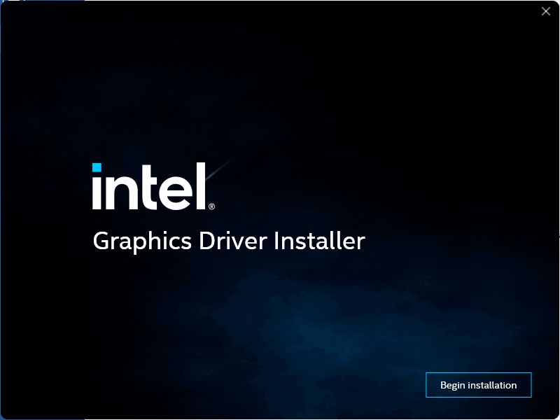
Intel releases first Windows 11 ready Graphics Driver - gHacks Tech NewsIt's got a modern look and the background is animated with a thundercloud effect.

  • [T] Installation UI appearance

    kelvinA12/22/2022 at 01:22 4 comments

    I've just made the project icon (see below). Me wanting to write this log out has given me the energy to actually go into PowerPoint and create the visuals I'm imagining (because this log would've just been a block of text otherwise, and I don't think any amount of detailed descriptions would actually convey well over text). 

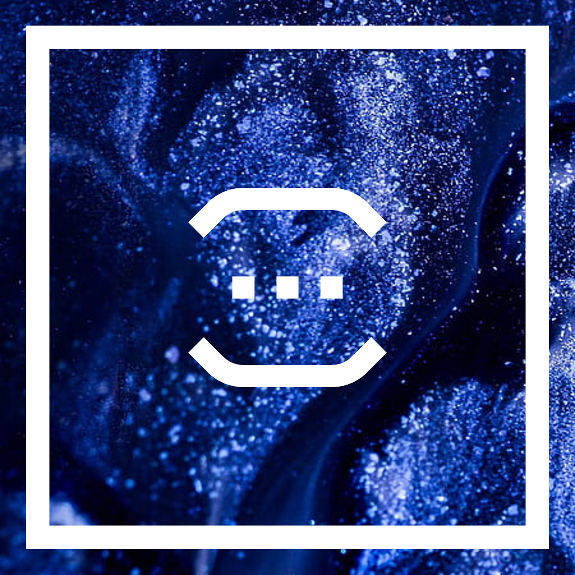
    If you're wondering, the reason why I've been thinking of this project lately is because I watched a 12.5hr playthough of Sonic Forces a few weeks ago and I liked the rank letter animation and the tech-crystal texture seen around the environment. This lead me to think about how I could incorporate those things into a theoretical #T^2 TyMist [gd0138] user interface.The general idea is that the window is going to be a square and there's going to be a smaller, hollow square inside of it that gives the window a visible edge.
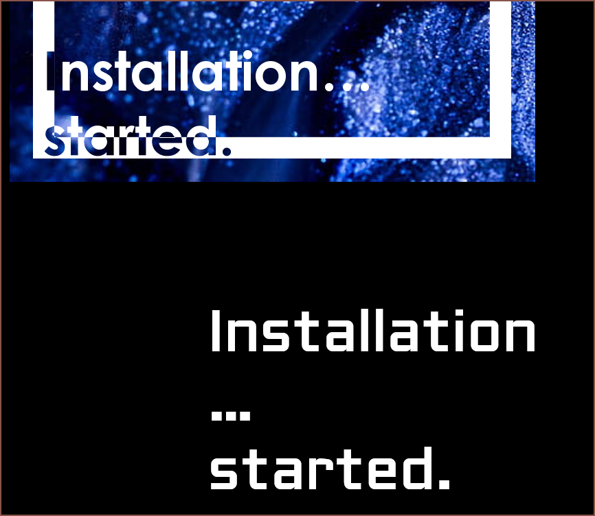
    So far, I've only thought about the part when all the files are being created, just after all the user questions have been asked (e.g. install location). 

    Installation... started.

    Before seeing essentially a fancy terminal spew of created files, I want there to be an "Installation... started" animation. It's part of the digital branding I want to have. 

    1. Installation
    2. Installation.
    3. Installation..
    4. Installation...
    5. Installation... started.
    The first font I tried was Century Gothic because it was the closest to the font I had in my mind, but the issue is that the dots were circular. 
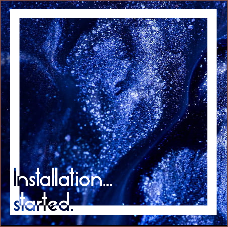
    Next was Essense Sans (the font used on #Teti [gd0022] and #Interval Provisional [gd0097] ) and it looks fresh, though compressed. I've always thought this (and that it's too thin) ever since I first downloaded the font sometime pre 2015). After fixing that, the "started" part seemed harder to read than necessary, so I tried this:
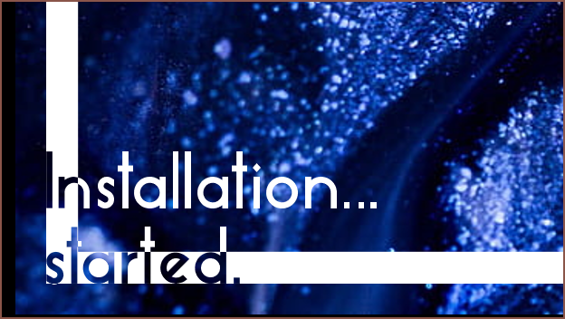
    I don't think this is quite the vibe I was going for here. 
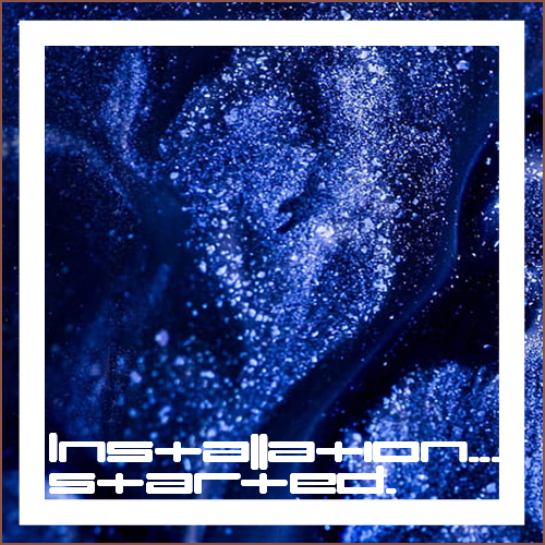
    I tried umopMedium because I thought it'd look cool, which it does. The width of the characters also makes it impractical.
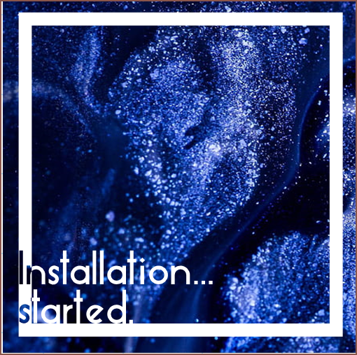
    This might work, though it doesn't look as "fresh" (refridgeration feeling) as when more of "started" cut into the hollow square.
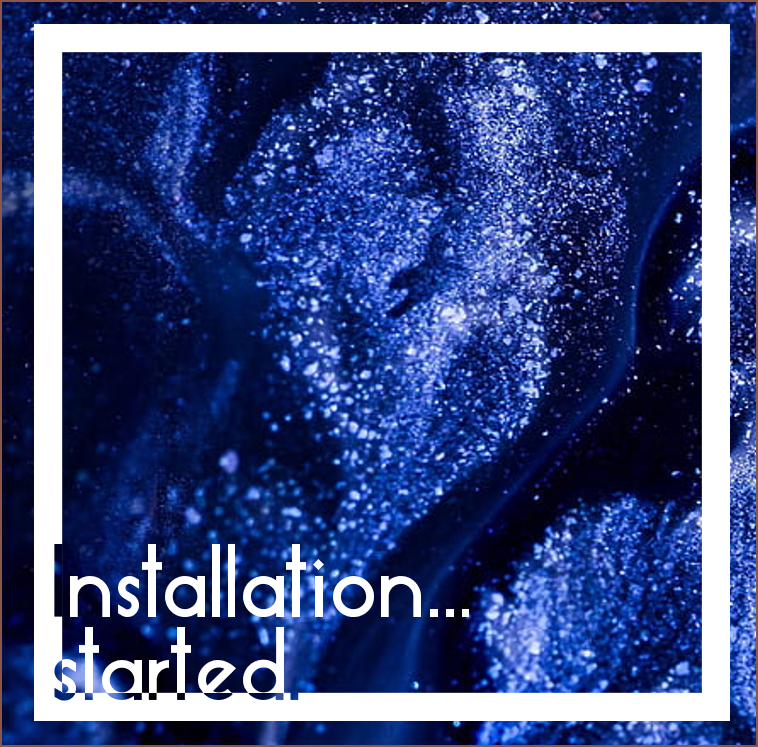
    This also might work? However, I start to creep back into the readability issue.
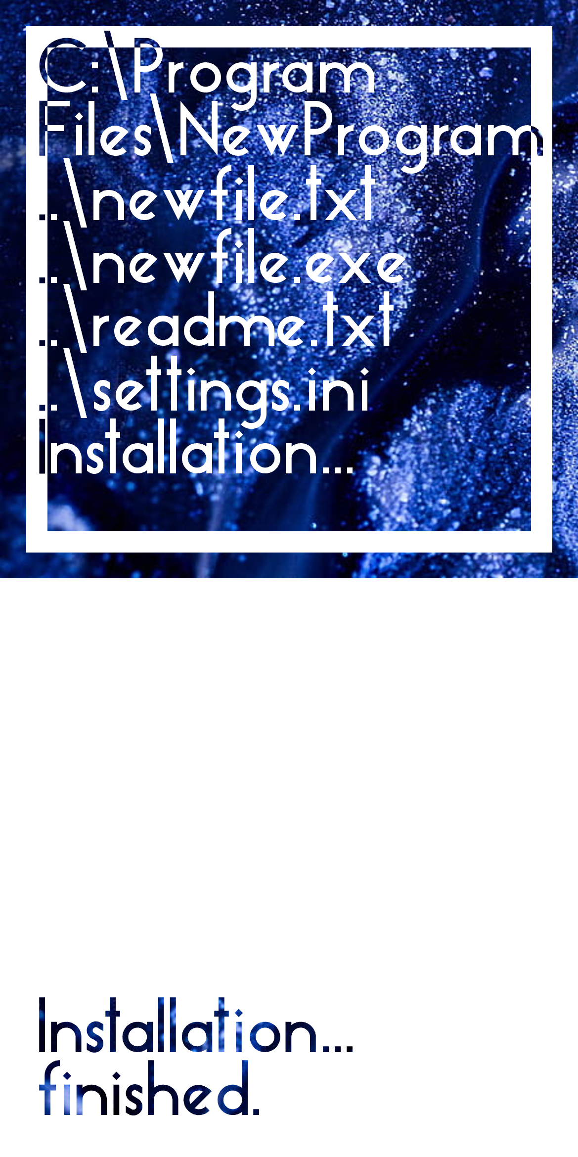
    Installation... finished.

    Moving on, after the lines of filenames being added, there'd be a similar animation to the "started" one, just that all white/alpha will be inverted and the filename text will be cleared.

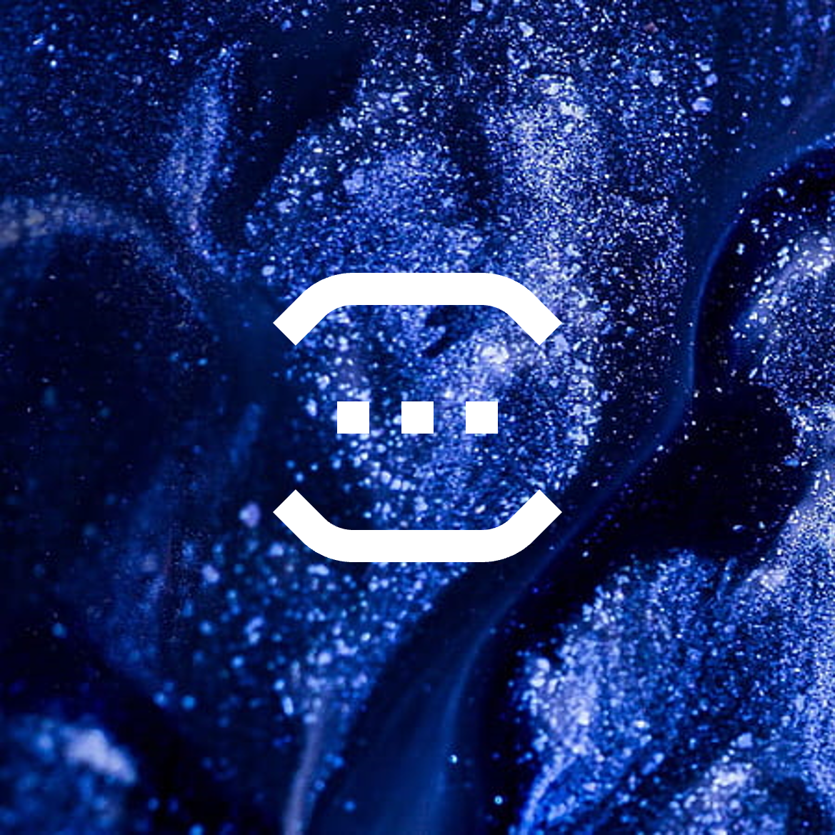
    I'm imagining that any video intro I'd create will start with a full white frame with the text in the lower left corner, where the animated glitter liquid can be seen (essentially, a 16:9 of the white panel). Thus, it makes 100% sense to include it in the installer.
    Transition

    After this, the text will move up so that options to either close the window or open the program straight afterward have space. If the user wants to open the program (which is usually the case), I want to have an animation where the white part of the square shrinks and becomes the middle square of my logo:

    The above is also the splash screen for any desktop programs; part of the reason I decided on the logo that I have now is because I like loading screens and thought it'll be cool to have the logo as one. 
    The installer and the actual program will share the same liquid glitter colour, so this should actually look a "never before seen in this industry" level of seamless, which should set a good first impression. (YouTube commentors sound like they're impressed when a segway to a sponsor is seamless.) I'd be using the same installer for updates too, so I think it would make the whole process feel more fluid.

  • [T] Liquid glitter background

    kelvinA12/21/2022 at 12:45 0 comments

    Just like how Microsoft or Adobe have specific colours used in their programs, I'm thinking of the same. #SecSavr Sol^2 [gd0045] is mainly a rich blue, wheras #Interval Provisional [gd0097] is closer to a cherry red. I think the default colour (for when I can't imagine a program having a specific colour) would be a mossy green:

    I want a live background, and whilst I don't like the look of smoke, I liked how it slowly moves in the few b-roll video shots I've seen it over the years. I think I've finally found what look I'm going for:Marble Glitter Background Free Images | Free Photos, PNG Stickers,  Wallpapers & Backgrounds - rawpixelI searched "liquid glitter" in Google and this is what I'm imagining. I'm hoping there's a way to procedually generate something that looks like this that is still light enough to include in the installer and software that I hope to write in the future.

  • Why the fixation on UI/UX?

    kelvinA04/14/2022 at 11:02 0 comments

    Well, UI isn't very testable and it's what the users actually see. Under the hood improvements are likely to go unnoticed.

    Even with the best of UI's, a workflow riddled with spikes and potholes can halt user adoption (I learned this from FreeCAD after days of visual and keybind customations, only to find out I can only pad one singular profile at a time). 

    Ignite also showed me that a good UI can nullify my desire for an update (I don't think it's had one since 2013) because it looks and feels modern and made years before its time. I've heard a similar thing said for the Windows Phone and Zune interfaces, and I'd agree even though I never got around to trying either.

    I'd also like to mention that my prefered interface styles seem to be menus for games, consoles and media centers, so yeah I'm 100% adding button click and animation sounds to this installer (and the programs its for (+ a mute option)). 

    I'd also like to take Microsoft's animation ideas and actually get it into some end-use software, and maybe squeeze in a bit of the PS Vita's Welcome Park experience in too.

  • First use intro

    kelvinA04/14/2022 at 10:37 0 comments

    I just had this idea right now and had to write it quickly. 

    Now this isn't necessarily part of the installer, but the first start install straight after the installer. Ever since I saw the Mac OS X Snow Leopard intro, I've loved it and I always thought that it was a shame that Apple never continued that. Perhaps they thought they couldn't top it. Maybe it's like their Calculator App on iPad issue.

    Anyway I've never used MacOS X but I've really enjoyed the intro for all the years I've known it, and have wanted to replicate it in some way. Now that I'm starting all my software projects, I've got a non-negligible reason to do it. The game Yellow is another, more recent example I can think of.

    The intro also bridges the gap between install experiences on desktop and mobile, as custom installers aren't a thing on the latter. 

View all 4 project logs

Enjoy this project?

Share

Discussions

Similar Projects

Does this project spark your interest?

Become a member to follow this project and never miss any updates