 WJCarpenter
I could pretend I had a visionary design for the UI and refined my approach with extensive A/B testing and usability lab studies, but come on. This was a case of thinking about what I wanted to show while also experimenting with how to show things with a basic display library and reasonable performance. It was a case of form follows function and function follows form. What I'm describing here is pretty much the end result and mercifully skips over dead ends and boneheaded choices late withdrawn.
When I first started thinking about this project, I was imagining a rotary encoder for navigation, with selection being done by pressing the knob. Once I chose the TTGO T-Display board, I decided to see if I could make things work reasonably with just the two buttons. (The third button is to reset the device, so it's not a very good UI input.) After looking around a bit, I decided to do the interface to those two buttons with Espressif's IoT Button. It was easy to add via the ESP-IDF component manager, and it provides a simple event callback mechanism for various kinds of button presses.
I use these button events:
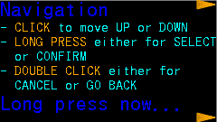
- Single clicks with the (physically) top and bottom buttons are used for moving the highlighted item indicator up or down, respectively. I avoided the great "Which way is natural for scrolling?" debate by never scrolling. Instead, I'm just moving an on-screen indicator around, for which I think the directional buttons are pretty obvious.
- Long press (on either button) is used to select or confirm the currently highlighted item. That always leads to some action, but sometimes the action is to navigate to a submenu.
- Double click (on either button) is used to cancel or move up one level in the menu hierarchy.
I originally decided to use long press for confirmation because the user is less prone to do that accidentally, which definitely can happen with double clicking. Contrast that with typical mouse UIs where double clicking selects the item. I'm still thinking about whether to swap my choice of what long press and double click mean. I also fiddled with the timing configuration settings for IoT Button to make mistakes less likely. It's still pretty easy to try to rapidly move the selection and end up double clicking to go up a menu level. When that happens, it's not a tragedy. Nothing is lost and the user can just long press to go back into the submenu.
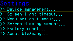
I wrote an implementation for a fairly simple menu system. All menu screens have to fit on the display with no scrolling. All text is horizontal in the natural direction (at least for LTR locales) when the buttons are on the right-hand side. A menu screen is a collection of lines. Everything on a particular line is rendered in the same font (and the size is implicit in the choice of font). Lines may have an action associated with them, and that action is performed when that line is highlighted and selected. I prefixed submenu lines with ">>" and user configuration choices with "-", but that's just a convention of the text I used and is not built into the menu system. A line on the screen is a collection of line fragments. Fragments include a text color choice. They also include a text fill (background) color, though I decided to not use any after seeing how it looked (it made the text stand out, but it also made it harder to read).
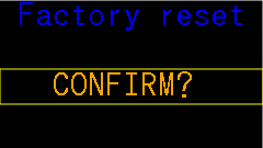
For most menus, I use a medium-sized font for a header and a small-sized font for detail lines. With that arrangement, I can comfortably fit 7 detail lines on the screen. With 5 detail lines, I can also fit a medium-sized font footer line. This arrangement is adequate for all the things I want to do (so far), though it did bleed through to functional requirements so that I changed the limit of paired Bluetooth devices to 6 in each direction (so, sue me). I only used a large-sized font in the (non-menu) Bluetooth status screen and in the "factory reset" confirmation screen. I will probably use the same scheme in some additional confirmation screens for device management. All of the menu screens were tediously hand-crafted to see that they fit on the screen and looked OK.
To highlight an item in a menu, I draw a single-pixel rectangular outline of the whole line's area regardless of how much text is actually on that line.
The fonts I'm using have at least 1 empty pixel all around the glyphs, so I can easily erase that rectangle without leaving crud on the screen. When moving the highlight around with button presses, the menu system skips over any lines that are not selectable (that is, lines without an associated action). It also wraps around the top and bottom of the screen if the user navigates past the first or last selectable item.
When the user selects an item whose action is to go to a submenu, there visual feedback is obvious: the submenu appears. When the action is something else, it's not as obvious. With the selection action being a long press, when can the user stop pressing the button? To provide visual feedback for the non-submenu cases, I blink the screen. Blinking is done by commanding the ST7789 to invert the colors for a short time and then switching back. Menus have a lot of black background, so this has the effect of being a visible white flash. Through trial and error, I selected 120 milliseconds for the duration of the blink.
The color scheme I chose for the UI is fairly simple. Overall, there is a black background. There is lots of blue and cyan text (because Bluetooth; duh!). For a typical menu, the header and footer lines are in blue with detail lines in cyan. Sometimes there is an important word or number, in which case I display it in orange (and usually uppercase if it's a word). For the highlight rectangle, I use yellow because it contrasts nicely with all the other colors.
My plan is that most of the time the device will be displaying a Bluetooth status screen.

I'm hoping to have little on-screen blinky lights to indicate activity for each device (inside the small blue boxes in the photo above), but I'll have to see how that goes when I actually have some activity for some devices. While that screen is being displayed, either button press summons the menu system, with the first screen being a brief description of how the rest of the navigation works. My thinking is that even I won't remember how this works after enough time has passed.
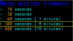
There are two configurable timeouts:
- There is an idle timeout when in the menu system. When the timeout expires, the display switches back to the Bluetooth status display. The default is 5 minutes. Expiration is determined by time since the last button press of any kind.
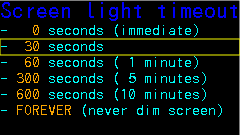
- Menus are always displayed at 100% screen brightness. The Bluetooth status display can be dimmed when a timeout expires. The default is to dim to 25% brightness after 30 seconds. The brightness percentage is also configurable. Expiration is determined simply by the amount of time since we switched to that screen.
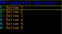
Here, without much comment, are the other UI screens not already shown above. The list of devices on the "Peripheral devices" screen is just dummied up for UI design purposes. Eventually, slots will be populated with the names of devices actually paired with the bleXmang device. There is a "Central devices" screen (not shown) that is visually similar.


Discussions
Become a Hackaday.io Member
Create an account to leave a comment. Already have an account? Log In.