(A preliminary collection of non-editable maps in .html form has been uploaded as a .zip to dropbox while I figure out the project files area)
Where can I find one of these?
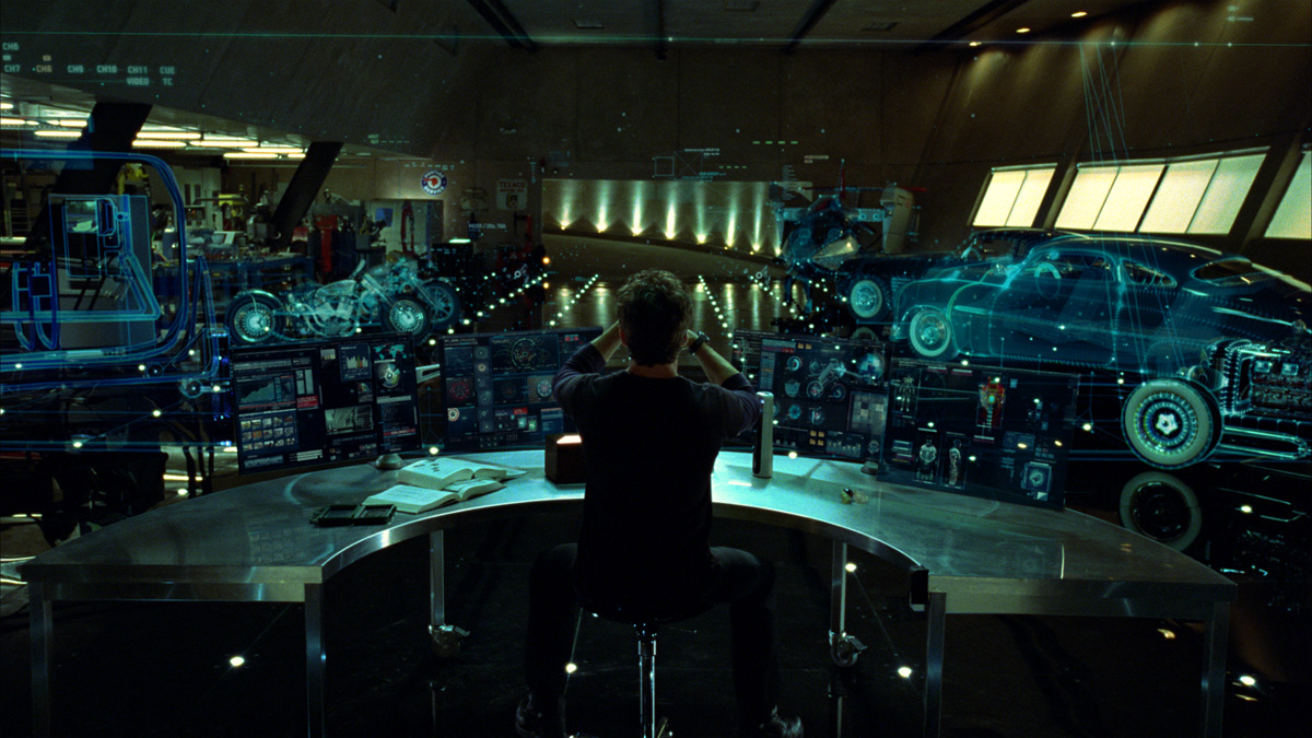
(screenshot of Iron Man 2 from ArtofVFX.com)
The first time I saw the design and prototyping montage in Iron Man (2008) I nearly jumped out of my seat... Where can I get one of those!? (A reaction probably shared by many of the folks who would be found skimming build logs on lackaday. :P ) Living in the future hasn't yet provided us with flying cars but a holographic prototyping lab sure would be nice...
Most of us also have more concrete problems than building powered armor. At a minimum we have our own projects to sort out, with hundreds of files across dozens of programs. At worst, we need to make sense of what someone else did from their repository. Some variation of "auto-maps" are ubiquitous in adventure games, why don't they exist for actual work? Fortunately, it turns out they already kind of exist.
Mapping in Design Work
It's not enough to just dump images or application windows into an empty canvas. A massive, animated display is a trope in movies but wouldn't necessarily be useful on its own. The most important question to ask when building a new medium is: "What can I do here that wasn't possible (or easy) before?" In the case of a big blank canvas, being able to put down a mix of things is indeed part of the solution, but remember the scale problem above. The organization of bits being worked on has to make sense of anywhere between a few dozen and a few thousand elements. Consider how we do this already with text information. Books can contain millions of bytes of text but they are made meaningful and approachable through layers of structure: chapters, sections, paragraphs, sentences and phrases. What's needed is a sort of visual language for composing "sentences and paragraphs" with pictures.
A bunch of visual languages, like mind maps, circuit diagrams and flow charts, may already be familiar to you. This project will focus on a few less common ones referred to as concept maps and rationale diagrams. They help to understand complex concepts by “sketching” networks of ideas and their relationships. While they are useful in paper form, you can do even more with the help of dedicated mapping software. These tools emphasize simplified interfaces and linking in ways that drastically enhance map creation, navigation and scalability. For example, after nearly ten years, my database of working diagrams contains over 30,000 interconnected, searchable elements.
While the 2D maps in this project aren't as flashy as Tony Stark's holo-displays, they are a way to make that kind of content meaningful. It's not enough to just put more windows on a desktop, there needs to be a focus on what assists thinking in the face of lots of design issues and information overload. The software itself is just a sort of "fancy pencil": a streamlined interface for quickly adding words, images or data into a map. The value of using the maps isn't in the simple drawings on screen but in the kinds of interactions that they enable between people and information.
Mapping Design Rationale
This is all hard to understand in the abstract, so let's look at the example of “rationale mapping”. Its structure is based on Horst Rittel's “issue-based information system” (IBIS) for working on “wicked problems.” That is, problems with no single, clear answers, where each solution is a single-shot experiment and where the very definition of the problem is ever-shifting. IBIS works by clarifying problem structure and mitigating non-constructive "political" behaviors like rhetorical repetition. The diagramming technique uses three types of elements: questions (issues), answers and arguments (pro or con). In an IBIS diagram these may be visually represented as question marks, light bulbs and “+” or “-” signs. The image below presents an example exploring the toy problem of "how to get home?".
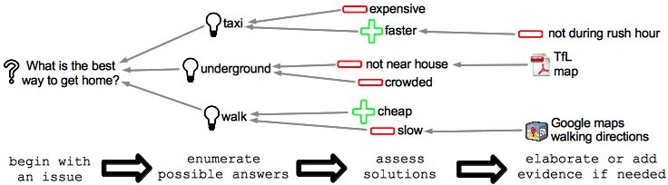
Note how arrows converge on the root question. This is because the whole diagram's aim is to resolve that core issue. Rationale may be constructed in any direction and complex structures can emerge. Issues themselves may be rejected if they pose the wrong question. More commonly, answers and arguments may raise further questions and so a pattern of question-answer or question-answer-argument “phrases” repeats itself across the map. This IBIS structure improves the quality of reasoning in many ways. It highlights one-sided arguments and “pet solutions” that serve no particular issues. It also retains alternative solutions, enabling an agile review if the chosen solution needs revisiting. Incrementally recording one situated idea at a time means that documentation is always complete regardless of when work pauses. From a collaborative perspective, the most useful feature may be that it captures both conclusions and “blind alleys,” showing how everyone's ideas contributed to the outcome, improving ownership and confidence in results.
As visuals on an otherwise blank canvas, maps are easy to add to with other visual content. Exploring the layout of elements also means you can express a tremendous range of relationships. Just like a sketch, ideas can be incrementally refined, progressing at the designer's pace to keep things from getting overwhelming.
Scaling Up: an Integrated Information Space
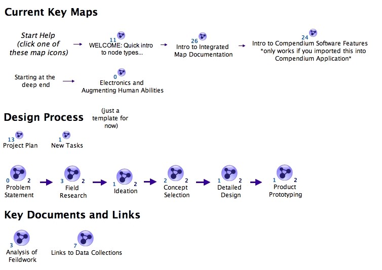
(a navigable version of this map is in the project files dropbox)
Individual maps are useful for developing rationale or improving organisation. Networks of maps provide even more possibilities. An "integrated information space" (pdf file) seeks to pull all project information together in a collection of maps, organized from a top-level template. Combined with hyper-linking across maps and other digital resources, it becomes possible to explicitly connect, remix and organize project information into all kinds of different views. Points discovered in research can be parsed across concept evaluation for quick consultation. Critical results from analyses can be assembled together in a single view for sorting and troubleshooting. Elements from the last week's work can be arranged in a single presentation as part of a team update. Imagine a Prezi presentation assembled by just copying key results from recent work into a map. You get to skip a lot of the re-writing involved in reporting and each element retains navigable links to the full-depth supporting information and reasoning.
Closing Notes
All of this potential comes with some limitations, of course. First among these is that the software packages for doing this work aren't mature or well supported. As a result of development in academic projects, there are some clunky bugs and sharing maps with the broader public is a bit cumbersome. They are good enough, however to pose the question - what if we managed open project information in this different way? If it gets us closer to an Avengers design lab, I figure it's worth a shot.
Discussions
Become a Hackaday.io Member
Create an account to leave a comment. Already have an account? Log In.