 Christian Walther
Three weeks ago, I was invited to contribute an activity for the side program of a graphic design exhibition. The exhibition presence fell through in the end, but the project I had come up with felt interesting enough that I continued working on it. Let’s see whether blogging about it from the beginning – something I don’t usually do because I like presenting things when they are done – will result in a better documented project than usual.
I didn’t have anything that felt really suitable in my previous repertoire. Inspired by two things I had recently seen in FabLab Zürich, the FabPlot and the robotic drawings by Maria Smigielska, it seemed like something involving a pen plotter would be appropriate for a graphic design context. After mulling it over for a night, I came up with the following idea:
An installation where visitors could photograph themselves, the portraits would be converted into line drawings by an algorithm I had just invented, and plotted out with metallic ink on black paper on my Silhouette Curio plotter.
I had no idea how well that would turn out, and there were only two weeks left before the exhibition, so completing it would be a challenge, but I was eager to give it a try. It seemed doable, if not too many unexpected obstacles would come up. And if not, I could always show it at the next Maker Faire Zürich or at some other occasion. As it turned out, I didn’t have to meet that deadline, so the project is now off the fast track and competing for my time with other projects and interests.
The algorithm I had in mind was based on some previous experiments on vector field visualization. I had written Octave code that would generate uniformly spaced streamlines by successively placing each one at the position that was farthest away from all previously placed ones. It occurred to me that I could use this to approximate an image instead of a uniform distribution by modulating the targeted density of streamlines. The underlying vector field could be generated from the image as well, perhaps as a gradient.
Metallic ink on black paper seemed appealing because it is something you cannot produce on any old office printer, so using the plotter would provide some added value, besides being interesting to watch and giving the result a more physical touch through imperfections. The Curio has two tool holders, allowing to plot in two colors, maybe cyan and magenta. A disadvantage is that it is driven by proprietary software, so the process could not be completely automated. But manual intervention would be needed anyway to change paper and pens, and further out building my own plotter could improve on that.
On my next visit to the supermarket I picked up a set of opaque metallic felt-tip pens (Edding 1200). There was no cyan and magenta, only silver, gold, red, and green, but silver for luminance and red or green for a color accent seemed nice as well.
In my photo library I found two suitable test pictures of a face on a dark background and set to work in Photoshop trying to separate them into a luminance and a color accent channel, using various ad-hoc techniques of contrast and saturation enhancement, gradation curves, and channel arithmetic. In particular, I tried to get the two output channels somewhat linearly independent, so that the resulting plot would have areas of pure silver, areas of pure accent color, and areas of both on top of each other.
With the resulting images, I went into Octave and applied one channel to my streamline placement algorithm, still on a generic example vector field consisting of a point source, a point sink, and a vortex. I also extended the code to produce SVG output instead of just an Octave plot. The result was encouraging, with the face barely recognizable as I had hoped. Some experimentation was required regarding what gamma to interpret the incoming image data with: With the correct value of 2.2, in most of the picture the lines ended up spread out so sparsely that the spatial resolution was too low to recognize anything. Choosing a lower gamma value, i.e. artificially lightening midtones, improved that, and I settled on a value of 1.5.
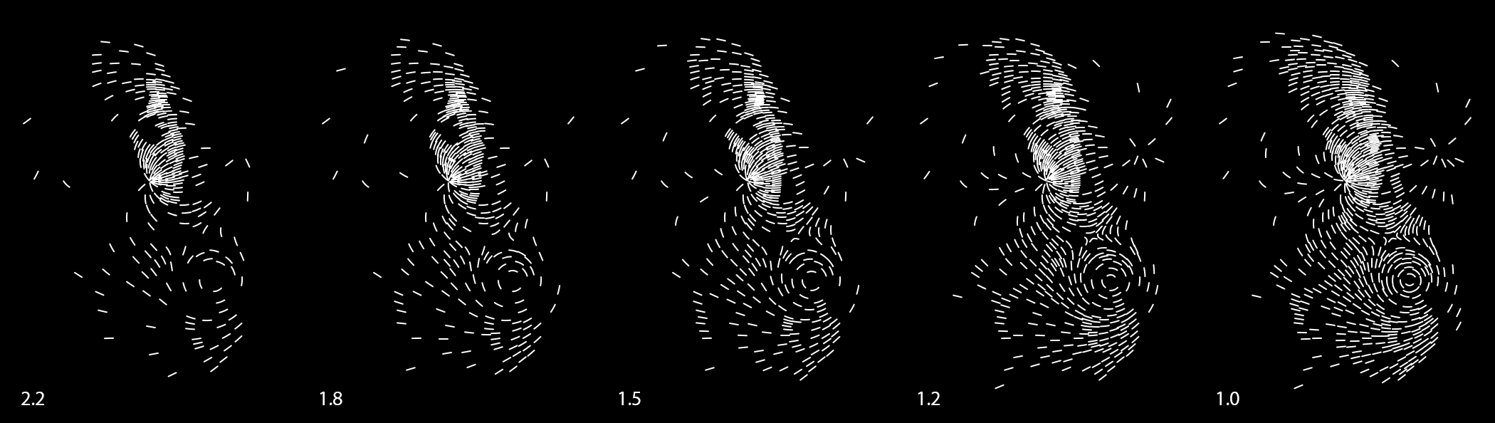
There are two faces in this picture, but the lower one is hardly recognizable unless it is lightened by choosing a lower gamma value.
To be continued in a few more installments of catching up with history, followed by ongoing updates!
Discussions
Become a Hackaday.io Member
Create an account to leave a comment. Already have an account? Log In.