 Christian Walther
Next up was the question of how to generate the vector field that determines the direction of the lines. I wanted it generated from the image rather than random or constant, in hopes that extracting more information from the image would make for more recognizable paintings. An obvious choice is to use the gradient of the luminance of the image, so that’s what I tried first.
What about areas of zero gradient, in particular most of the background that is a solid black? I don’t generally care about the magnitude of the vector field, only about its direction, but I want it nonzero so that it has a direction everywhere, and a more or less continuous one if possible. I solved that by successively blurring the image until I had a nonzero gradient at every pixel. I experimented with different amounts of initial blurring until I got a nice not-too-chaotic furry-looking field.
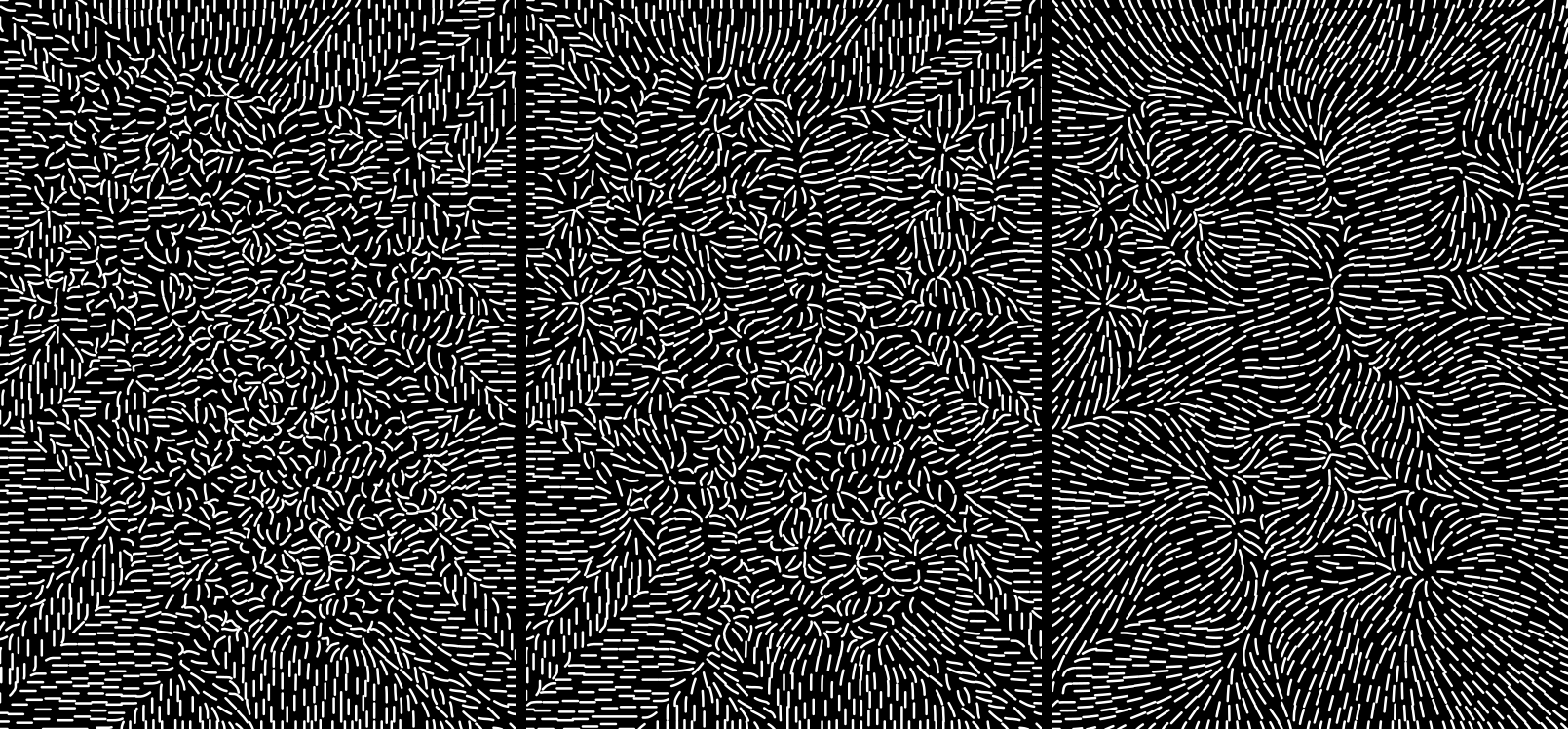
Gradient with less to more initial blurring
The resulting vectors could still be rotated, and assuming that I was to use the same base field for both color channels, it should probably be rotated by different angles for each channel. I didn’t like the look of the 90° rotation with its obvious contour lines, but the ±45° and ±60° ones with their spiraly vortices looked nice. For two channels, ±45° looked best, where lines of different color would always be perpendicular.
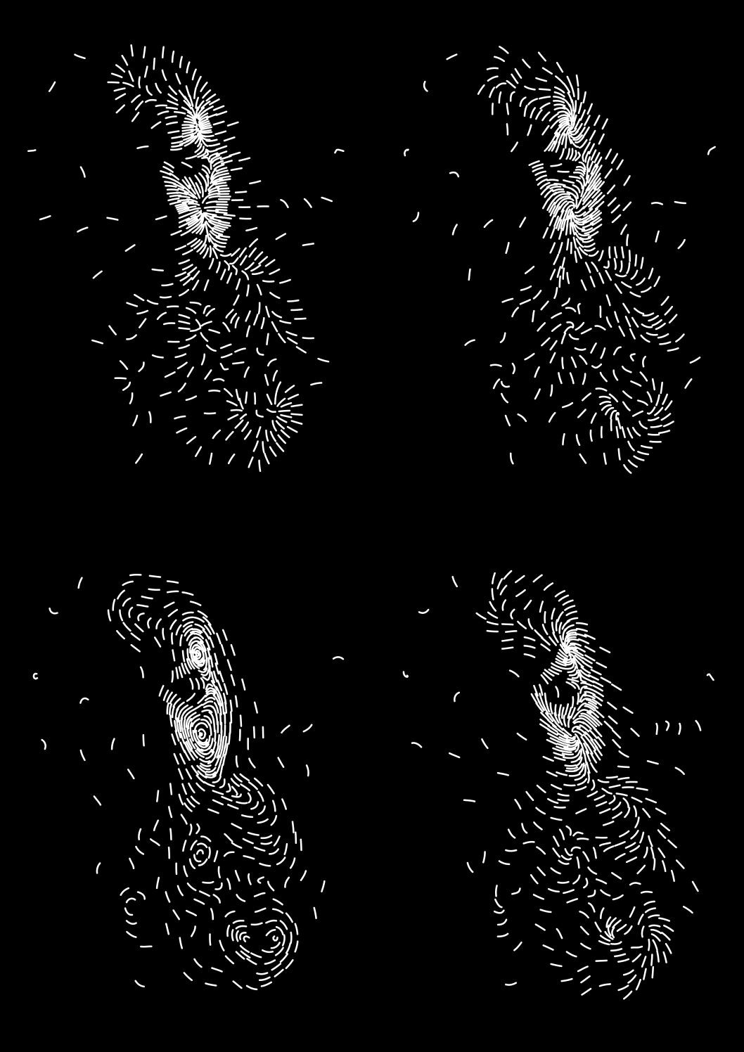
Image traced with different rotations of the basic gradient field
Another idea was to use a vector field whose divergence corresponded to the image luminance, as if electrical charge was distributed according to the image. Results turned out disappointing however, any detail from the image was drowned in a general outward tendency from the total charge. Even offsetting the values to achieve a total charge of zero would just result in a field radiating outward from the middle and toward a ring along the periphery. This idea was therefore quickly abandoned.
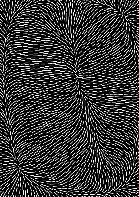
Divergence field with offset
It was time to get the first prototypes actually plotted, in particular to find out how much time that would take – despite some rough estimates, I had really no idea if it would be quick enough for the patience of visitors at an exhibition. To generate the drawings for this, I now had to take into account the stroke width of my pens. Up to now, I had just been arbitrarily using 1 mm. Unfortunately, the Edding 1200 pens turned out to make a much thicker line than that after having endured some pressure on the tip, up to 2 mm, which noticeably reduced the output resolution. I finally put a compromise value of 1.8 into my program.
First plot!
The prototype plots actually turned out quite nice. I wondered whether that would stay that way when all the hand-tweaking would be automated. The low resolution caused by the thick strokes was unsatisfying, but on the plus side it made for a plotting duration of only 6 and 7 minutes respectively, which seemed very appropriate for an exhibition.
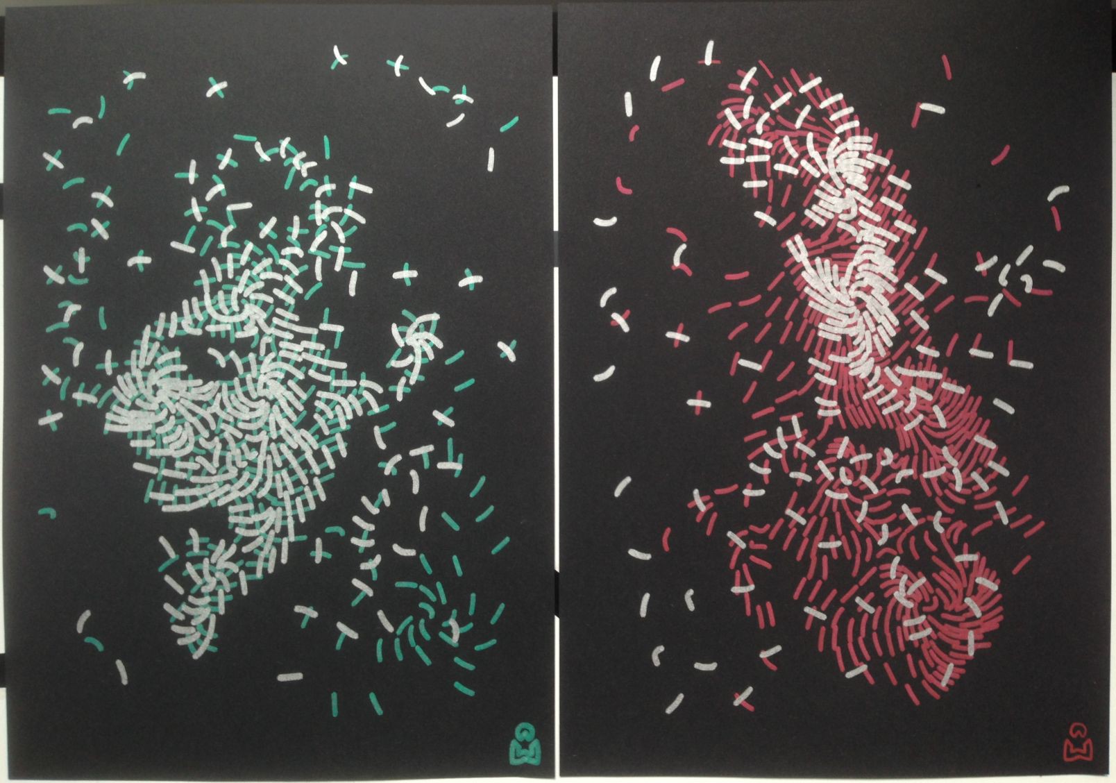
To improve the resolution, I went looking for thinner pens. After scouring the local stationery stores, I brought home two more types in various colors: Uni-Ball Signo Broad and Faber-Castell PITT Artist Pen.
The Uni-Ball Signo Broad is a ball-point gel roller and works very nicely when used by hand, with a stroke width of about 0.7 mm. Like the Edding 1200 or even a bit more so, it is very opaque and makes a bright sparkly color on black paper. Unfortunately, when mounted in the plotter, it seems to have a very uneven ink flow, which causes the stroke width to vary randomly between about 0.2 mm and 0.7 mm. I am not sure why, as I could not reproduce that when holding it by hand, even with different angles, pressures, and speeds.
I did a test plot of the same design with it. Due to the thinner stroke, it needed many more lines (3384 vs. 714 for the Edding), which greatly improved the resolution and recognizability, but also increased the plotting time to about 30 minutes.
The Faber-Castell PITT Artist Pen, a felt-tip pen, makes a stroke of about 0.9 mm. It turned out to be considerably less opaque than the other two, in particular the green one, making for much duller colors on black paper. I therefore dismissed it without even making a full test plot.
Between the other two, I finally decided to stick with the Edding 1200 despite the coarse resolution. I found the Uni-Ball drawing aesthetically less interesting because it was too detailed, in comparison to the more abstract and enigmatic Edding drawing. Something in between would have been best, but this went too far in the other extreme. Together with the uneven stroke width, which also led to a darker appearance on average than intended, and the long plotting time, this tipped the scales in its disfavor.
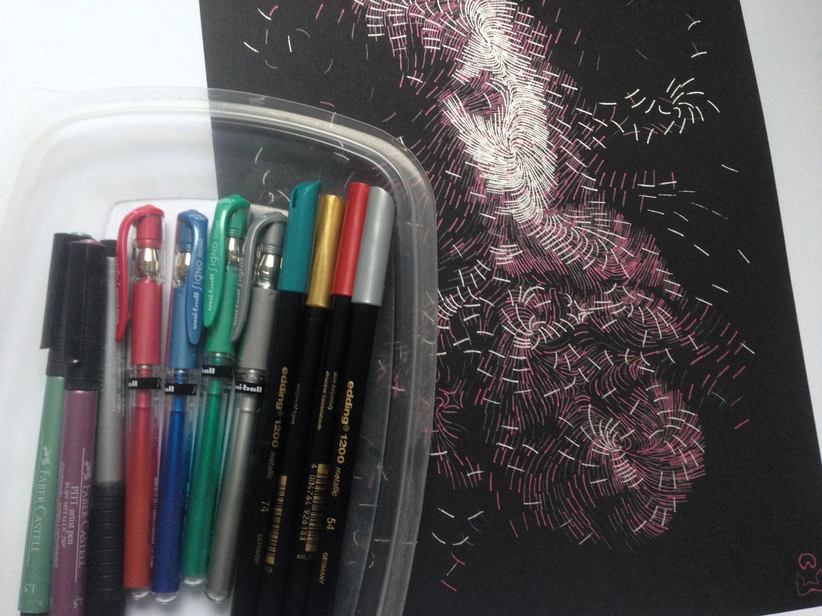
Pen collection and the Uni-Ball drawing
Discussions
Become a Hackaday.io Member
Create an account to leave a comment. Already have an account? Log In.