 Radu Motisan
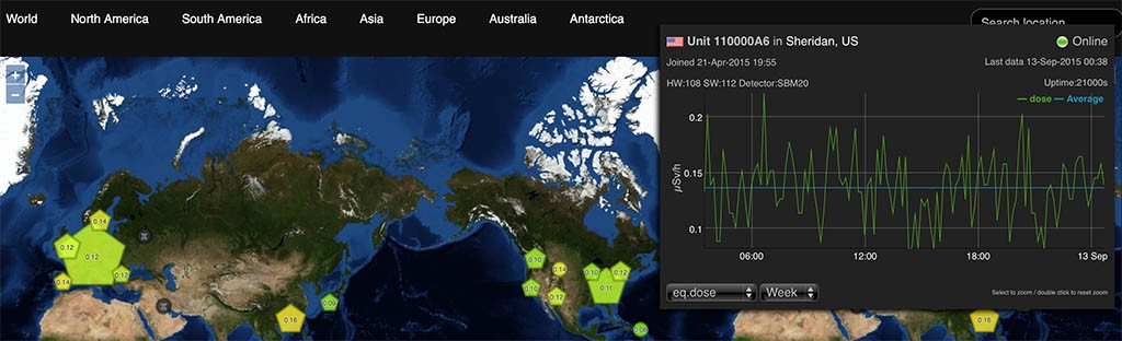
The complexity of the uRADMonitor system stretches from a multitude of compact hardware detectors capable of sensing the invisible ionising radiation and air quality, to the big data software solutions that can handle the huge amounts of data in real time. With the network spreading at a fast pace, periodic upgrades on the server side are a must, in order to provide a high quality, uninterrupted service.
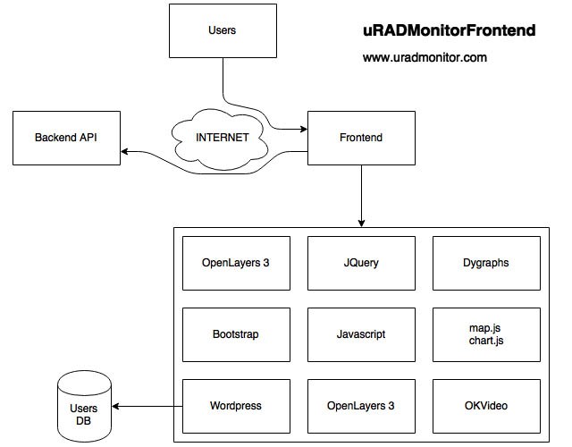
This uRADMonitor server upgrade improves both the backend and the frontend. While the former brings a more efficient big-data-ready database implementation and RESTFul APIs for robust data access, the latter was shaped in a modern user interface with animated maps and interactive charts. The Backend and the Frontend are hosted on separated servers.
The Backend or data.uradmonitor.comThis is a separate server, in charge of the system database and the uRADMonitor RESTful APIs. It’s purpose is to provide input/output real time data operations via a mature API interface. It receives data from the distributed detectors, and provides data to the frontend, mobile apps and other parties, all via API calls. The data is stored in a big-data ready database.

The RESTful API methods are properly organised, and the code can be extended to support additional calls. Currently the following APIs are supported, all using JSON formatted data:
[POST] http://data.uradmonitor.com/api/v1/upload/e1/[encrypted data] , used by the uRADMonitor units to upload data
[GET] http://data.uradmonitor.com/api/v1/devices , used to retrieve the content of the summary table, the complete list of units in the network and their basic parameters
[GET] http://data.uradmonitor.com/api/v1/devices/[id] , used to retrieve the list of supported sensors for the specified unit ID
[GET] http://data.uradmonitor.com/api/v1/devices/[id]/[sensor]/[timeinterval] , used to retrieve the measurements for the given ID, sensor and time interval.
Here are a few examples, click to see the output:
http://data.uradmonitor.com/api/v1/devices
http://data.uradmonitor.com/api/v1/devices/93000001
http://data.uradmonitor.com/api/v1/devices/110000AA
http://data.uradmonitor.com/api/v1/devices/110000AA/cpm
http://data.uradmonitor.com/api/v1/devices/110000AA/cpm/604800
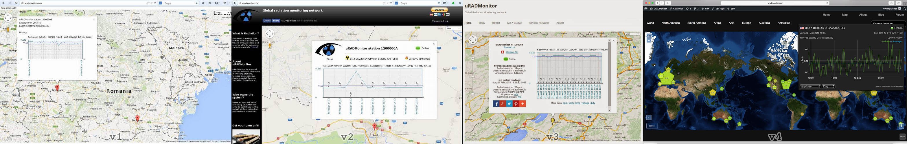
This is the visible side of the centralised server system, as it is in charge of generating the webpage showing all radiation and air quality readings. The webpage is a modern implementation using the powerful OpenLayers 3 mapping library. Thanks to JQuery and Dygraphs the data is shown in interactive charts, this time generated on the client side to allow features like local timezone mapping and zooming, highly requested among uRADMonitor users.
The Clusters
Because of the high number of units on the map, close to 300 uRADMonitor units at the time of writing this article, representing all at far zoom out is impossible, due to obvious overlapping. The solution was to group the close units in clusters, automatically, based on the zoom level. The individual units are represented by circles, while the clusters are pentagons. The bigger the pentagons, the more units they are composed of. Clicking a cluster will unveil its comprising units automatically, by zooming the map to that particular location:
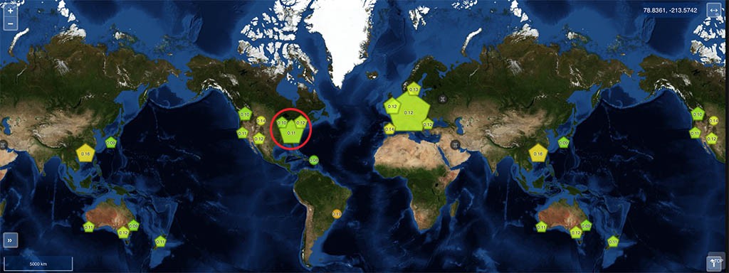
Clicking the highlighted big cluster on the Eastern US territory will zoom the map automatically so the comprising units become visible:
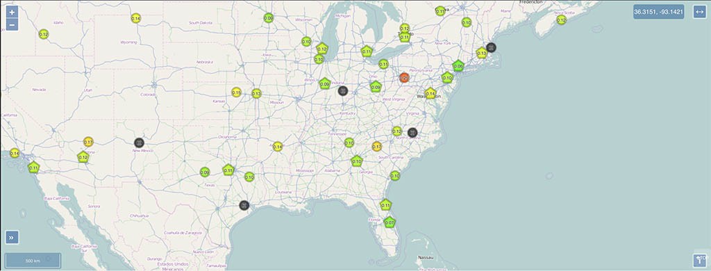
The colors are a gradient going from green to red, representing the Equivalent Radiation dose in uSv/h measured by that particular detector for the last 24 hours. For clusters, an average between all units contained is calculated instead, while the same color representation is used. Offline units are shown in black.
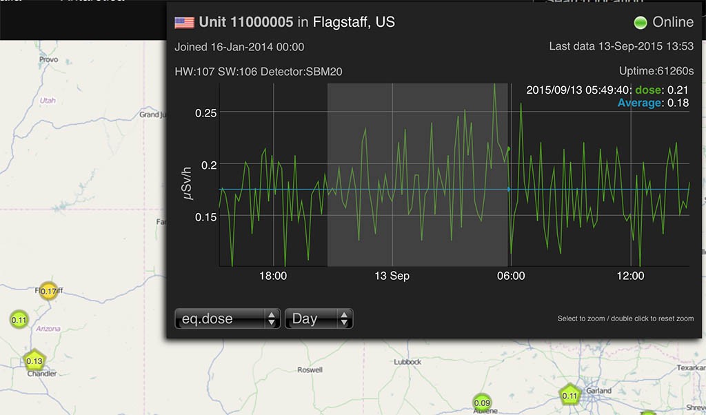
Clicking each individual unit opens a popup, where you can see the interactive chart, and can select the other sensors or a different timeframe. The charts support zooming, by selecting a portion of interest on the chart (click and drag).
 The map menu can be used to jump to various geographical areas, while the “Search location” box takes in any address and resolves the location to geographical coordinates, to jump to the specified place.
There are a few improvements planned already, such as showing the units in close proximity (list of closest units and distance to them), full screen charts, comparison between various values and stations, and most important, allowing users to manage their own stations by changing location coordinates or setting alarm thresholds (eg. for radiation or air quality readings).
Discussions
Become a Hackaday.io Member
Create an account to leave a comment. Already have an account? Log In.