 Daniel
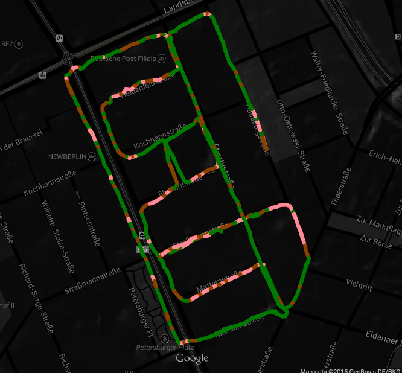
While the measuring hardware is working fine and collecting nice data, we are still working on what to do with that data afterwards. Currently, we are simply saving the maximum peak from the previous time frame (1 s) every time we log a new datapoint. The visualization then draws a line from one point to the next, with the color of the line representing the intensity of the vibration.
Green areas are smooth roads, whereas orange and red areas represent medium and high surface roughness. It is easy to see how the main streets are rather smooth excluding some small defects, whereas the smaller, perpendicular cobblestone roads instantly stand out as long red lines.
We can probably do a lot more by looking at the detailed waveform of the vibration.
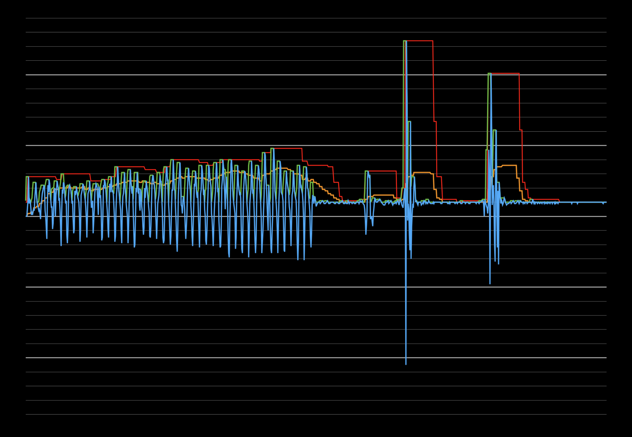
Blue: Raw data from accelerometer
Orange: Smoothed envelope of vibration profile
Red: Maximum acceleration measured within a certain timeframe
Left part: bumpy road
Right part: single potholes/bumps
Potholes and bumps can be extracted not only by their short duration, but by the ratio of the red and orange curves.
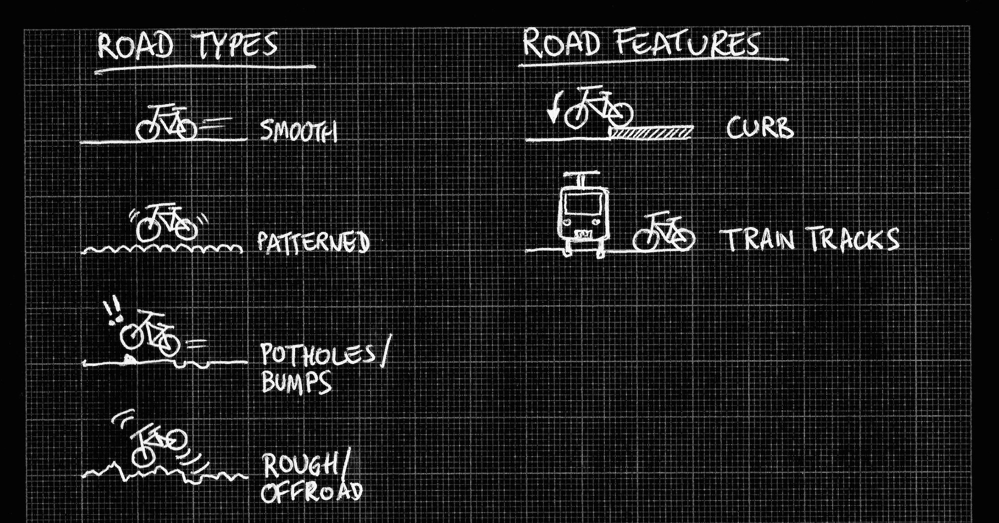
By looking at the envelope of the vibration over time, we could try to classify different types of roads. Maybe even a Fourier transform to get a detailed profile of a road, to determine whether it is a regular pattern (cobblestone) or a random roughness profile (going over grass, gravel, etc.).
Detailed peak analysis could reveal features such as curbs and train tracks crossing the road.
Discussions
Become a Hackaday.io Member
Create an account to leave a comment. Already have an account? Log In.