 RoGeorge
Rant
Last week I made a big mistake: I clicked a button on the My Feed page (from hackaday.io). The button was named something like "See if you like our New Feed" or something. Well, I didn't liked the new feed, but also I found myself locked out from the old feed format, the one which I liked and wanted back. There was no way to go back to the old Feed format.
Since then, I have no idea what exactly I am notified about on my Feed page.
:o(
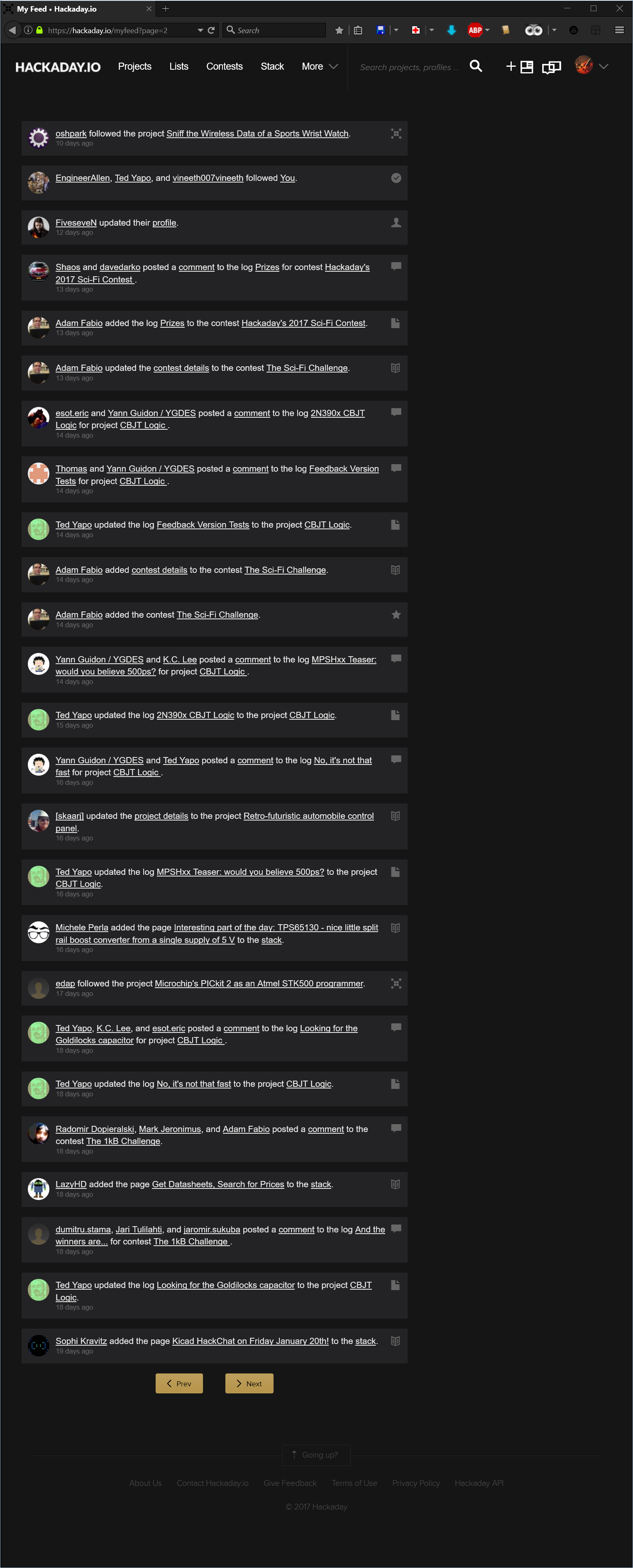
The Feed page is now totally cluttered with buttons, pictures, icons, descriptions, recommendations, comment boxes and so many other unwanted elements. Over the top, the items of interest are grouped by some inconsistent criteria that I couldn't figure out yet.
The Feed is so cluttered that the only question this page should answer, "What are the last x things I am notified about?", remains a mystery:
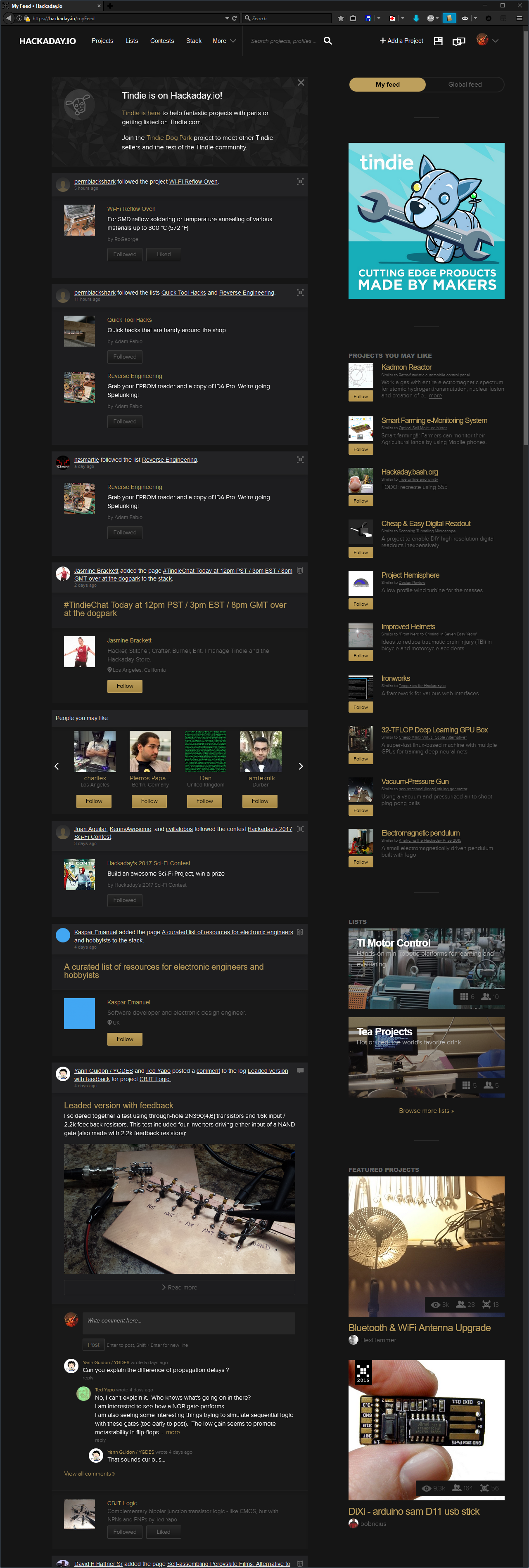
So what exactly I am notified about?
I have no idea, but wait, there's more:
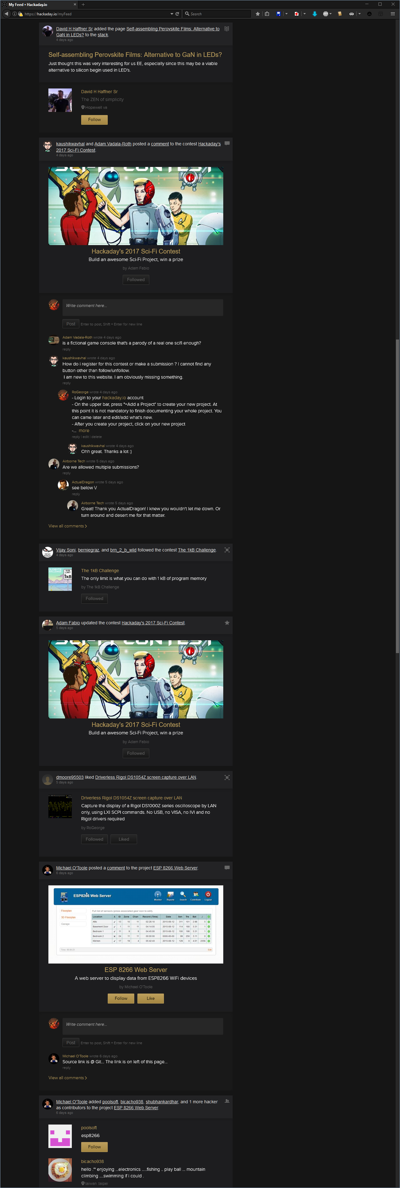
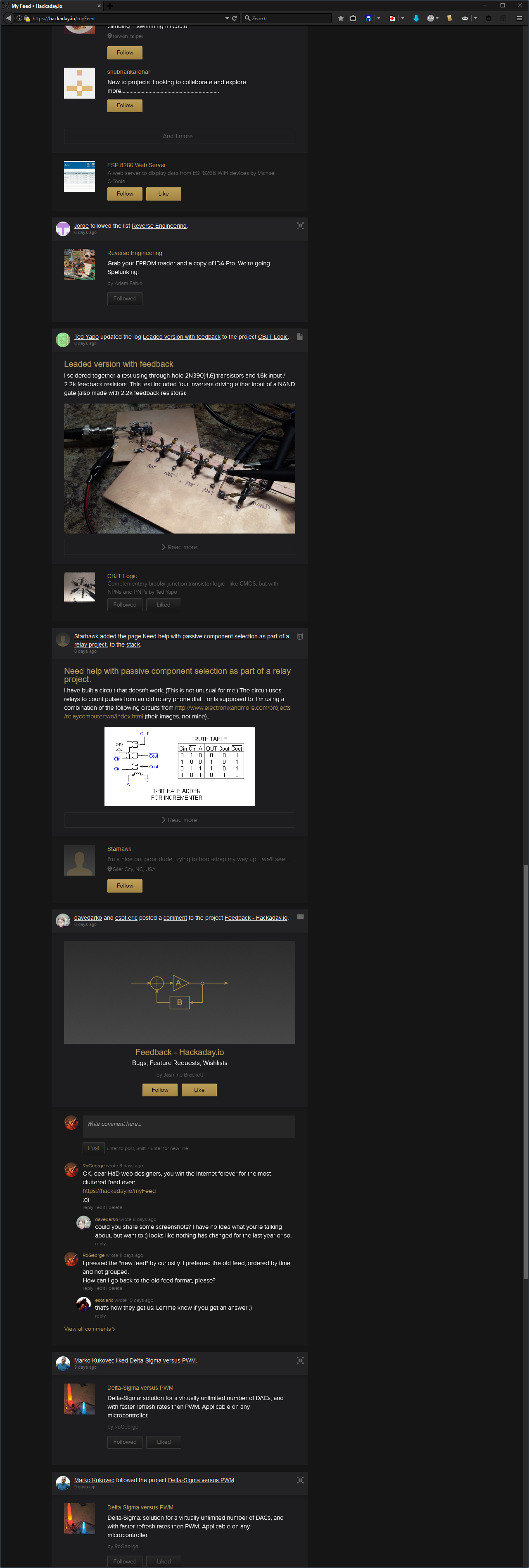
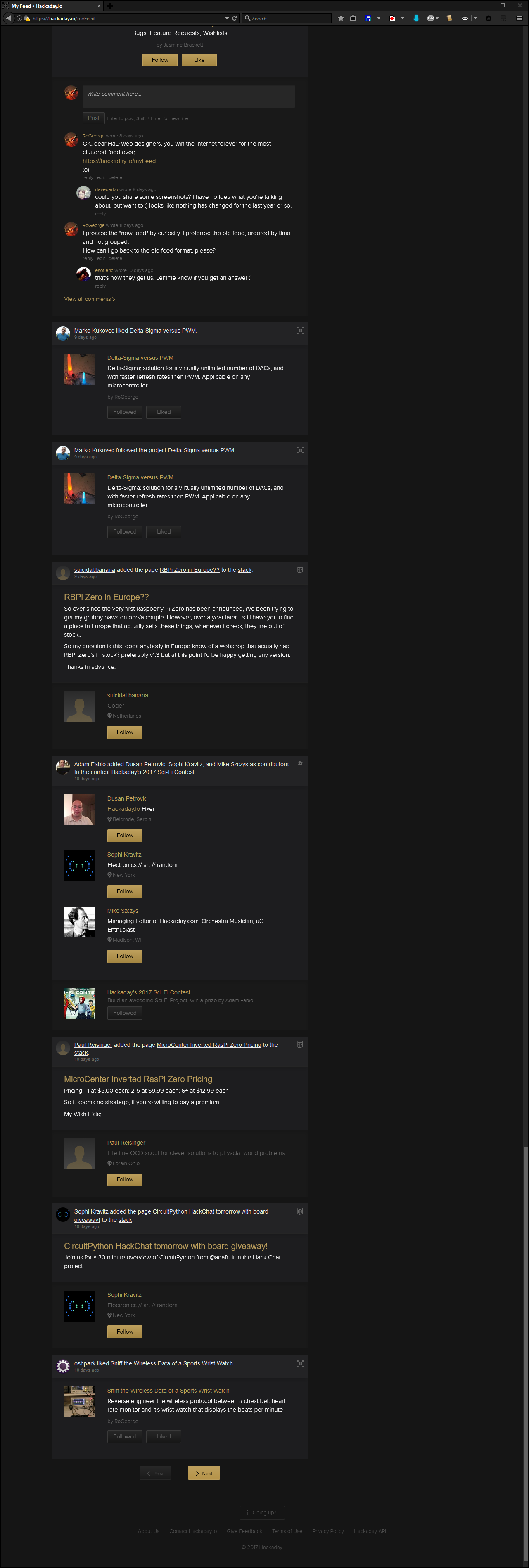
What can I say. Don't know.
Maybe there are reasons why some people refuse to have a Facebook account. Please note that I am not even complaining here about the "Skulls" being replaced by the dumbed "Likes", but it just crossed my mind now, when I realized the Feed page looks like a black themed Facebook page.
.
Anyway, given the look of the "new" Feed page, I asked if I could get the old format back, but no answer: https://hackaday.io/project/37-feedback-hackadayio/discussion-75327
Then, an Internet Award was granted to the web designers that designed the "new" feed look, but still no answer from them: https://hackaday.io/project/37-feedback-hackadayio/discussion-75570
OK, so "Life's hard, and then you die", now what?
tl;dr: Workarounds
- Use a custom AddBlockPlus filter to get rid of the unwanted elements. The notifications will still be grouped, but the 'Feed' will be much clear.
- Use a custom JavaScript for GreaseMonkey (or Tampermonkey) to rearrange the 'Feed' pages upon wish. This one is not trivial.
First workaround: Add a custom AddBlockFilter
- Install AddBlockPlus
- Go to 'Filter preferences... Ctrl+Shift+E'
- Check 'Element Hiding Rules' and show the filters list 'Action' -> 'Show/hide filters Ctrl+R'
- Add the following filters:
hackaday.io##.feed-group.beta
hackaday.io##.object-list
hackaday.io##.object-content
hackaday.io##.object-images
hackaday.io##.slider-holder
hackaday.io##.comment-section
hackaday.io##.show-more
hackaday.io##.cover-padding
hackaday.io##.content-right-other
That should do it. The 'Feed' page will look like this:
The last entry in the filter removes all the right-side column, so it also removes the "My Feed / Global Feed" switch buttons. If you need those buttons, then remove the line
hackaday.io##.content-right-other
Note: the above steps to add a custom filter are for Mozilla Firefox. For Chrome, the AddBlockPlus filter is the same, and can be added in the AddBlockPlus menu 'Options' -> 'Add your own filters'
Second workaround: Custom JavaScript for GreaseMonkey
This one allows to select what kind of notifications to display, and how much clutter to display.
:o)
Still playing with it, but not polished enough to be published.
Discussions
Become a Hackaday.io Member
Create an account to leave a comment. Already have an account? Log In.
The feedback design kind of grew on me and I must say you're kind of late to the party ;) I don't think you'll get a response on your feedback comment, whenever it get's to the design things get kind of difficult - see the blog, every article with a project from here get's the "hackaday.io design is shit" treatment.
Good to see that you're sharing your scripts, I guess they won't support the old feed much longer. There was a time when you could select what you've want to see, but that got removed, too. So I also have a script ;)
$('[data-group="assign-user-project"]').hide();
$('[data-group="follow-list-list"]').hide();
$('[data-group="follow-event-event"]').hide();
$('[data-group="follow-contest"]').hide();
These will hide followers of stuff you follow and everyone who gets added to the hackchat (for example).
Since not everyone can be happy, I really like the idea of using JS to hack it the way you like.
Are you sure? yes | no
I started here because I think the interface is infinitely better than that other DIY site with user-generated content. You know the one.
Are you sure? yes | no
My guess is most of the people will want to avoid those notification too.
I'll try them, thanks a lot!
Are you sure? yes | no
I'm new here, so never saw the old feed - I like the density your adblock filters create. On the other hand, some people may like the verbose format. It's easier to make a script remove content than add it, and it is a hacker site, so this solution seems like the right approach. If there's something you don't like, just fix it ... this applies to anything in the universe you may encounter :-)
BTW, you missed one:
hackaday.io##.cover-padding
Are you sure? yes | no
Thanks!
"hackaday.io##.content-right-other" added.
The old feed was also compact, but not grouped with a couple of users or event for one entry. Each notification used to appear in the list one by one, in the order of the events, with the newest on top. Also, there was a checkbox of 10-20 various categories in the user's profile configuration, where you were able to disable categories you don't want in the myFeed, e.g. "I don't want to see notifications from the Stack page".
Are you sure? yes | no
This is cool. And as Ted pointed out, this is a site for hackers, so it doesn't not make sense to kinda motivate their so-doing. OTOH, some hackers are good at C, some at analog circuitry, some at whatever F'd up "language" runs the internet these days. You can probably guess I'm not one of the latter. So, thank you for making this available to the likes of us!
OTOH, I'm not sure about Ted's response "If you don't like the way it looks, fix it"... That's great for *viewing* feeds, but it doesn't apply when you're creating content for others. And, ironically, this site-for-hackers really locks-down the layout of one's own content, even more-so than Myspace script-kiddies. Mixed-blessing; I think the majority of us would actually improve our pages.
I'm confused why people consistently complain about notifications from the stack. There's only something like a few posts there a week. Other things (like users added to the hacker channel) certainly add *way* more clutter.
And, dagnab, what the heck is up with your screen?! Is it high-res, wide-screen, and vertical?
Are you sure? yes | no
LOL, yes, you are correct about the screen. The captures were made from a 4K monitor (3840 pixels × 2160) in portrait mode, with scaling 1:1 (100%). Programmers love to keep their monitors in portrait mode, because they can see more code lines on the same page without scrolling. Unfortunately I'm not a programmer either, so my monitor usually stays in landscape mode, with 150% zoom. For those captures, I wanted to have the whole first page of the thread captured, but if I would have done it in landscape 150%, than it would have been about 10-15 pages of captures instead of "just" 4. So I zoomed out from 150 to 100% and rotated the screen only from the driver (and also physically rotate the mouse, or else mouse pointing becomes really disturbing - just try it once, for the fun :o), then took 4 very long screenshots in order to point out how much clutter is there in a single page.
.
By the way, your question made me realize why the new feed is so slow compared with the old one. The new feed page is indeed a VERY long one, and all those excerpts with comments and pictures are, in fact, request to many, many hackaday.io pages. So, when one clicks on the feed and the grey box starts to scroll sideways, then in the background the scripts are making request for tenths of pages. After all those requested excerpts from various pages are fulfilled, then the gray box prepares all the clutter and displays it as the new feed.
As you pointed out, that's a darn long page! A 1/10 of it would have been more than enough for one screen, and also 10 times faster then it is now. Thanks!
Are you sure? yes | no
I still like landscape, personally... When I program it's nice to have multiple windows/files open side-by-side, and even better when referencing datasheets, etc. Tall/skinny is nice, though. 80-columns FTW! Oddly, I almost never do that with webpages, though, 90% of the time it's fullscreen. Huh. I've tried portrait a few times, and know about mousing left-up, er is it down...? Even more fun on a sideways laptop touchpad ;)
Hadn't occurred to me that the feed is calculated at our end, that could change things as far as rescripting prospects. I preferred how it listed things chronologically so it was easy to see where I last caught-up when I saw two or three of the same updates in a row that I'd seen before. (Now that I think about it, that might actually be easy-ish with the addition of: ?beatle... try it.)
Are you sure? yes | no