 Clyne
ClyneMany DSP algorithms are designed to target frequencies within a given signal. This makes it essential to be able to view the frequency response of an algorithm, and is why I had to bring in an external tool to view the results of the low- and high-pass filters in the previous project log.
DSP PAW aims to be an all-in-one solution, and so I set aside some time to implement the ability to view the frequencies present in the output signal. The previous log used spectrograms, which show magnitude over a range of frequencies over a range of time. A simpler approach would be to drop the range of time, only showing the instantaneous frequency magnitudes; this is possible by implementing the Fourier transform.
For computer applications, the Fourier transform can be efficiently calculated through what is known as the "Fast Fourier Transform" (FFT). Instead of "reinventing" the wheel, I chose a C library called kissfft to take care of the FFT calculations.
Designing the FFT visualization
The GUI uses the imgui framework to build its interface, making the addition of this feature fairly simple. To start, a checkbox is added to the menu which controls a drawFrequencies flag that will be used to make the visualizer visible:
bool drawFrequencies = false;
// ...
ImGui::Checkbox("Plot over freq.", &drawFrequencies);
Later on in the rendering code, we simply add an if-statement that checks the drawFrequencies flag and renders the visualizer if true. This is the exact approach taken for the current signal plotter; in fact, most of the current plotter's code will be copied for this new visualization. The only significant difference will be the application of the FFT to the data before plotting.
The first FFT change is within a conditional that checks for changes in the sample buffer size. This prepares our buffers for taking in the incoming samples, as well as the kissfft configuration structure which needs to know this buffer size.
// Adds new samples to bufferCirc unless the block size has changed.
auto newSize = pullFromDrawQueue(bufferCirc);

if (newSize > 0) {
    // Sample block size has changed, resize buffers.
    buffer.resize(newSize);
    bufferFFTIn.resize(newSize);
    bufferFFTOut.resize(newSize);
    bufferCirc = CircularBuffer(buffer);
    pullFromDrawQueue(bufferCirc);

    // FFT: Re-initialize kissfft's configuration.
    kiss_fftr_free(kisscfg);
    kisscfg = kiss_fftr_alloc(buffer.size(), false, nullptr, nullptr);
}
kissfft needs separate input and output buffers (bufferFFTIn and bufferFFTOut) due to type differences: our samples come in as 16-bit unsigned integers, the FFT calculation requires floating-point values, and the calculation results are complex numbers.
So, we use std::copy to move the raw samples into bufferFFTIn, and then call kiss_fftr to perform a "real" FFT since we don't care about the imaginary components of the calculation.
std::copy(buffer.begin(), buffer.end(), bufferFFTIn.begin());
kiss_fftr(kisscfg, bufferFFTIn.data(), bufferFFTOut.data());

// Plot real values only: bufferFFTOut[i].r
When building the plot, the x-axis will simply span the range of bufferFFTOut. The y-axis ends up being more difficult to put constraints on: to my knowledge there isn't a real unit (it's simply "magnitude"), and there isn't a clear upper bound either. Dividing the output by the sampling rate isn't enough, neither is taking a fourth of that division. However, this constrains the plot enough that we can observe spikes in present frequencies and make relative comparisons between them.
Testing the FFT visualizer
I tested this new feature by using the signal generator as an input signal with the default pass-through algorithm. This is the output given the input equation "0.8*sin(x/7)":
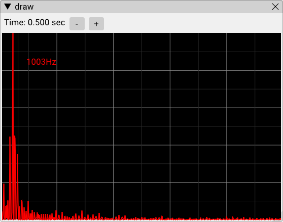
Given sampling rate Fs, an Fout frequency sine wave can be created with the equation sin(2*pi*x/Fs*Fout). At the default sampling rate of 32kHz, this means sin(x/7) creates a sine wave at about 728Hz. This would be the red spike in the above plot; the mouse cursor is controlling the yellow line, simply confirming that the frequency spike is a bit under 1kHz.
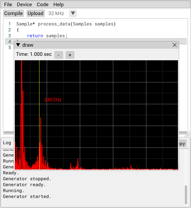
Now, we can write a new signal generator formula which adds a second sinusoidal component:
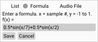
sin(x/2) would have a frequency of 2,546Hz following the Fs/Fout equation. With the new visualizer, we can confirm this is true:
While basic, this visualizer gives the GUI a great boost in analysis capabilities. More can certainly be done here, from quantifying the y-axis to layering the input frequency response to plotting maximums or averages for steadier output. For now, I'll leave this as-is and get back to finishing up the new hardware design...
Discussions
Become a Hackaday.io Member
Create an account to leave a comment. Already have an account? Log In.