 John Duffy
I see the light at the end of the tunnel, most of the big pieces are in place now.
So... fonts
Very important for simultaneously having the display readable/legible and information-dense. Easy to make it legible with a huge block font, but then I can't fit more than a few digits. A tiny font could fill the screen, but would b inscrutable. In order to push this tradeoff as far as I can requires good fonts, the axis being legibility vs size (separately, horizontal and vertical).
Two things to know, the fonts for this are stored as bitmaps, and the screen I'm using now is 128x64, AND updates 8 lines at a time - so it's basically got 8 rows of pixels that are updated together. That makes it difficult (and slow, and difficult to use the screen efficiently) to update anything other than a full 8-pixel row, so I haven't been.
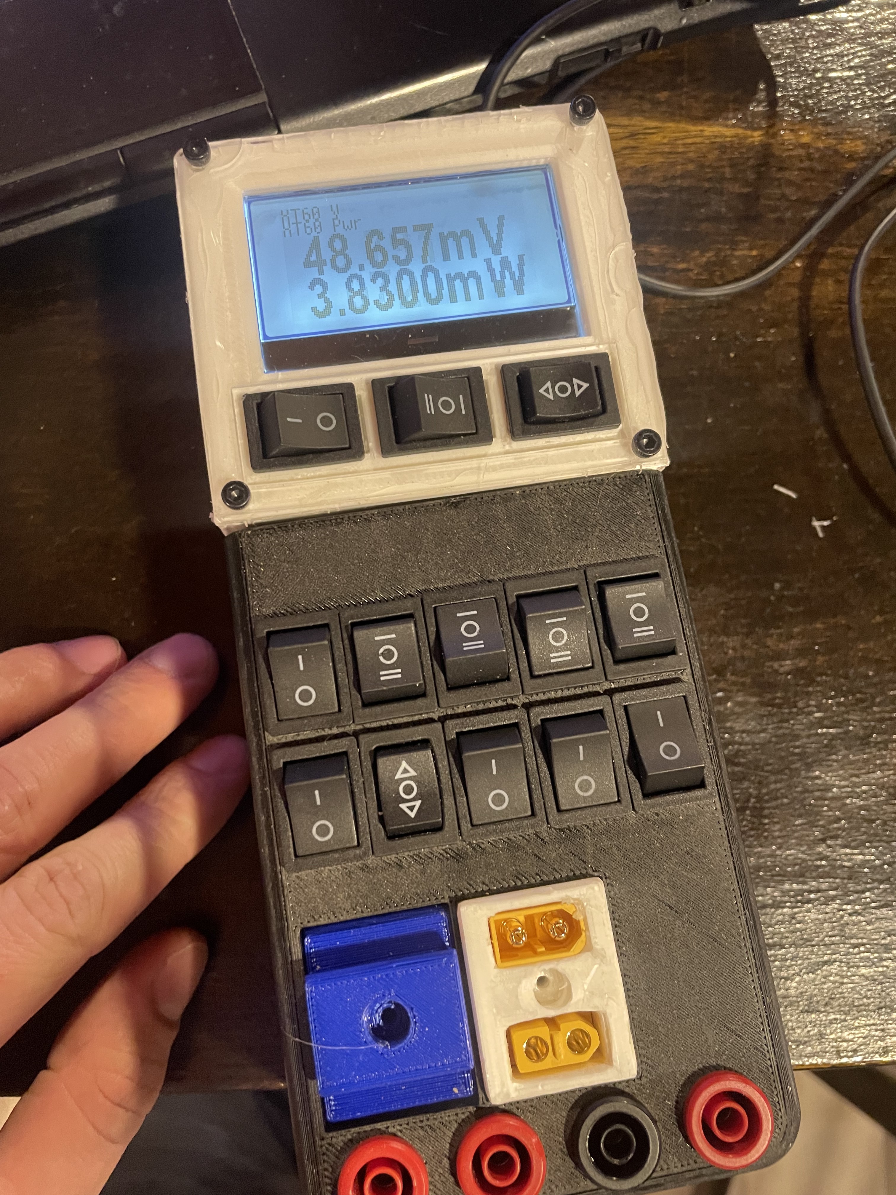
Upshot of that is, all the fonts I'm using now are multiples of 8 pixels tall, I've got 8, 16, 24, and 48.
Problem I ran into was, that the display isn't crazy wide, especially for the 48-pixel font, digits were previously about 25-30 pixels wide, so couldn't fit more than a couple digits. Including a unit, milli/micro/kilo/mega and minus sign wouldn't fit more than three digits
So, got to shrink the digits horizontally, but don't want to vertically.
This was my first step into madness.
Fonts and font rendering is a whole rabbit hole I have not dove down before but with this, I've had to start. My toolchain at this point is three programs, one, FontForge that lets me edit the vector fonts - moving parts around, replacing characters, adding parts (like bars on Z's and 0's, converting triangular-style 4's to open football-style ones, etc). Then there's another one, FontBuilder, to convert those to bitmap. Those two are existing programs. Finally I use a java program I wrote to do pixel manipulation and convert the bitmap to a C header file that the display code can understand. That took a while but really wasn't *too* bad. Looking through hundreds of fonts for the perfect blend of legibility, looks, and horizontal size, then tweaking those to look exactly how I want, then tweaking them pixel-by-pixel has taken far more of my finite life (i dunno, thirty or forty hours?) than I ever expected to spend worrying about how the letter M looks (MAN M is a pain at low resolution, you need three lines, which means a minimum of 5 pixels wide with spaces, but then it looks like a sideways E and it's weird. Lot of fonts I liked had weird M's at higher resolutions too. That letter alone has been a huge pain).
Being a multimeter, numbers are the biggest consideration, of course. That actually hasn't been terrible, current version is a lightly modified version of "steelfish", which lets me fit five digits across the display, including a +/-, decimal point, and n/u/m/k/M/G, at 48 pixels high, which is all this meter needs. Smaller fonts are different, hacky combinations of BebasNeue, FreeRoad, and LeagueGothic. Like the look of those more but they're wider, this almost certainly won't be the final version. The 8-pixel high font has been an enormous pain and is almost entirely handmade at this point, based it off an existing pixel font but changed almost everything.
So this is *mostly* nailed down by now, though I'm sure I'll keep tweaking it.
Discussions
Become a Hackaday.io Member
Create an account to leave a comment. Already have an account? Log In.