ALLLLRIGHT!
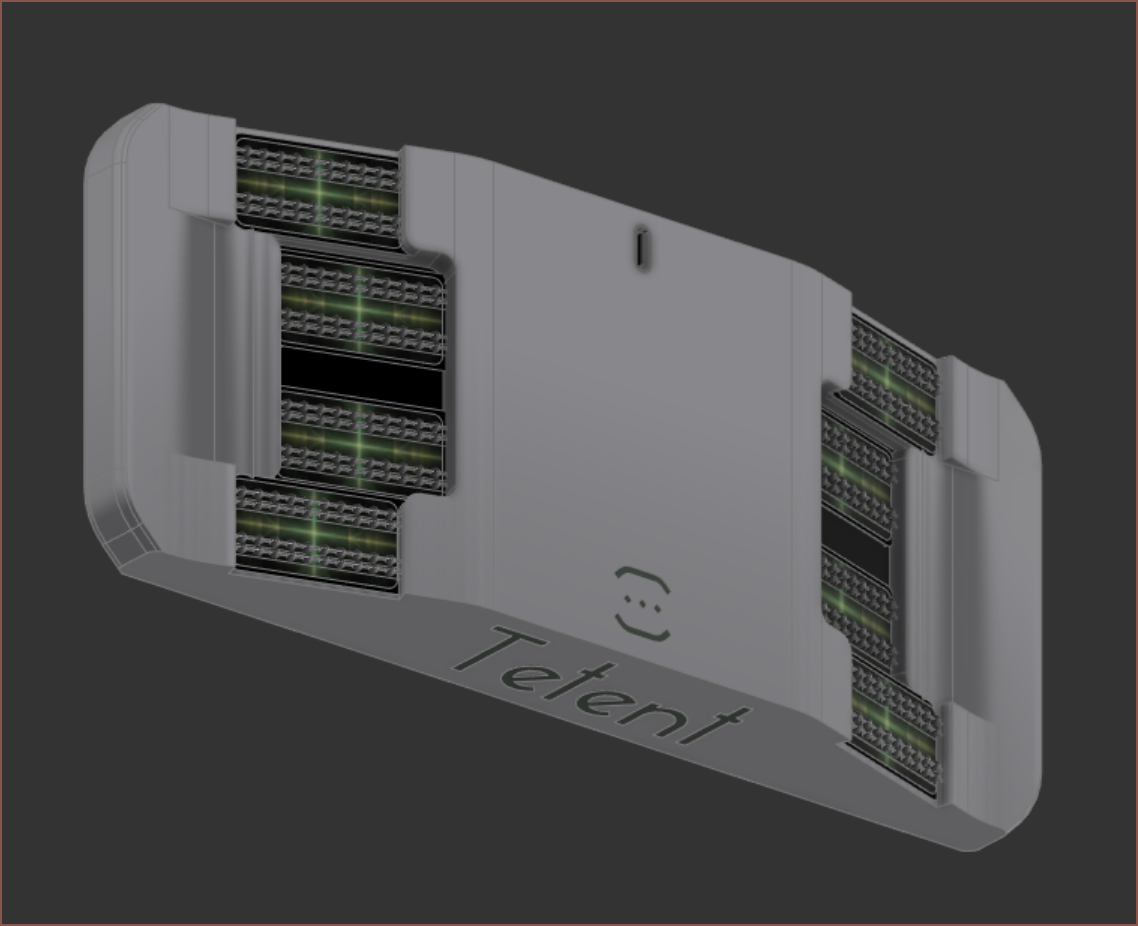
Tweaked look
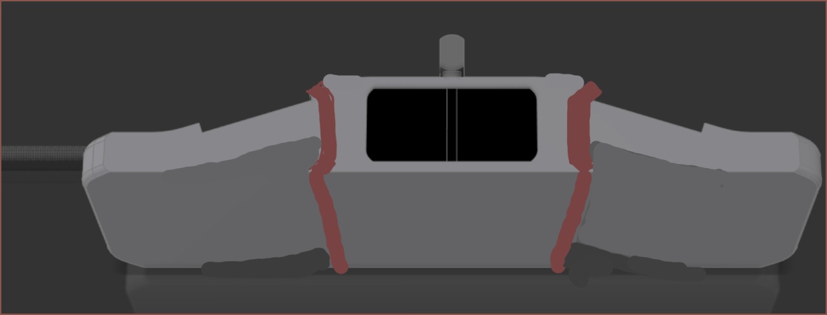
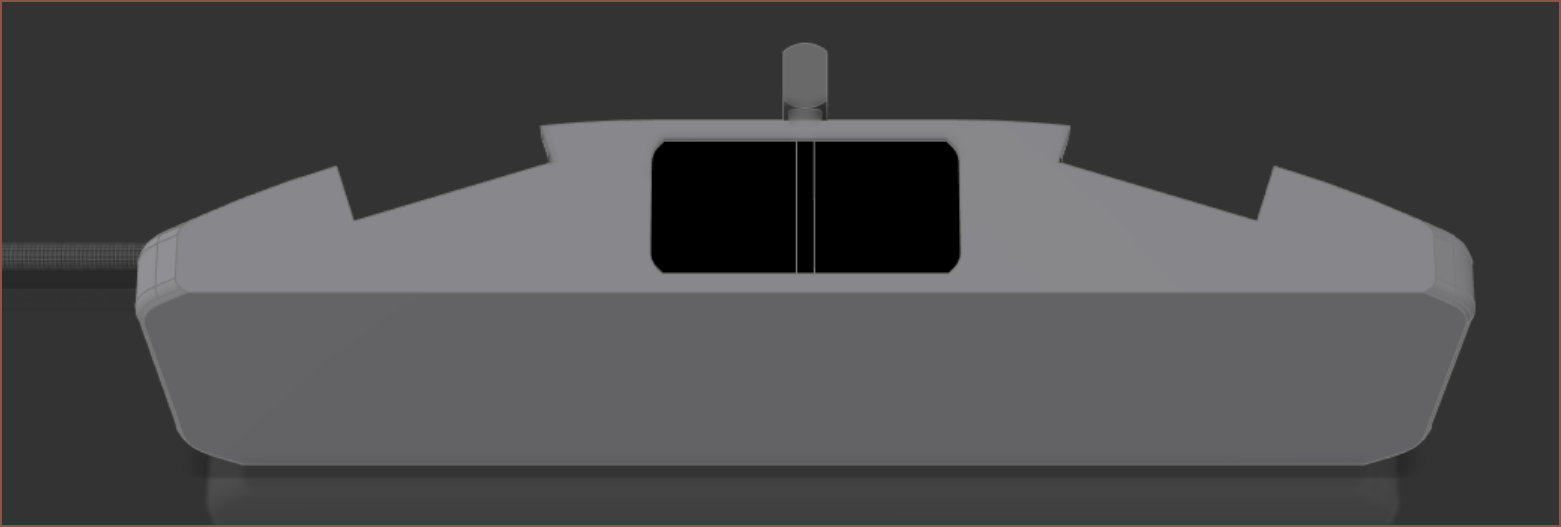
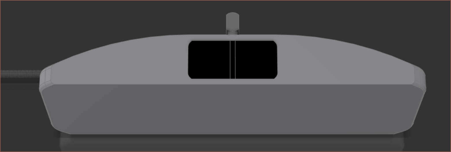
That last one is kinda ok, but I just reverted back to what I started with.
I then decided that I really wanted some symmetry, mainly because I did say "reversible" was a similarity of the goals of Tetent and USB-C and I didn't like the idea of technicalities. Looking at my hand and putting some imaginary tilted lines connecting Finger5:Finger2 and Finger4:Finger3, they're actually close to parallel. I might be able to ergonomically get away with this, as long as I added a gap so that Finger3 could use the bottom chain. If I didn't do this, Finger3 would occupy the top chain and collide with the inside edge of Finger2.
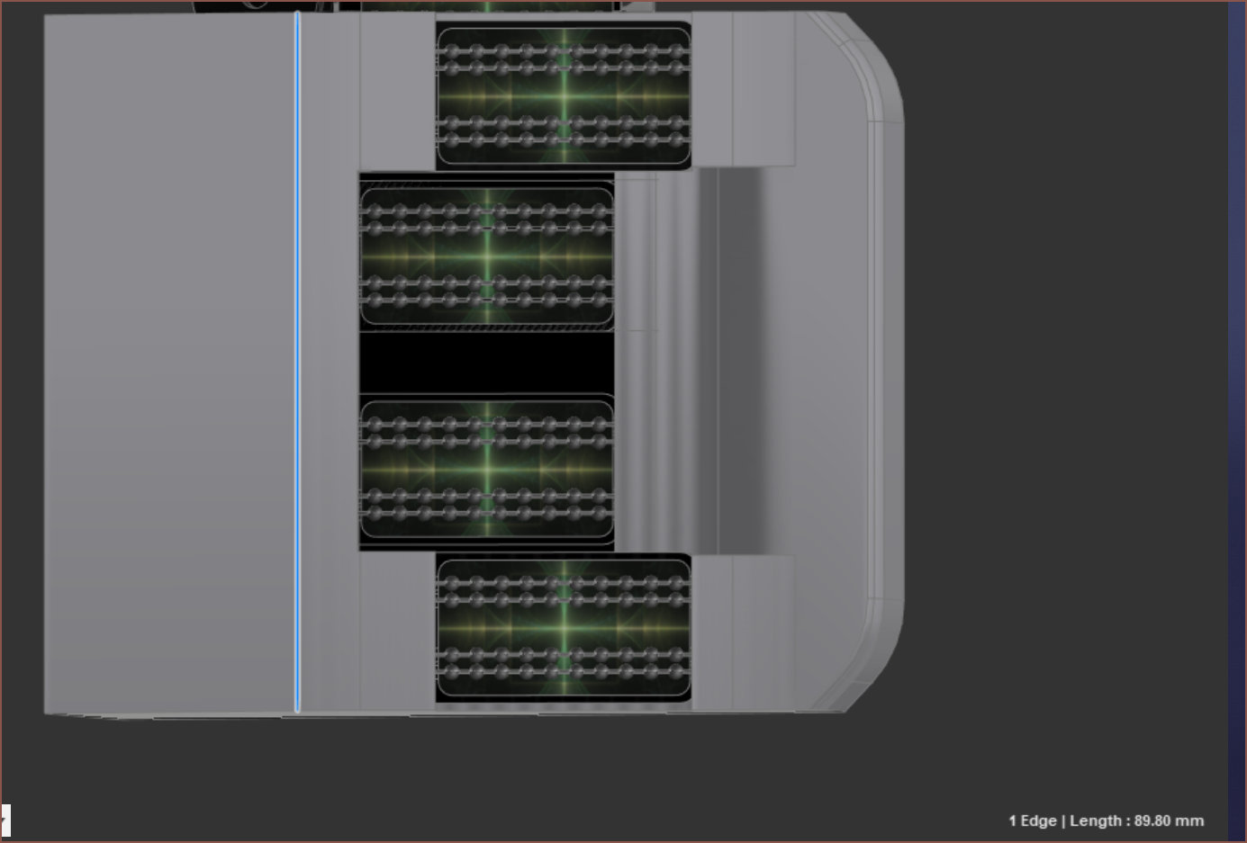
I then spent a while with the fillets to get what can be seen in the top image. Additionally, I started with putting "Tetent" on the back, but I thought it looked much cleaner to go with my original idea (see the TwySize Log drawing pic) of a small logo, moving the "Tetent" text to the bottom of the device.
Main UI interface
So I thought it would also be a good idea to actually design a basic UI, which is the one a user would see the most often.
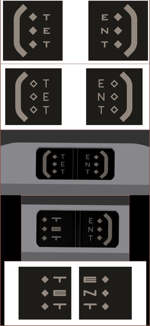
This was the process:
- I started with my logo and thought that the "white" sections (which will look greenish-beige on the LCD) were too thick, so I hollowed out the diamond squares.
- Then I thought that I could have hollow squares normally and full squares to signify that the shift modifier was being applied, so I went back to full squares.
- Tried that in CAD and didn't like it; I thought it looked too busy.
- Tried again and preferred the typed letters to be as close together as possible and the diamonds to be centred. This gives me the chance to put the list of characters, ordered be weight, that shows what characters are available at a specific Tetrinsic position.
Renders
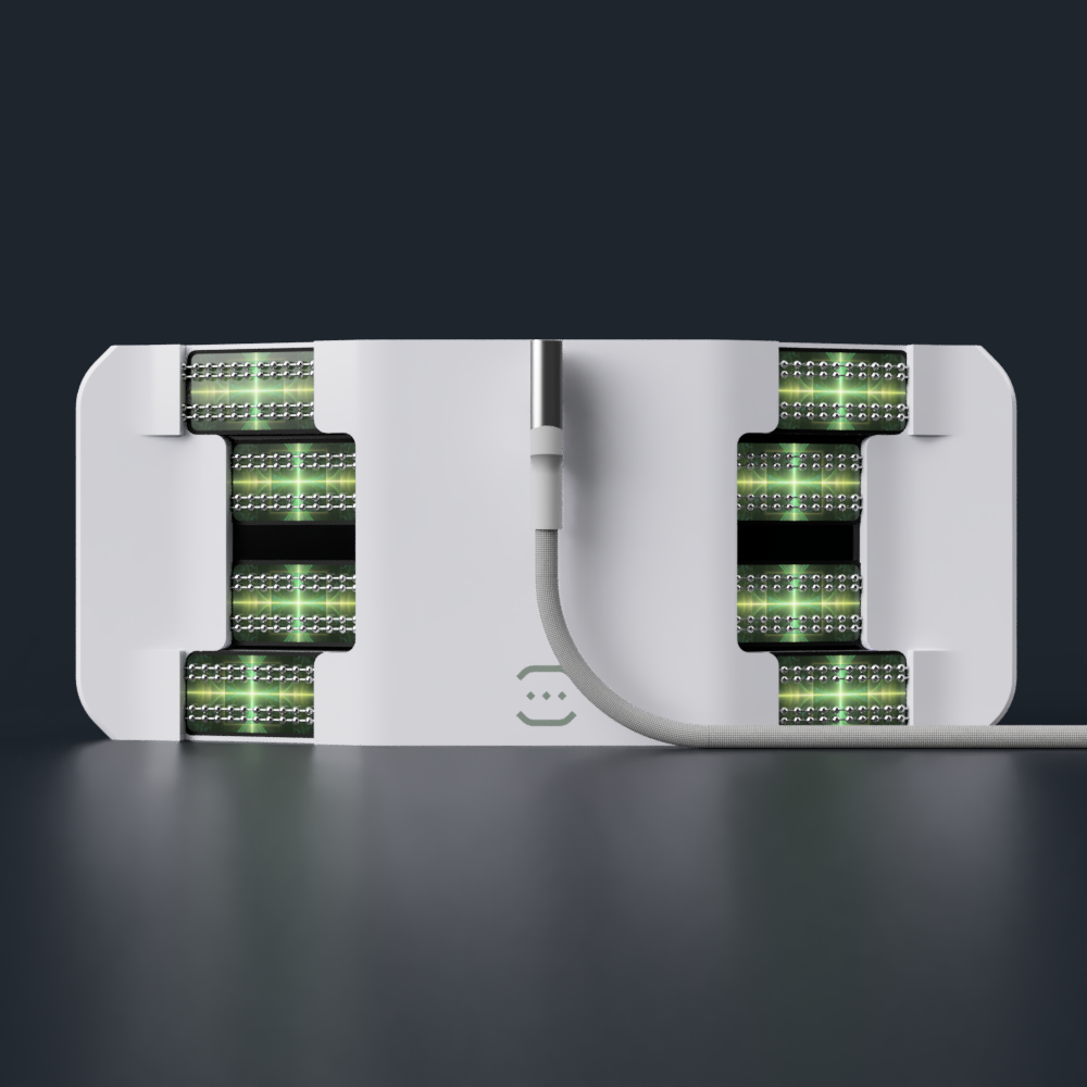
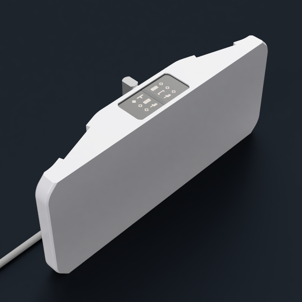
 kelvinA
Discussions
Become a Hackaday.io Member
Create an account to leave a comment. Already have an account? Log In.