 kelvinA
So, after trying a multitude of options, I think the below design is the most generally visually apealling:
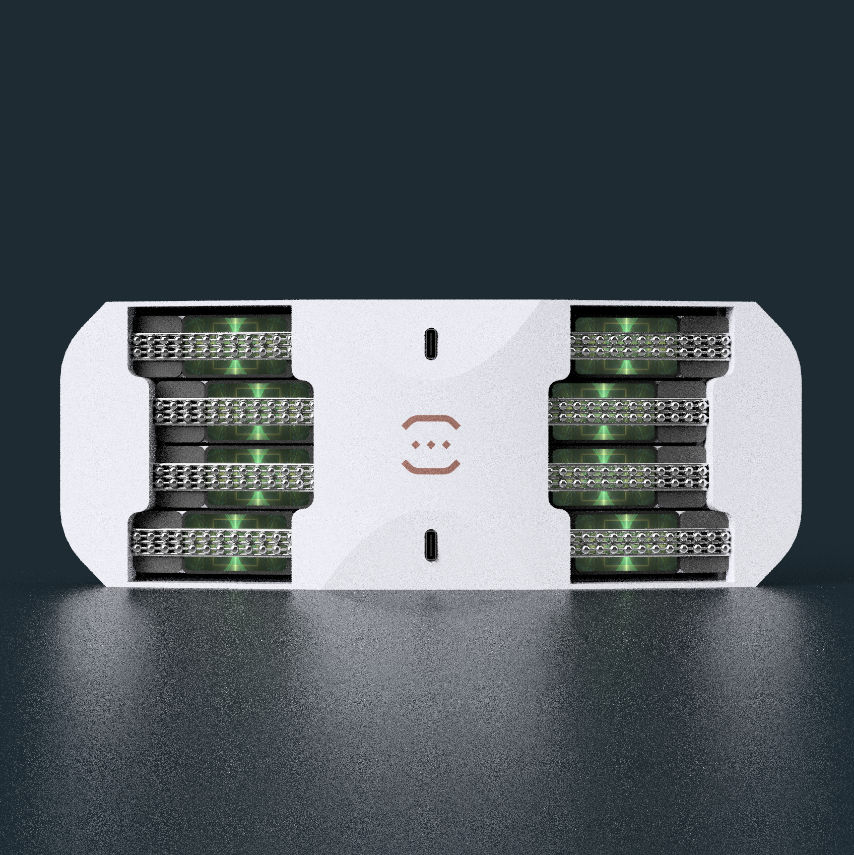
With the Tetrinsics set to a green texture, Tetent looks like it's themed by some kind of jungle temple. As I'll explain below, I thing grey is the most versatile colour to fill in the extra space.
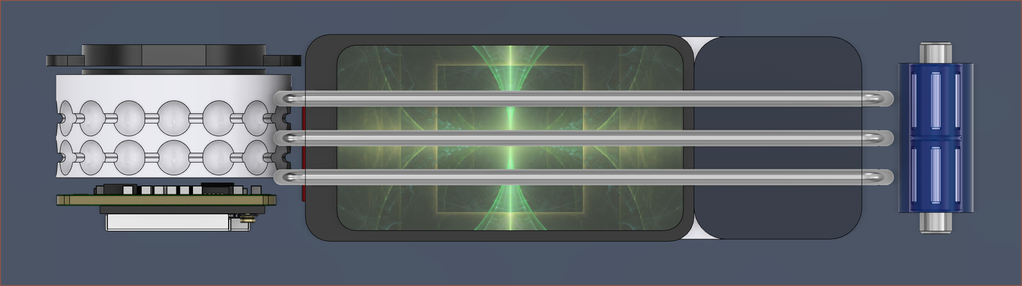
I first considered if there was a better-fit LCD. There wasn't, so the plan was to place the LCD so that it was still visually appealing. There's essentially 3 alignment options: Nearest to pulley, centered and nearest to sprocket. Considering centered would need 2 extension pieces precisely glued, and the LCD has a chin with a cable I also need to consider, I decided to align nearest to either the sprocket or the pulley.
Since the "home position" of the fingers (which are not see-though) are closest to the pulley, the flat ribbon cable between the PCB and LCD aligns when the LCD's chin is closest to the sprocket and the LCDs look more homegeneous when the only thing that seperates them is the center white section of Tetent, I've decided to align the LCDs closest to the sprocket of Tetrinsic.
 The first idea was to have a piece that had a dark blue colour to have a similar look to Tetrinsic Taic, which for Tetent I'm just going to shorten to "Tetentaic". I quickly decided to have a bezel that matched the LCD:
When in Tetent, the dark colours just made the illuminated area seem lobsided:
Perhaps lobsided is the wrong word. More like the dark part is made of some kind of spacematter or void (such as in Minecraft). Essentially, I was growing more focused on the part that isn't the screen.
 The next idea, intuitively, was to go to the other side and use white. While it gives Tetent a White + Black theme that's popular in the self-built PC hobby, I think it has an even more distracting look than the dark blue.
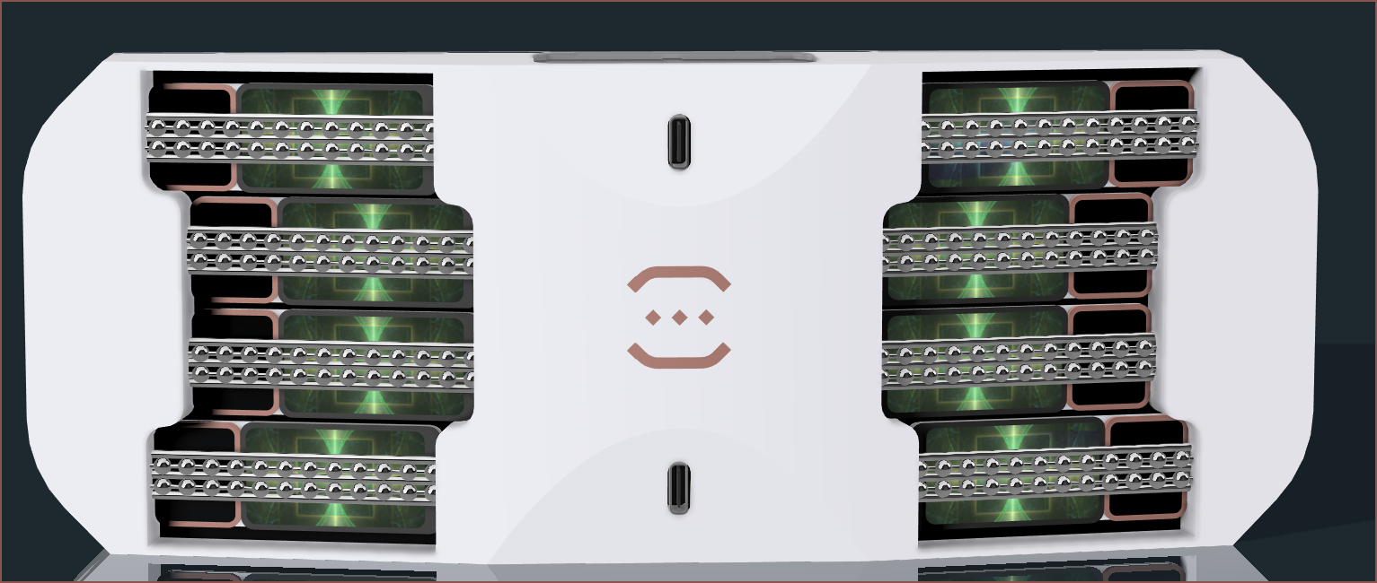 This idea certainly didn't help. It'll probably be ok if one sticks to similar colours on the LCD too, but I wanted to have a design that could work with any colour scheme.
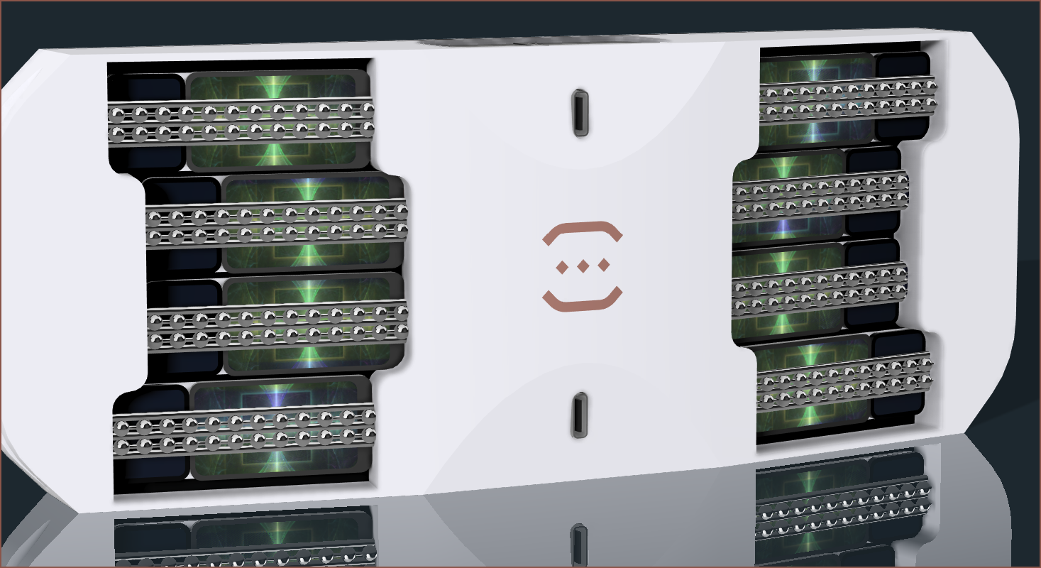
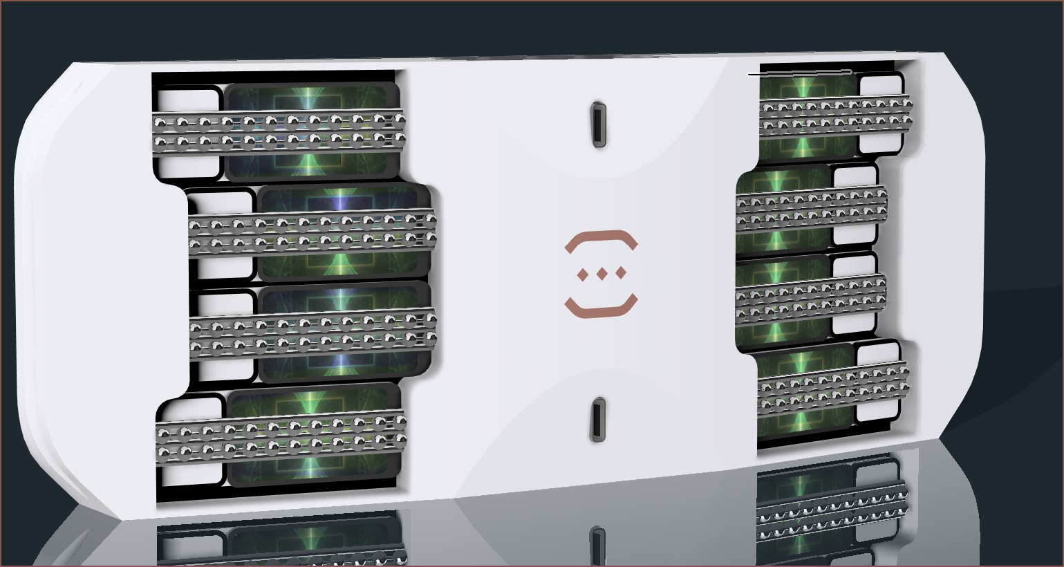
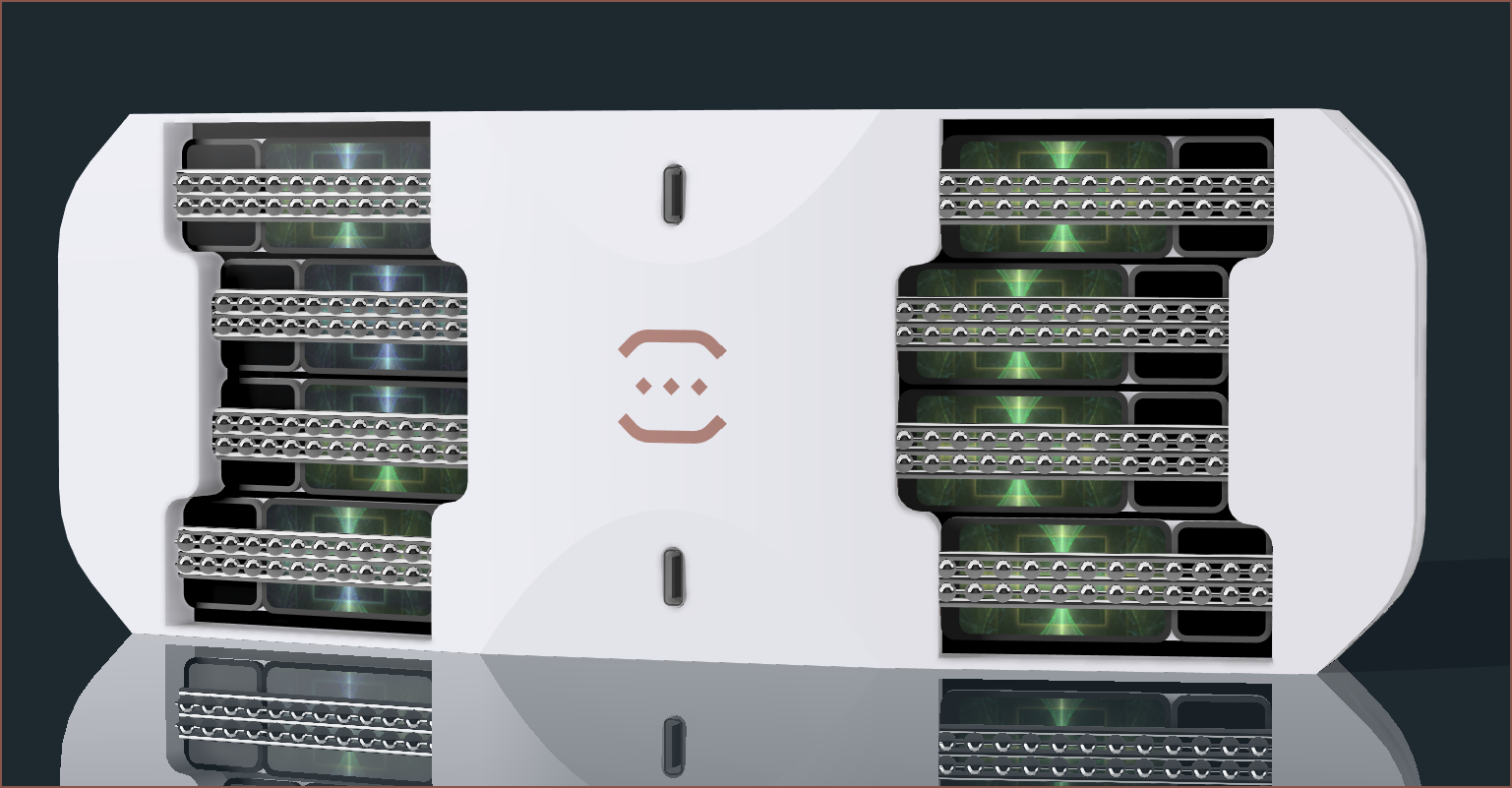 I then tried black with a grey bezel. I think this has a good balance of brightness and darkness. This is the one I tried just before trying an all-grey approach seen at the top of this log.
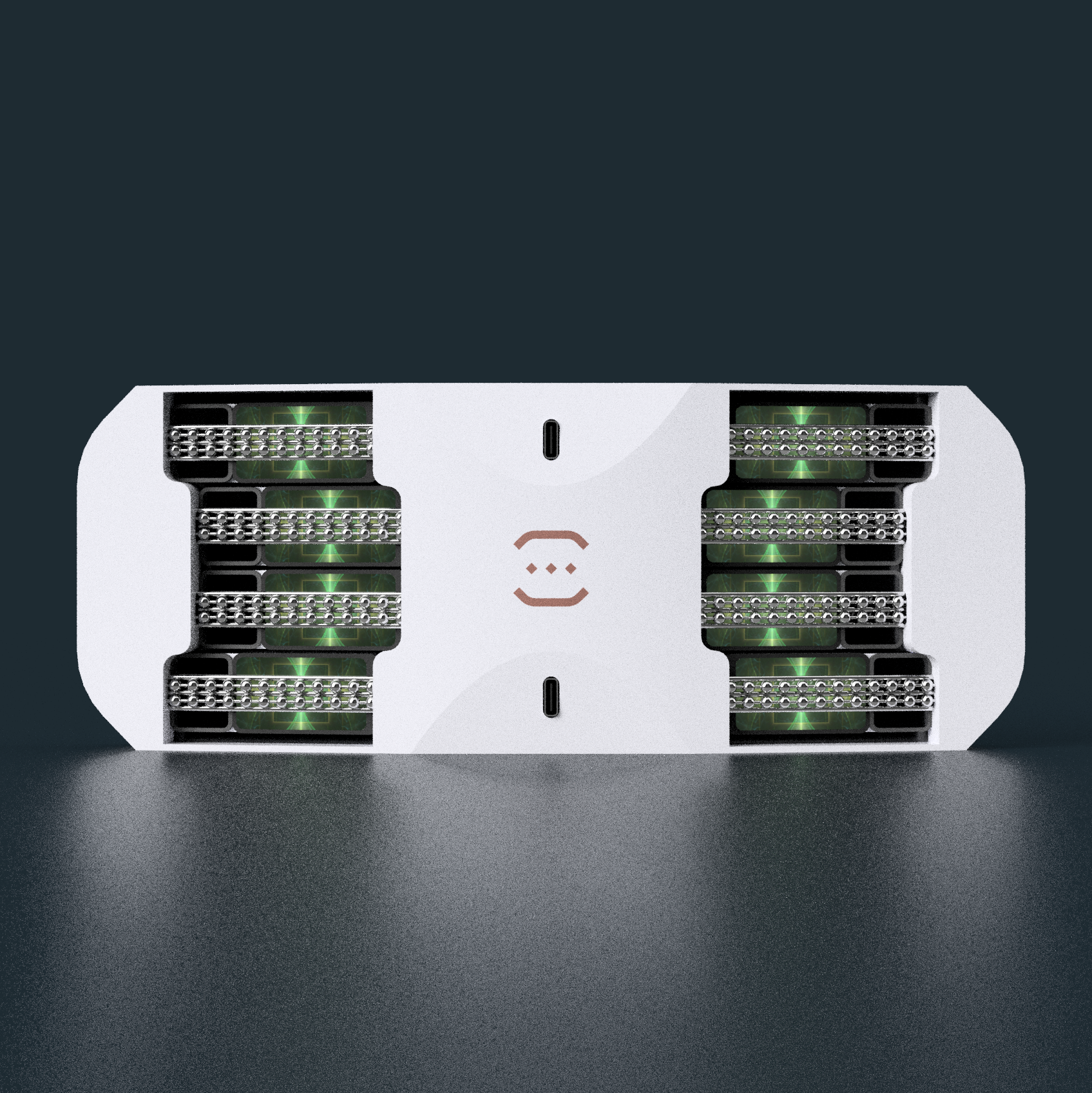 I think this version is visually crispier than the all-grey version due the the higher contrast from the black plastic. However, I belive the all-grey extension blends with the LCD better and promotes a calmer looking mindset.
Discussions
Become a Hackaday.io Member
Create an account to leave a comment. Already have an account? Log In.