 kelvinA
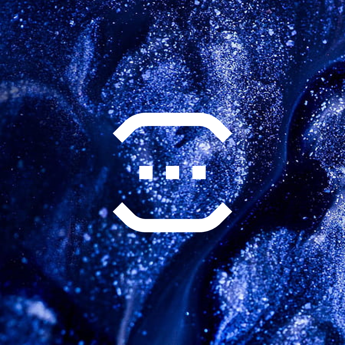
I've just made the project icon (see below). Me wanting to write this log out has given me the energy to actually go into PowerPoint and create the visuals I'm imagining (because this log would've just been a block of text otherwise, and I don't think any amount of detailed descriptions would actually convey well over text).
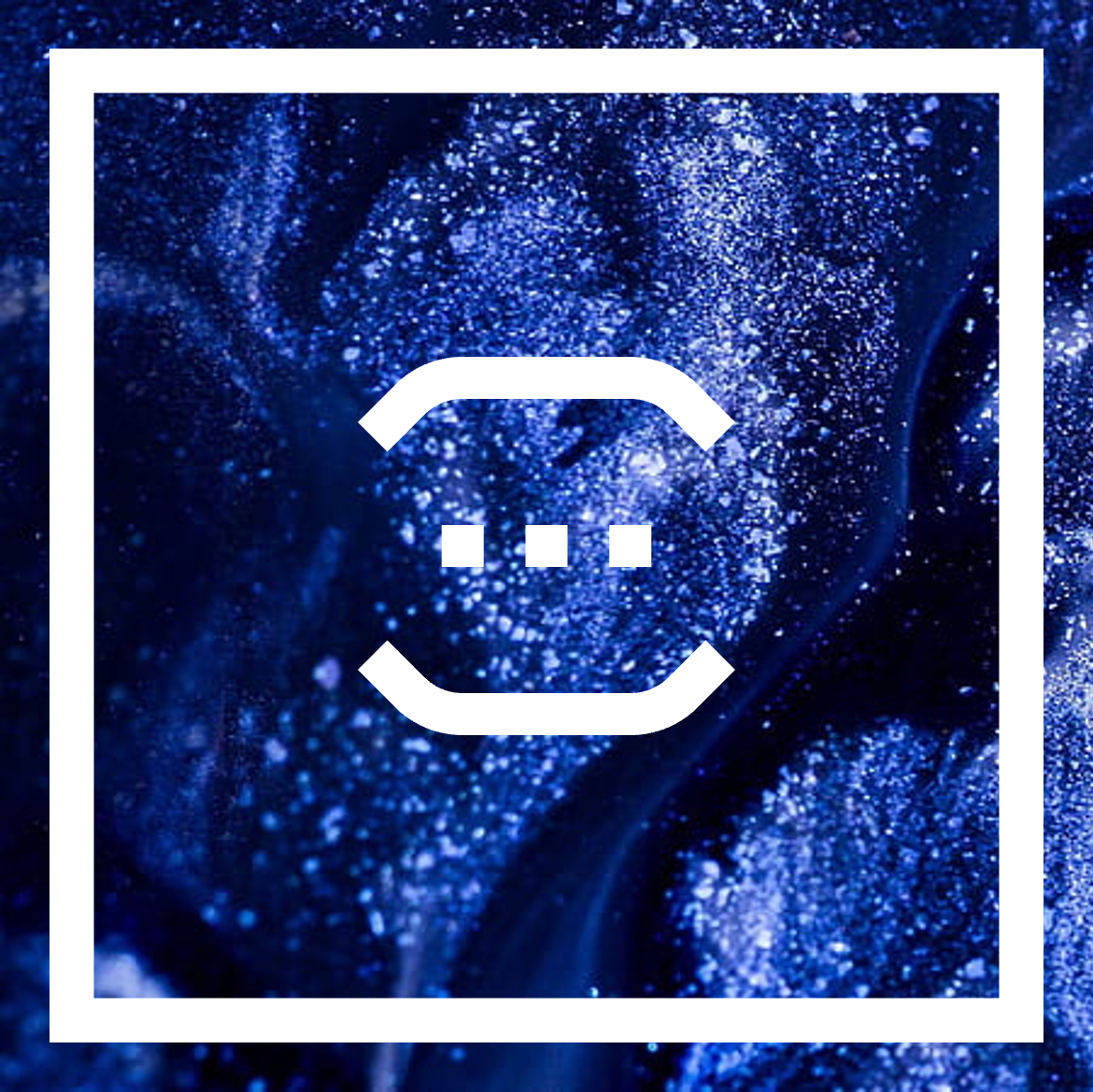 The general idea is that the window is going to be a square and there's going to be a smaller, hollow square inside of it that gives the window a visible edge.
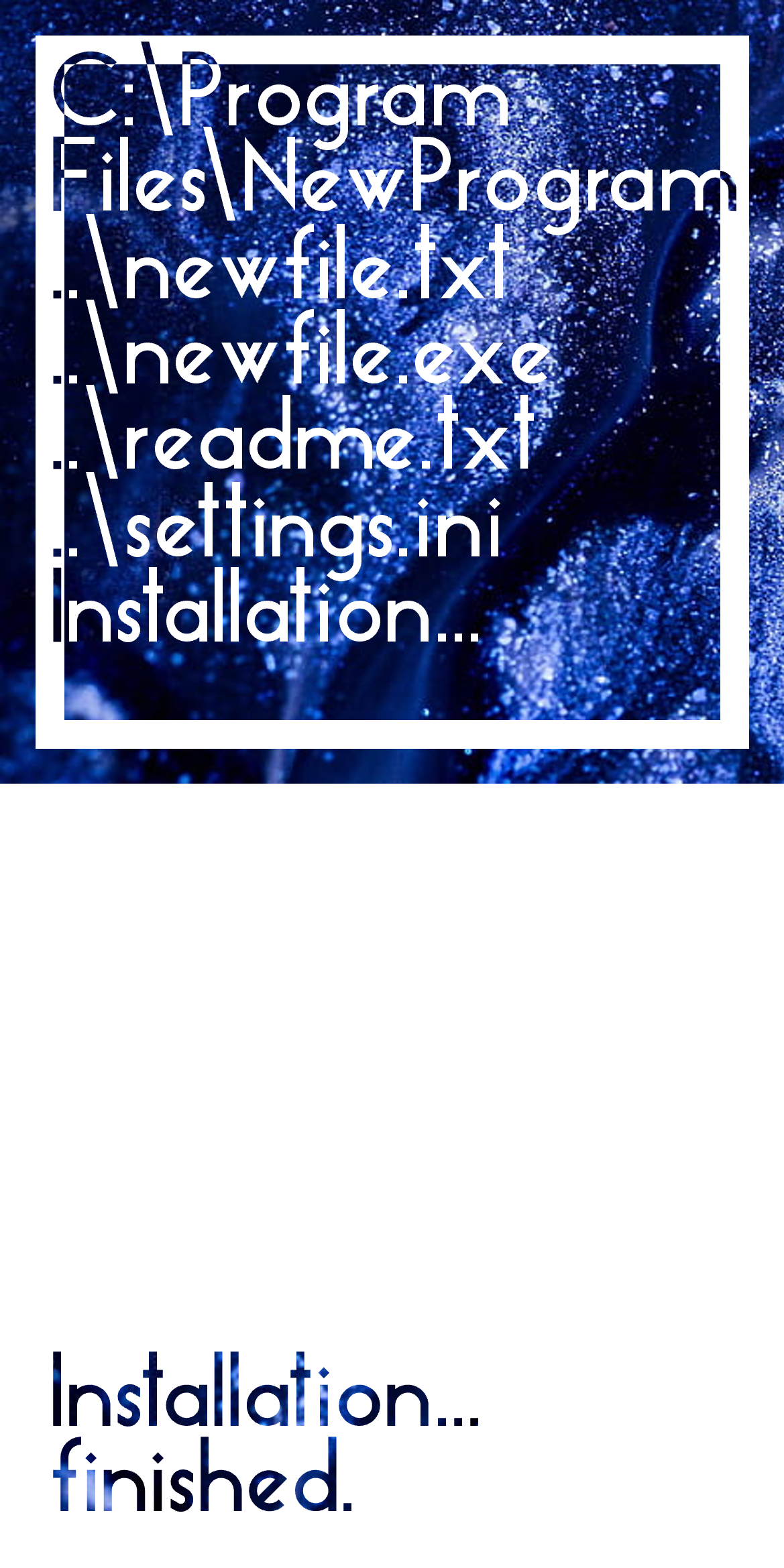
So far, I've only thought about the part when all the files are being created, just after all the user questions have been asked (e.g. install location).
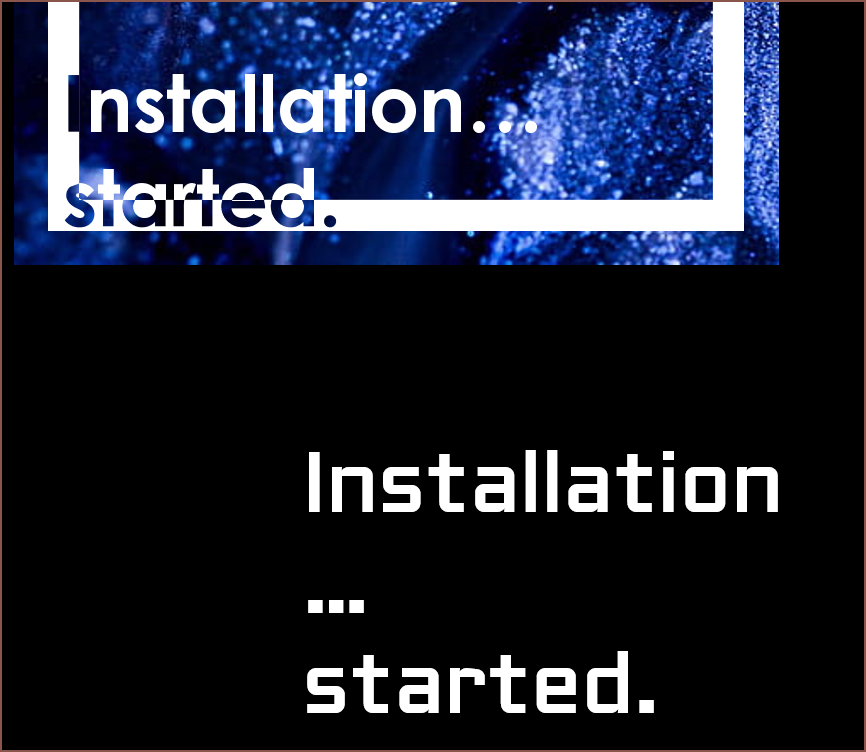
Installation... started.
Before seeing essentially a fancy terminal spew of created files, I want there to be an "Installation... started" animation. It's part of the digital branding I want to have.
- Installation
- Installation.
- Installation..
- Installation...
- Installation... started.
 The first font I tried was Century Gothic because it was the closest to the font I had in my mind, but the issue is that the dots were circular.
 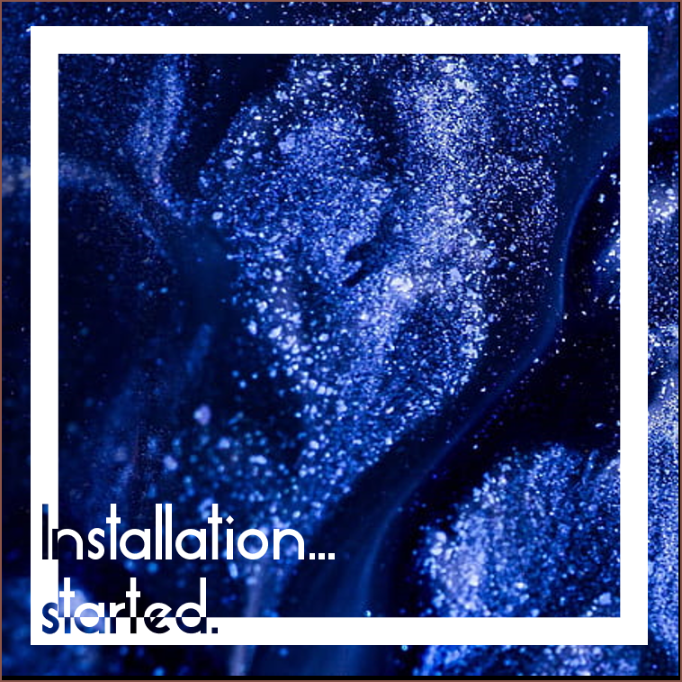 Next was Essense Sans (the font used on #Teti [gd0022] and #Interval Provisional [gd0097] ) and it looks fresh, though compressed. I've always thought this (and that it's too thin) ever since I first downloaded the font sometime pre 2015). After fixing that, the "started" part seemed harder to read than necessary, so I tried this:
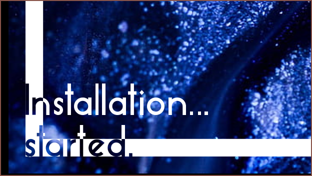 I don't think this is quite the vibe I was going for here.
 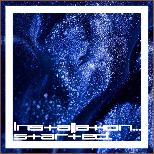 I tried umopMedium because I thought it'd look cool, which it does. The width of the characters also makes it impractical.
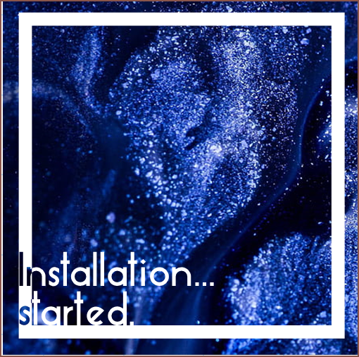 This might work, though it doesn't look as "fresh" (refridgeration feeling) as when more of "started" cut into the hollow square.
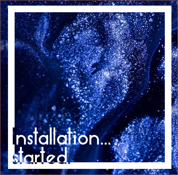 This also might work? However, I start to creep back into the readability issue.
Installation... finished.
Moving on, after the lines of filenames being added, there'd be a similar animation to the "started" one, just that all white/alpha will be inverted and the filename text will be cleared.
 I'm imagining that any video intro I'd create will start with a full white frame with the text in the lower left corner, where the animated glitter liquid can be seen (essentially, a 16:9 of the white panel). Thus, it makes 100% sense to include it in the installer.
Transition
After this, the text will move up so that options to either close the window or open the program straight afterward have space. If the user wants to open the program (which is usually the case), I want to have an animation where the white part of the square shrinks and becomes the middle square of my logo:
 The above is also the splash screen for any desktop programs; part of the reason I decided on the logo that I have now is because I like loading screens and thought it'll be cool to have the logo as one.
Discussions
Become a Hackaday.io Member
Create an account to leave a comment. Already have an account? Log In.
What if the areas of the text that overlap the square were filled with an inverted version of the backdrop? It could be value-inverted, to avoid adding more colors while still increasing the contrast.
EDIT: alternatively, you could desaturate that area a bit.
Are you sure? yes | no
Considering that the background is dark, I can't imagine how an inversion would increase contrast with the white foreground elements.
I'm not sure how noticable a slight desaturation would be, but I can imagine a darkened, no saturation version on the overlap sections. Another idea could be the background becoming like this for an "Uninstall... finished." card.
In any case, I'm going for a monochromatic, transparent display look. I just think sticking to a single foreground and background colour would be visually and programatically simpler. I'm trying to get something of a Microsoft Metro UI 2.0.
Are you sure? yes | no
My idea was to *de*crease the contrast with the white parts of the letters, to make them blend better into recognizable glyphs, while not blending into the rectangle enough to be invisible.
Are you sure? yes | no
I can't imagine what you're describing. Aren't all parts of the letters white?
Are you sure? yes | no