 Eric Hertz
Trying to graph, say, y=mx+b in so few pixels is turning into more art than science. Heh!
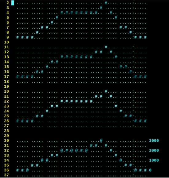
The goal is we have 8 values, which are each connected with a three-pixel line-segment. So, y=mx+b is actually used twice for each segment. First to interpolate the three steps from one point to the next. Then, again, to scale from the input range (0-3000, in my case) to the number of pixel rows (8).
It looks great, but not excellent.
The most notable funkiness is the discontinuity between the sixth and seventh line-segments. (ignore the eighth, it doesn't belong there). I found that this is a result of the weird scaling necessary: 0-3 scaled to 0-7. If I don't use all 8 rows, and instead use 7, it looks far better.
(Yes, BTW, I did take integer math and rounding into account... Surprisingly, that discontinuity isn't rounding/truncating error.)
Another example is the fifth character/line-segment. Sure, it looks nice, but it's not really representative of what's happening.
The horizontal section to the left is at 2000. The line-segment goes from 2000-3000. Thus, ideally, the three dots should be at 2250, 2500, and 2750. But, because there's only two rows to fit them in, of course there's loss of resolution. But, it gets weirder because the third row from the top isn't 2000, it's something like 2333, (from memory of a lot of experiments yesterday). So, the 2250 step gets lost. And so does the 2500 step, because 500 is closer to 333 than 667, or something. So, instead of looking like a ramp from 2000 to 3000, it looks like it's staying at 2000 until halfway through, then ramps to 3000 (at a far steeper angle than is real).
So, A quick fix was scaling across 7 instead of 8 rows, then 0 is at the bottom row, 1000 is two rows up from there, 2000 is the fifth row, and 3000 is the seventh.
This looks pertydurngood, But, these are fake values... (and, still, it's not without misleading visual artifacts).
(also note the first and second segments, these start at 0, the first goes to 1000, the second goes from 1000 to 2000, so they should look the same, only shifted vertically).
So, somewhere begs the question... How much "fudging" should be done to carry across the right meaning, visually?
Mathematically, the above graph is actually "right"... but obviously it doesn't look right, at all. So, then, it's not really right, is it?
If this were spread across 100 pixels instead of 8, it wouldn't be nearly as visually-wrong, but technically, would still contain such glitches. they'd be more hidden by factors like multiple-pixel thick lines, and maybe antialiasing... Boy howdy them kiddos used to 320x480 on a 4in screen have it so easy.
(Actually, my first homebrew function-grapher was in the late 90's with Visual Basic and 1024x768, so I had no idea the difference a pixel makes, either).
So, I'm debating how to go about this, we're not talking "visually-appealing" here, we're talking visually-representative, maybe, wherein the mathematical approach is actually very misleading.
What a weird thought.
I've drawn out, by hand, on paper, all the possible "straightest line" representations between two values; between one row to another. I think they can work-out. BUT, then there's a bit of visual misleading going-on when switching from one slope to the next (e.g. making some abrupt slope-changes appear smoothed).
So then I tried a by-hand for this specific example and came up with a sort of "algorithm" for choosing a line-segment pattern that is *very* visually-representative, *but* requires that some points be at the last column in one character, while other points may be at the first column of the next.
In this particular system, that would, actually, be less misleading. Even though, in a sense, I'd be stretching and shrinking the "time" (horizontal) axis willy-nilly. And, the two extremes are pretty extreme: In one case, one single character (three pixels) might represent two points, whereas in another extreme, the first point might be at the end of the previous character, and at the beginning of the next (five pixels!)
Heh! What a weird conundrum. /time/, however, is not really what we need to know. Nor is *value*. I think what really needs to be gleaned from this system is whether it's increasing or decreasing (or constant), and a rough idea of the rate in comparison to other points. A cursor sliding left to right will show where we're at presently...
I'm still debating whether to do this the math-way (which is ugly but done) or to try coding-up the handwavy-lookup-table artsy-way and accept its crazy time-stretching.
Discussions
Become a Hackaday.io Member
Create an account to leave a comment. Already have an account? Log In.
Don't forget: *temporal* anti-aliasing is also a thing. You can have a pixel blink on/off at half the frame rate to appear grey.
Are you sure? yes | no
Indeed?!
I had briefly contemplated the idea, but figured it would be too difficult to get the timing right. Thanks for the encouragement to experiment!
Are you sure? yes | no
What a fascinating excusion for the Z80 haquery.
I wonder if this might give you some ideas:
https://en.wikipedia.org/wiki/Bresenham%27s_line_algorithm
Are you sure? yes | no
Heh, yahknow, now that I think about it, I have implemented an algorithm similar to his numerous times, developed-and-improved over many years, for everything from lcd-graphics (of much higher resolution than 5x7) to multi-axis motion-control to even the fading of an LED's brightness via PWM...
"This is a done problem." I even have the libraries written in such a way as to drop-in to even those widely-varying situations.
How'd I forget those and wind-up starting with y=mx+b again?
I even wrote a friggin int32-division function. Hah!
...
Something about the seemingly-huge relearning-curve of using my library-system, maybe. *Sigh* That thing literally has two+ decades of development behind it. But every time I step away for a year, I have to go the "hello-world"/blinky route for a week or more to remind myself the flow :/
And yet, the whole point of getting SDCC working with this machine was to enable using that stuff.
...
Oh, also, my line-drawing library is designed for realtime-calculations (as it looks like his is too, calculating a running error), and this isn't a particularly realtime application (calculate once at boot, load to screen). So, I guess I just hadn't made the connection that *of course* this is still the same friggin process.
Sheesh, my brain these days.
...
On the plus-side, the first "hello-world" step is actually a fading "heartbeat" LED which uses that very library.
I guess my having been away from that system for a few years, this time, will give me some great insight as to how difficult the [re]learning-curve really is, and if it can be reduced.
[It was *supposed* to be easier than arduino. Hah!]
Are you sure? yes | no
Ahh, right, the switching of axes depending on which has the most travel... That might help, too. Though, I had thought about it, a tad, and am unsure how to make it look good with my horizontal skipping-dots method... two vertical dots atop each other but no two horizontal dots right next to each other.
The alternative might be to skip dots vertically, as well, but only when its the longest axis... hmm...
Thankfully I can experiment with that in a text editor...
Are you sure? yes | no