I think it would be great to integrate the various text and sign-in boxes into the artwork as much as is reasonably possible. For example, the black hanging screen could contain the login text (as mentioned above/below?), the logo could possibly be integrated by making it into a banner towed by the copter, and the "explore projects" text could be placed on the tablet in the lower left corner.
Good ideas. I was thinking more of separating the interface from the art to reduce confusion, but I think that if most/all of the interface was integrated into the art, that would also accomplish that.
Of course, on small screens it would probably have to be a completely different design.
Hey - thanks for the feedback! This is just an early prototype, but all the comments are spot on! We're redoing the illustration in the back (moving the screen etc.)
I *love* the idea of making the login as a part of the screen. Haven't thought of that! I'll see if we can make it happen.
I really like this concept but I don't like the execution as much, so I'll try to give a bit of constructive criticism:
First, the text is difficult to read because some of it is over a similar-lightness background. A darker background would help a lot, but I don't know how best to do that without having to cover up or move the hanging screen in the picture. Maybe work it into what the screen's displaying somehow?
Also, the "Sign in" button looks like it's part of the picture, a sign on the scaffolding around the giant robot. And why should it even be off to the side? I think it would be better right next to/above/below the signup form.
 Aleksandar Bradic
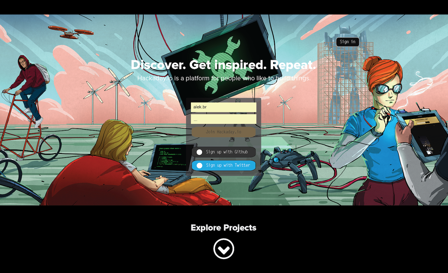
Discussions
Become a Hackaday.io Member
Create an account to leave a comment. Already have an account? Log In.
I love the artwork!
I think it would be great to integrate the various text and sign-in boxes into the artwork as much as is reasonably possible. For example, the black hanging screen could contain the login text (as mentioned above/below?), the logo could possibly be integrated by making it into a banner towed by the copter, and the "explore projects" text could be placed on the tablet in the lower left corner.
Just my $0.02USD.
Are you sure? yes | no
Good ideas. I was thinking more of separating the interface from the art to reduce confusion, but I think that if most/all of the interface was integrated into the art, that would also accomplish that.
Of course, on small screens it would probably have to be a completely different design.
Are you sure? yes | no
Hey - thanks for the feedback! This is just an early prototype, but all the comments are spot on! We're redoing the illustration in the back (moving the screen etc.)
I *love* the idea of making the login as a part of the screen. Haven't thought of that! I'll see if we can make it happen.
Thanks!
Are you sure? yes | no
I really like this concept but I don't like the execution as much, so I'll try to give a bit of constructive criticism:
First, the text is difficult to read because some of it is over a similar-lightness background. A darker background would help a lot, but I don't know how best to do that without having to cover up or move the hanging screen in the picture. Maybe work it into what the screen's displaying somehow?
Also, the "Sign in" button looks like it's part of the picture, a sign on the scaffolding around the giant robot. And why should it even be off to the side? I think it would be better right next to/above/below the signup form.
Are you sure? yes | no