 kelvinA
Earlier today, I found out that The Verge just got a fresh new look (see below) and after seeing their new logo, I thought I should see if I could freshen up my own now that it's nearing to be a year old.
Here is the old (top) and new (bottom):
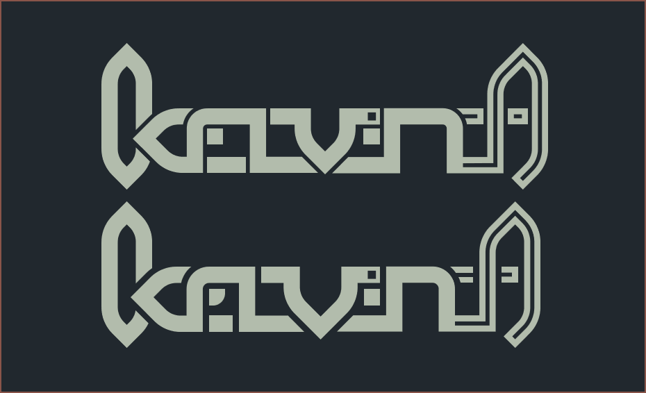 From using it for a few months, the only thing I thought needed improvement was visibility. The old logo became a hard-to-decipher blob a little to quickly for my liking.
The main thing I did was increase the negative spacing from 0.25 to 0.375. A nice side effect was that this made the line in the A a perfect 1x1 square. This means that I could potentially animate from the 3-dots logo to the kelvinA logo and match up the dots.
Next, I changed the line that comes from under the n so that it looks continuous. The base idea of this logo is that it can be made out of 2 lines. 1 line is the loop in the k and the other line creates everything else. The single-line idea was a feature of the verrry first kelvinA logo I made in 2015 all the way up to 2021.
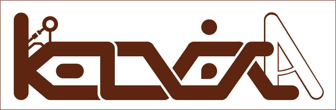

The 2 above are made in Powerpoint, and the newer ones are made in Fusion 360. The hours lost trying to get the sketch solver to cooperate... (FreeCAD wasn't any better or worse.)
Moving on, the next thing I did was reduce the width from 27.5 to 27. The idea was that I could animate 3 logos (each logo is 9x9) with a 0.25 gap, but I think the more predictable 3:1 aspect ratio is a more favourable solution. This change made the e look a bit compressed, so I added a fillet to the bottom of the square. It now looks more e and less E, as well as the filleted square looking a bit like a leaf (I like leaves).
The biggest thing that's changed that I didn't even notice until right now (when I had to export the logo so that I could have a side-by-side image) is that the v has become noticably larger. I think this is a good accidental thing though because now the v looks similar in size to the n, the sharp edge of the v noticably cuts through the bottom line (I like sharp stuff such as Beyblade performance tips, gyro tips and the tip of a pair of compasses, and I don't like ultrarounded Googleization) and it accentuates the overall shape (of looking like a 2D spaceship sprite) better from a distance. (The biggest problem I had with the 6 years of the old-old logo style was that I could never just press "align centre" and the logo actually look like it was centred. While the n might look wider than the e in the 2021-present logo, mathematically it's the same.)
Discussions
Become a Hackaday.io Member
Create an account to leave a comment. Already have an account? Log In.
The V shape looks more impressive being bigger and it makes the whole logo symmetrically shaped. What a cool transition from the old logos to the new one. The colour chosen is good, dark green and light green.
Are you sure? yes | no