The goal was easy to read, large numbers and simple layout. Succeeded on at least one of those. Icons can sometimes be confusing. I added lots of features to see what I could fit in. My philosophy is to always "stand on the shoulders of giants" instead of "re-inventing the wheel." I use several available libraries but where I could not find one, I wrote the code. ezTime and OpenWeatherMap.org were easy choices. Writing code to properly text wrap and modifying fonts was, well, fun. I am putting most of the documentation within the code itself as to how things were done, and will but some here as well. I fully expect that if anyone gets anything out of my efforts they will be cut-and-pasting into their own design.
One other thing, I try to keep the code decipherable as much as possible but one person's decipherable is another's awful spaghetti code. I know many will trash my code, that is the nature of the game. I started in this world coding a PDP-8 in machine code and went on via Fortran, LSIP, ... many assemblers, Pascal, html, php, etc.
Personally I find:
if (a > b) { result = x; } else { result = y; }
much easier to read and understand than
result = a > b ? x : y;
but that's just me, and printf drives me crazy.
On to the project at hand:
FONTS
To keep the fonts somewhat easy to use and modify and to not need too many added bitmaps I chose to modify a known font. I added symbols for degrees and precipitation (a raindrop). I also needed up and down arrows. By modifying the fonts I was able to replace characters that I knew would not be needed. Modifying the original TTF file (true type file, a font format often used by Windows, etc.) I was then able to produce different font sizes simply while testing out what I needed for the display.
FontForge is an open source (free) font editor I installed on my PC. I never used it before but it was pretty straight forward. I loaded the font (Roboto) and was able to copy and paste some glyphs (the individual characters) as needed. For the arrows I loaded a Windows symbol font and copied the arrows from there into what was Roboto. They overwrote some of the first printable characters (the project has a .png file that is the mapping). I created the rain drop and degree symbols as well. The Cyrillic letters (for the Russian version) were copied within the ttf file, in other words I changed their positions within the file to overwrite the Latin (i.e., English) letters. This was a bit tricky because some are linked to each other within the ttf file (who knew?) so that glyphs (letters) that look alike (a Latin "a" and a Cyrillic "a" are the same) are only in the file once, but there are links (pointers) where needed. I figured out how to break those links and copied all the Cyrillic letters over the Latin ones. The order in the file of the letters stayed the same as it maps to the UTF-8 order. Since there are a couple of more Cyrillic glyphs than Latin ones I did kludge a bit on the last two. But the end result is a ttf font file that has the Cyrillic characters where the Latin characters were and a direct mapping to the UTF-8 standard. And, with all the needed letters and symbols in the first part of the file, converting to the Adafruit GFX format was trivial. I output the new ttf file.
Next step was to convert the ttf file to Adafruit GFX format. I used the on-line converter truetype2gfx. You upload the ttf file, specify the font size, and get a header file read to go. Note that the font size may not be what you think so you will probably go through this cycle a few times to get it right.
To touch up any of the font, once I had the right font size for this project, I found it easer to use the Adafruit GFX Pixel font customiser [sic] to touch things up. You copy the source in the .h file, hit "extract" and scroll through all the glyphs (like how I keep switching from "characters" to "glyphs"? Just to keep you awake.) Here you can do thinks...
Read more »
 ziggurat29
 TAIBHSE DESIGNS
 Yann Guidon / YGDES
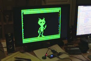
Got this working after some trial and error (and my inexperience). Great implementation that has a home on my kitchen window now.